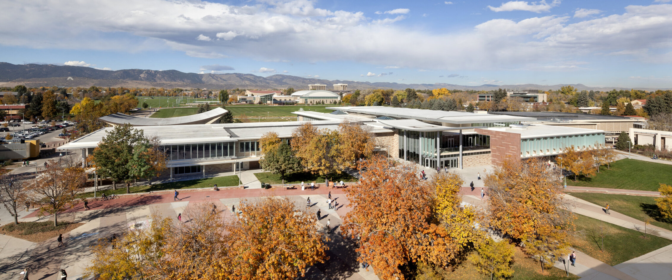
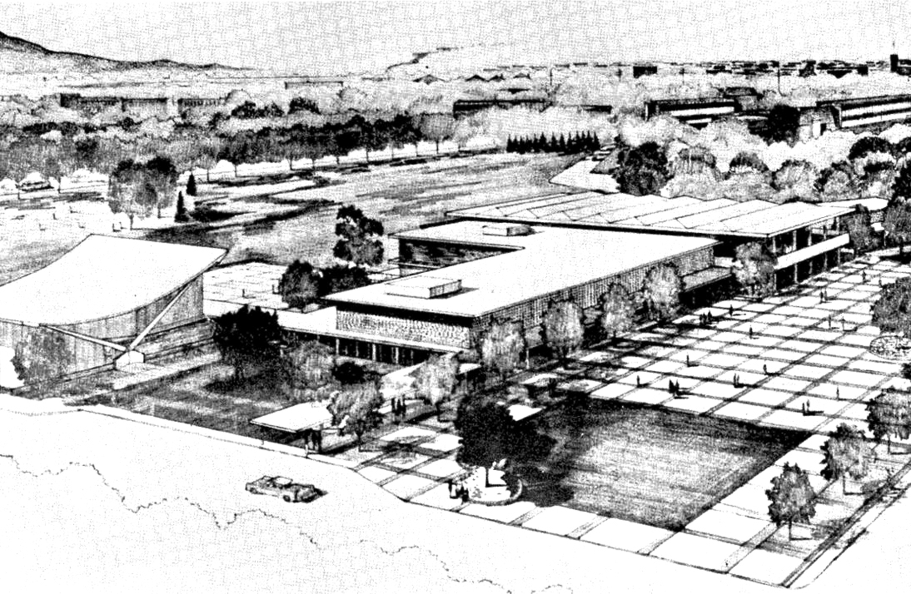
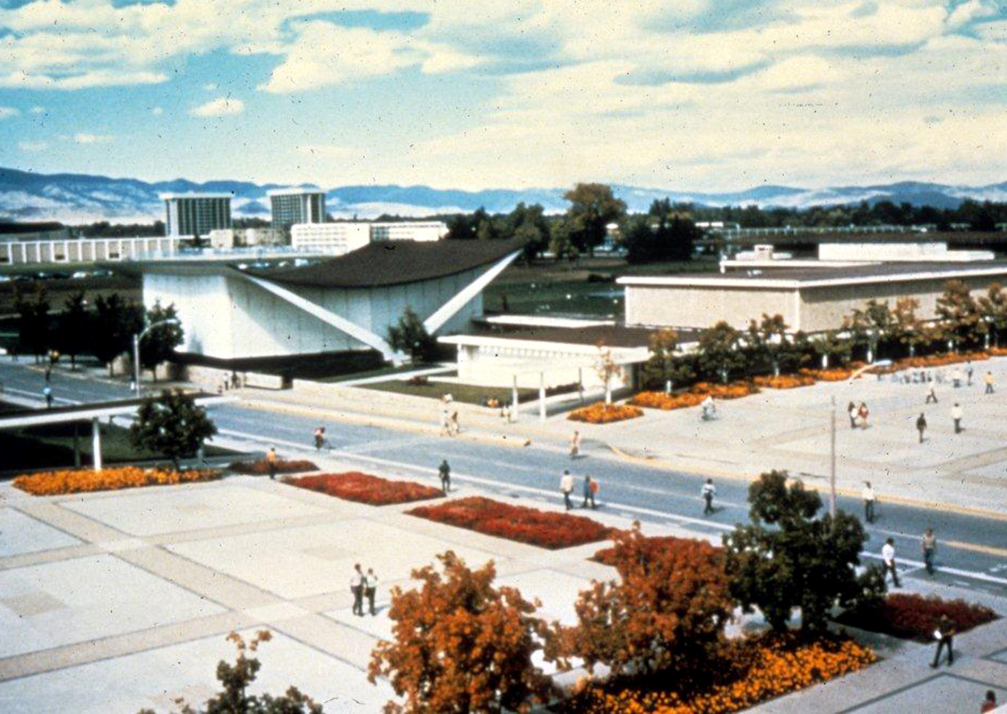
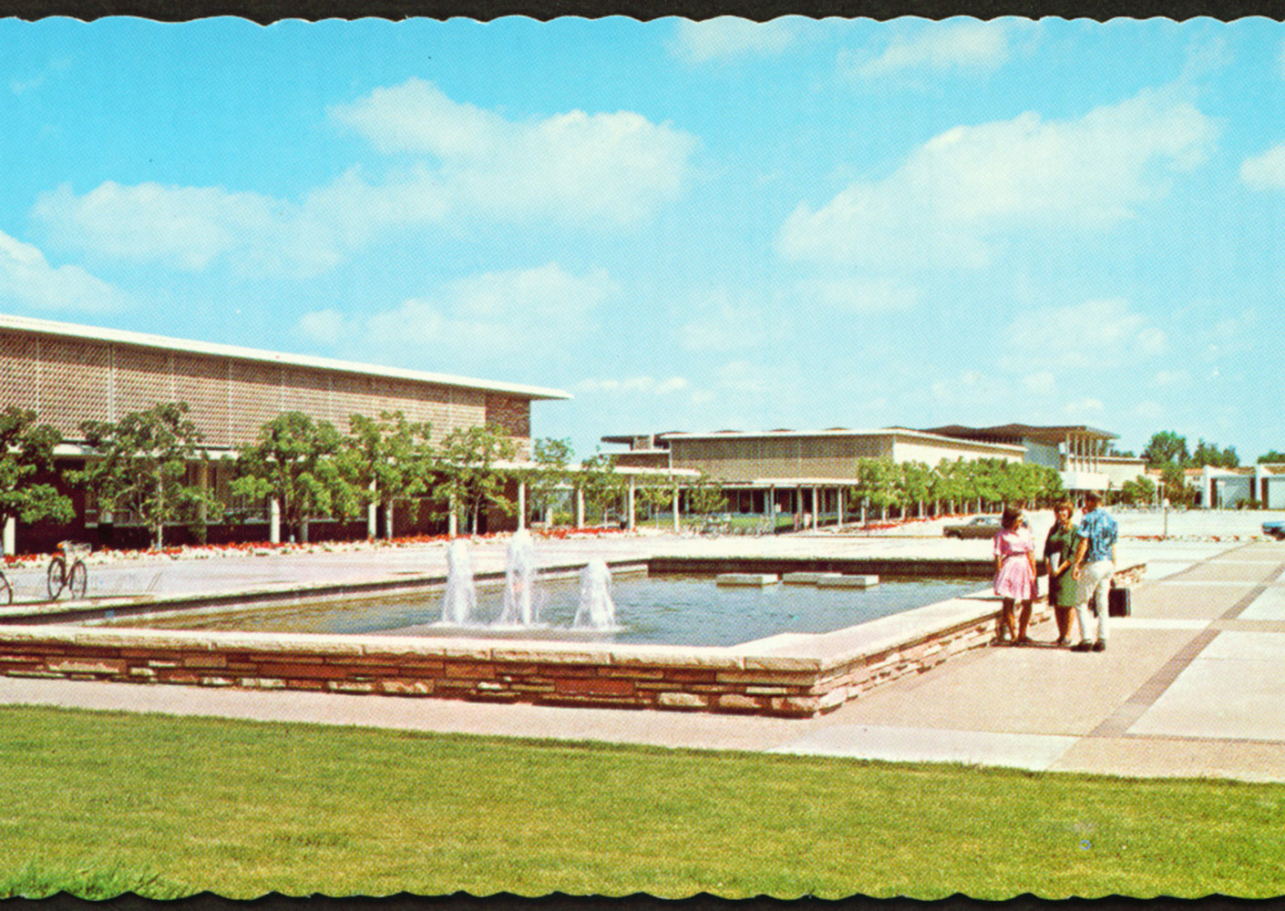
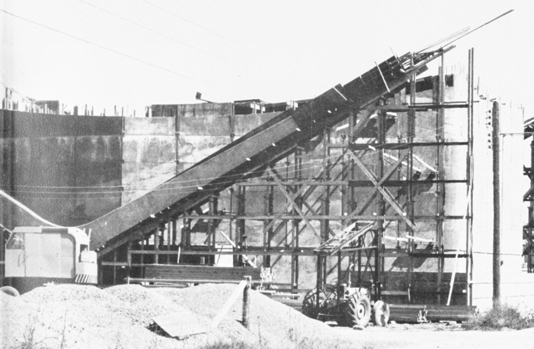
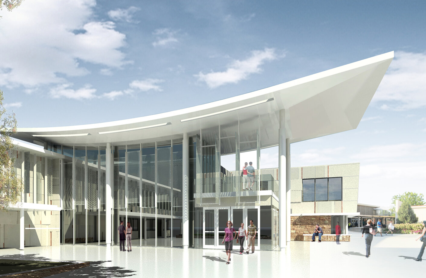
In 2011, I began working on a team to re-envision the Lory Student Center at Colorado State University. The original James Hunter-designed Center opened in 1962, and consisted of a small complex featuring a main building connected via arcade to a sculptural theater volume. The original was sleek: clean lines, rigorous grid, an open floor plan, a vast “free speech” plaza that received students, and a cantilever scissor-truss roof emphasizing the grand view of the Colorado peaks. The showstopper, though, was the one-of-a-kind catenary roof on the theater, a structural masterpiece modeled after a foldable camping stool. Our team was excited to work on such a heritage building. We felt compelled to rewind years of cluttered additions—which blocked mountain views, truncated natural light, and distorted the mid-century vocabulary—and reinvigorate this landmark on campus.
Phase One.
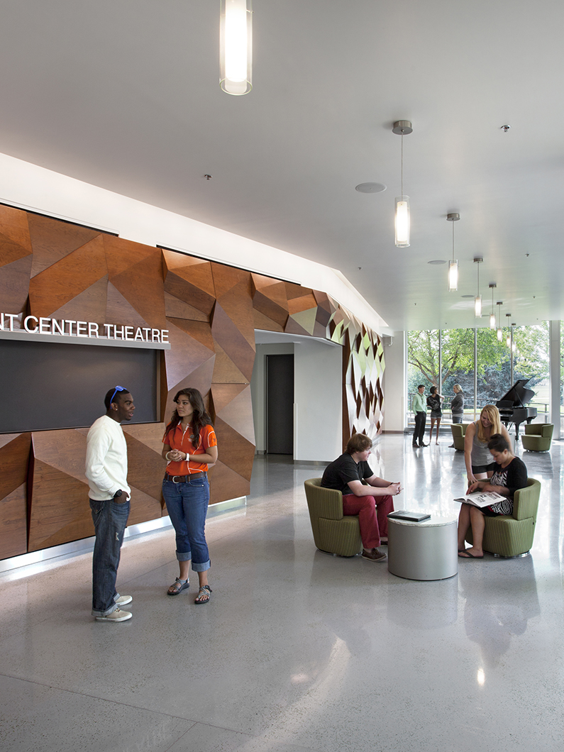
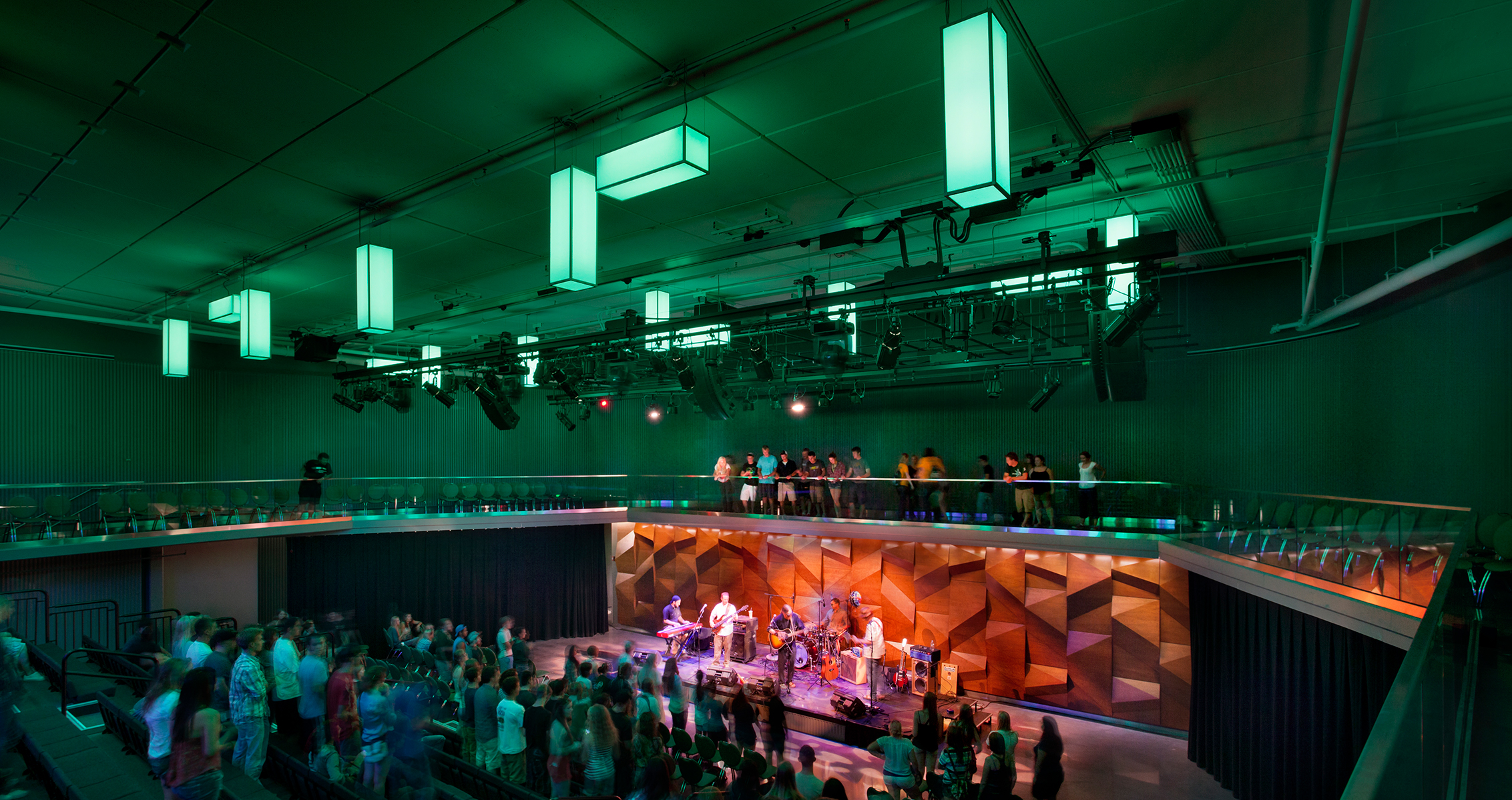
The first thing we tackled was the theater renovation, transforming the non-accessible, tiered seating into a flexible space that can host concerts, theater performances, and film screenings, among other things. In short, we hope to create a space for students to mingle and display their creativity. This is when we encountered our first challenge: the mid-century building’s envelope was a cast-in-place concrete skin with little interior insulation. How could we preserve the beautifully-crafted formwork of the concrete while enhancing the envelope performance? Poor insulation is a staple of mid-century buildings, so this was not a surprise to us. We devised a plan to insulate from the inside and replace the single pane windows. Most important was being able to improve performance while keeping the building’s heritage in mind.
We also looked at original photography, much of which came from Karen McCormick, a witness to the building’s original opening and someone who has worked in the building ever since. She’s now assistant to the Student Center Director and is in charge of special projects like ours. Thanks to Karen’s vast collection of photographs, we could travel back in time, “witness” events in black and white, and understand the building’s Land-Grant heritage and the role it played in shaping the life of students through decades of use. The Lory Student Center was indeed the Campus’ Living Room!
Phase Two.
While the theater renovation was under way, we began working on Phase 2, the main building. We intensely studied original documents like drawings, finding any clue we could use to reconstruct the spirit of the initial building’s glory. In that quest, we discovered plenty: a design responsive to natural ventilation, envelope screens that mitigated solar heat gain, interior wood screens that gracefully divided interior spaces, and an array of original artwork, most of it still intact. Some of that work included colorful mosaic walls that popped against the simplicity of the interior, an exterior fountain with the University mascot ram’s head water spouts, and a stained-glass clerestory that bathed the interior with a rainbow-like lighting effect.
This project proved to be one of the most technically complex projects I have worked on (and I know from asking around the larger construction team that I was not alone!). Yet perhaps because of these challenges, it was also one of the most rewarding projects of which I have been a part. It’s amazing what can happen when a team of passionate, crossed-disciplinary designers come together with a client committed to a mission of staying true to its roots.
– Yanel de Angel