Perspectives April 29, 2020

Public Spaces Are Never-Ending Stories, and Their Identities Should Be, Too.

By Meredith Kinney, Senior Branded Environments Designer

I want things to be beautifully simple yet packed with meaning. That’s my aesthetic and my process.  

As I’m designing, I am always asking myself, How many layers can I put in this one identity and make it clearer with each layer, not muddier? How can I play with color? With form and rhythm? Employ typography and line? How is it going to relate to the client and place?  
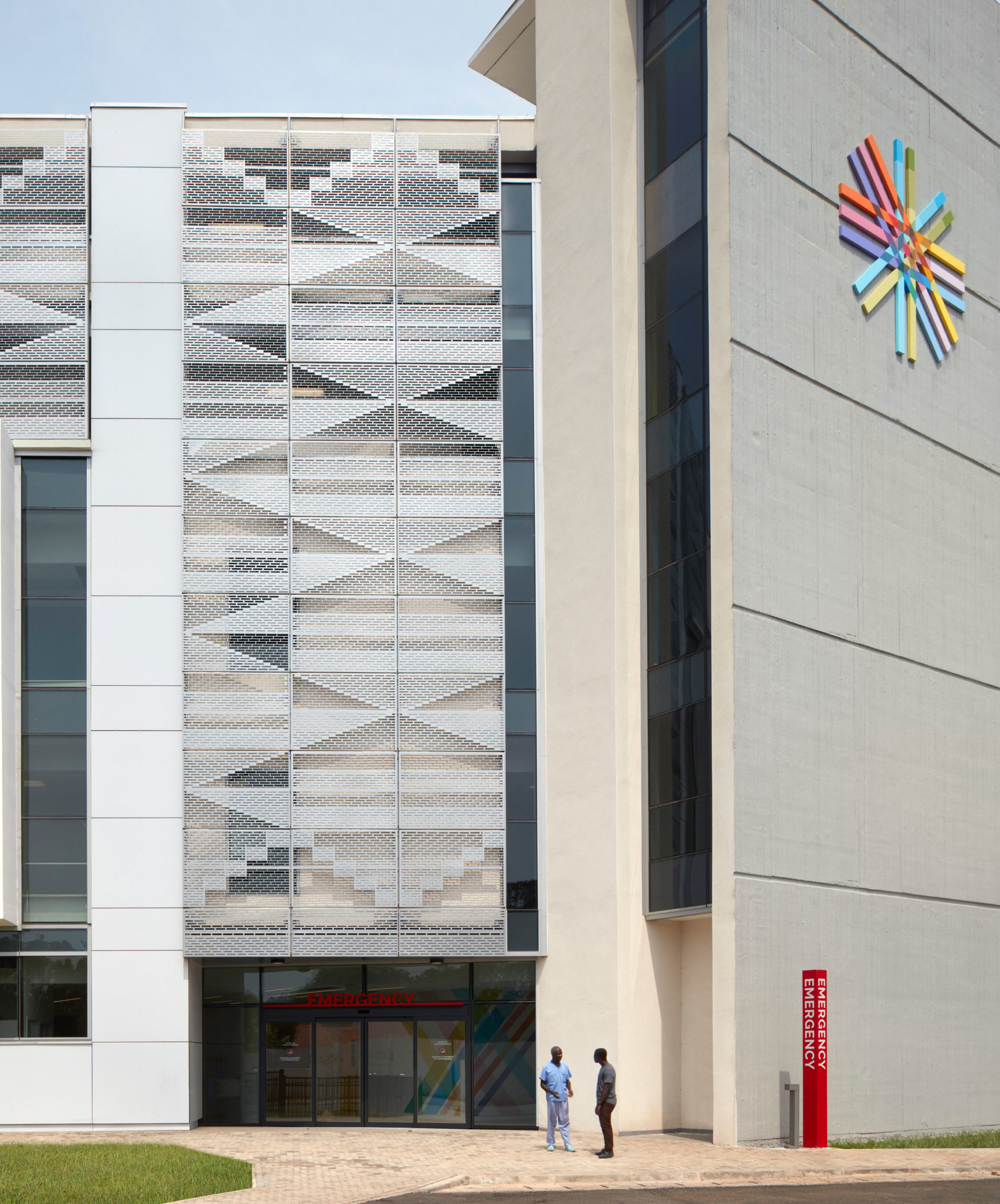
I am so prouof the integrated colorandpattern story we designed for the Greater Accra Regional Hospital at Ridge, in Ghana. It is as clean and sophisticated as the kente cloth that inspired it.  

The story starts on the building façade with the mark—which we actually never intended to be the markI love that it doesn’t need any words. Everything you need to know to understand what happens inside the Accra Regional Hospital at Ridge sounds out loud and clear: Health. Culture. Hope. Life.  

The logo for Accra Regional Hospital at Ridge took inspiration from a kente cloth and created a symbol on the facade of the hospital.

Inside, the identity system expressed by the mark develops into a floor-level system of wayfinding, textures, and patterns based on a single color, chosen both for its kente cloth meaning in Ghanian culture and for its important to health and healing. 

At the World Architecture Festival last December, Pat Bosch, lead architect and the Design Director in our Miami Studio, heard firsthand from a Ghanaian architect what the hospital has meant to his city. His words reflect exactly the spirit we were striving for.

Designing an identity is the ultimate test of efficiency and clarity. It’s just one thing—one tangible, visual thing—but it has to synthesize story, place, emotion, and then it has to become a vehicle for every possible relationship the audience is going to have with the organization it represents. It has to resonate. 

I come back to that word a lot: resonate. It’s really the best way to describe what a brand identity has to be able to do no matter the context. It can’t just make a big splash and then ghost everyone it inspires. It has to keep calling out to the audience and adding to their experience.

But if designing an identity is the ultimate test, designing an identity for a public park is the master class. Hospitals are one kind of public space. Parks are another. Unlike hospitals, they welcome as many uses as their public can dream up for them, and the “public” is an audience made up of, well, everyone! That’s a lot of opportunities and not a lot of constraints. Fortunately for the designer, a park has a strong built-in identity as a place.

Unless it’s a roadside park, and then it’s a little more complicated.

I am also really proud of the identity we created for Freedom Park here in Atlanta, a public space with a fascinating origin story. Today it connects with the famous BeltLine and serves as a protected thoroughfare and green space for a bunch of the city’s oldest neighborhoods. Currently, the park can’t host big events, so it doesn’t have that built-in strength most parks can build on for an identity. How then to make something concrete out of a place that isn’t your typical destination?

The logo mark is based on the “place” itself—the shape of the park. The logo also stems from the letterform “f” representing the story of the park’s freedom. The mark also illustrates the notion of sculpture and 3-dimensionality thus, alluding to the future focus of the park’s existence—art and sculpture.

Ring a bell you can’t unring—layer so many meanings into the identity that the story never seems to end. The audience becomes connected to it because they discover a new layer each time they come to it. You know, make it resonate.   

Back to the target audience problem: Our official client, the Freedom Park Conservancy, was launching its first capital campaign, so there needed to be a professionalism to what they portrayed. The identity would also need to prompt action and engagementfrom investors, yes, but also from artists or historians who might exhibit in the park. The visitors to the park, on the other hand, are on skateboards, they’re walking, running, cycling, they’re urbanites, millennials—they don’t want to feel like they’re in a space that’s professional.  

The logo would need a point of view that didn’t feel too specific. I wanted it to be a framework they could use to extend the brand into different forms. The same as in a person: the tone of voice could change, but the voice is the voice. It won’t change the park’s DNA.  

I couldn’t explain how the logo captures the park’s DNA better than Sara Clark, former Communications Committee chair for the Conservancy“We love the intersecting lines that match the shape of the park and form an F,’” she writes. The color sections show all of the overlapping communities, population groups, and interests that come together within our park. 

The Freedom Park tagline decorated as a lantern for Atlanta's Annual BeltLine Lantern Parade.

They might not see the first time—or even the second time—that it’s an F or that it’s an axon view of the park’s actual footprintBut eventually all the layers pile up and the experience starts to take the shape of a concrete place.  

And now F marks the spot.