York University, School of Continuing Studies
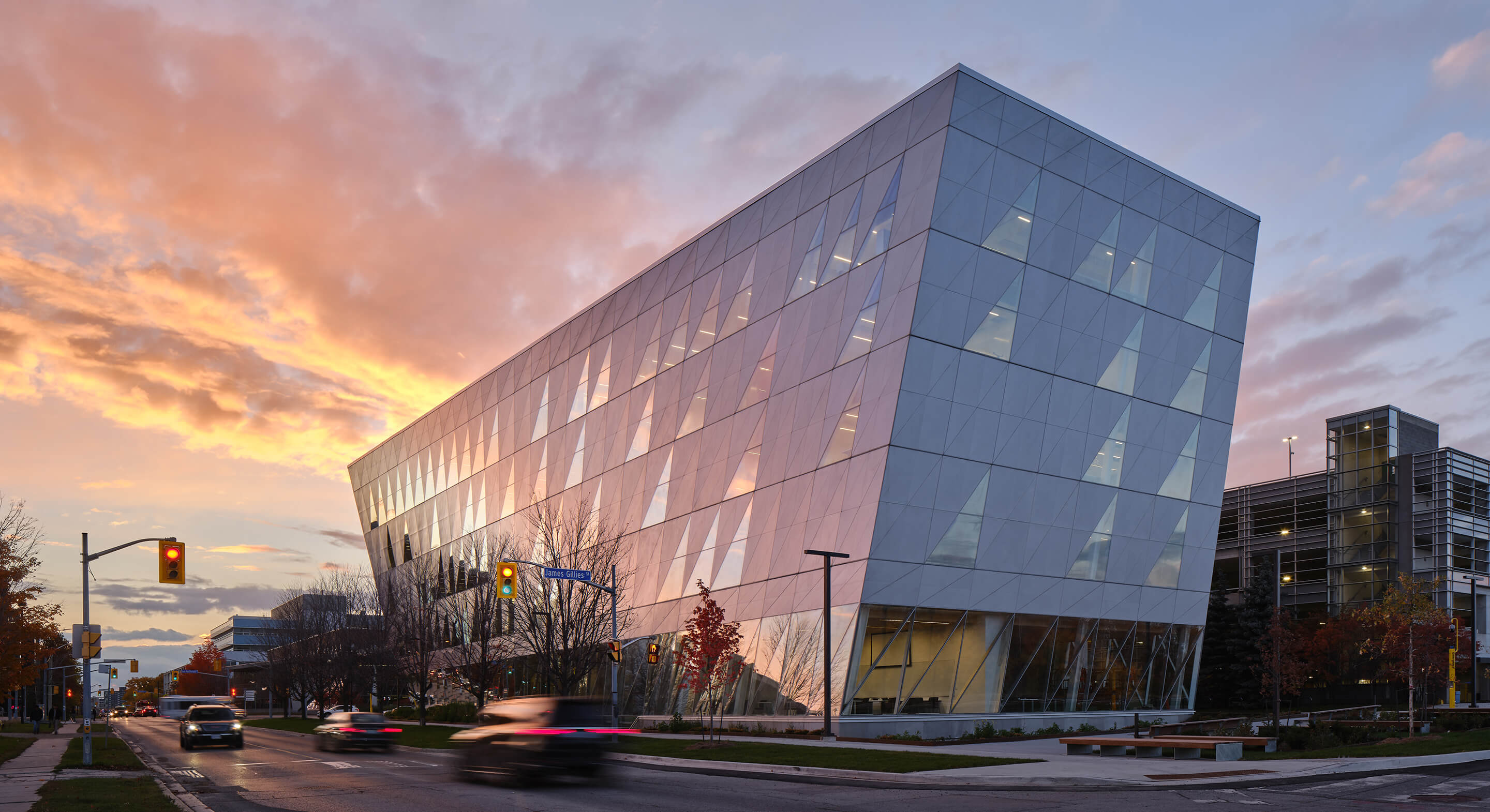
York University’s existing School of Continuing Studies was scattered throughout campus in a series of temporary accommodations. Despite being one of the largest schools of its kind in Canada, the faculty was without a home—a critical shortcoming for the faculty’s students, many of whom commute to the campus on evenings and weekends. In response, the University launched an international design competition, expressing the need for a dedicated structure to reflect the school’s identity and culture, define a campus gateway, and meet ambitious sustainability targets.
A landmark building with flexible social and learning environments for York University’s School of Continuing Studies.
User Experience
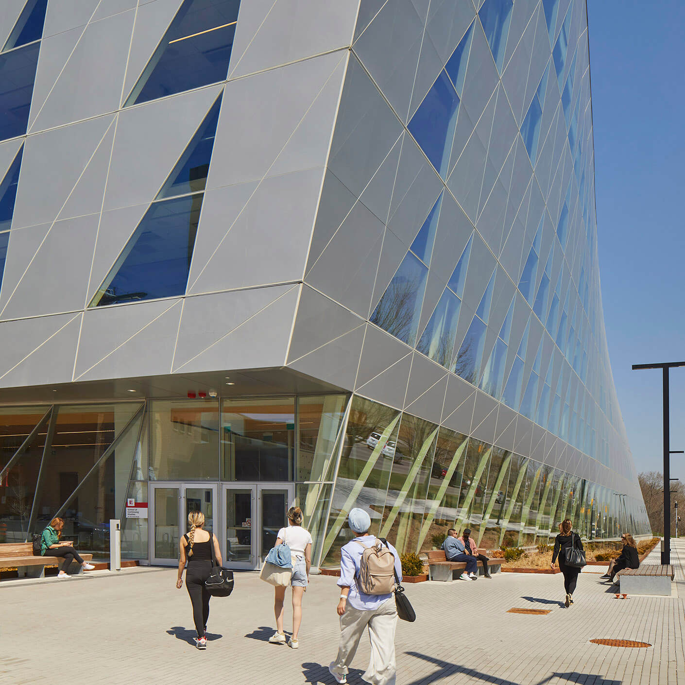
The School of Continuing Studies programs, previously dispersed across campus, are now together in a stand-alone adaptable building on a gateway site at York University’s Keele Campus.
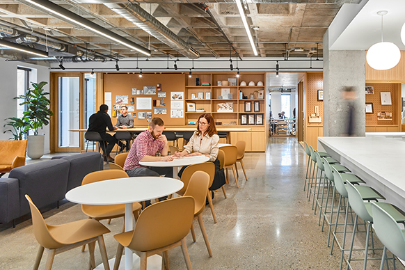
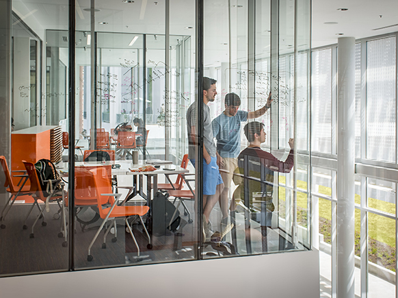
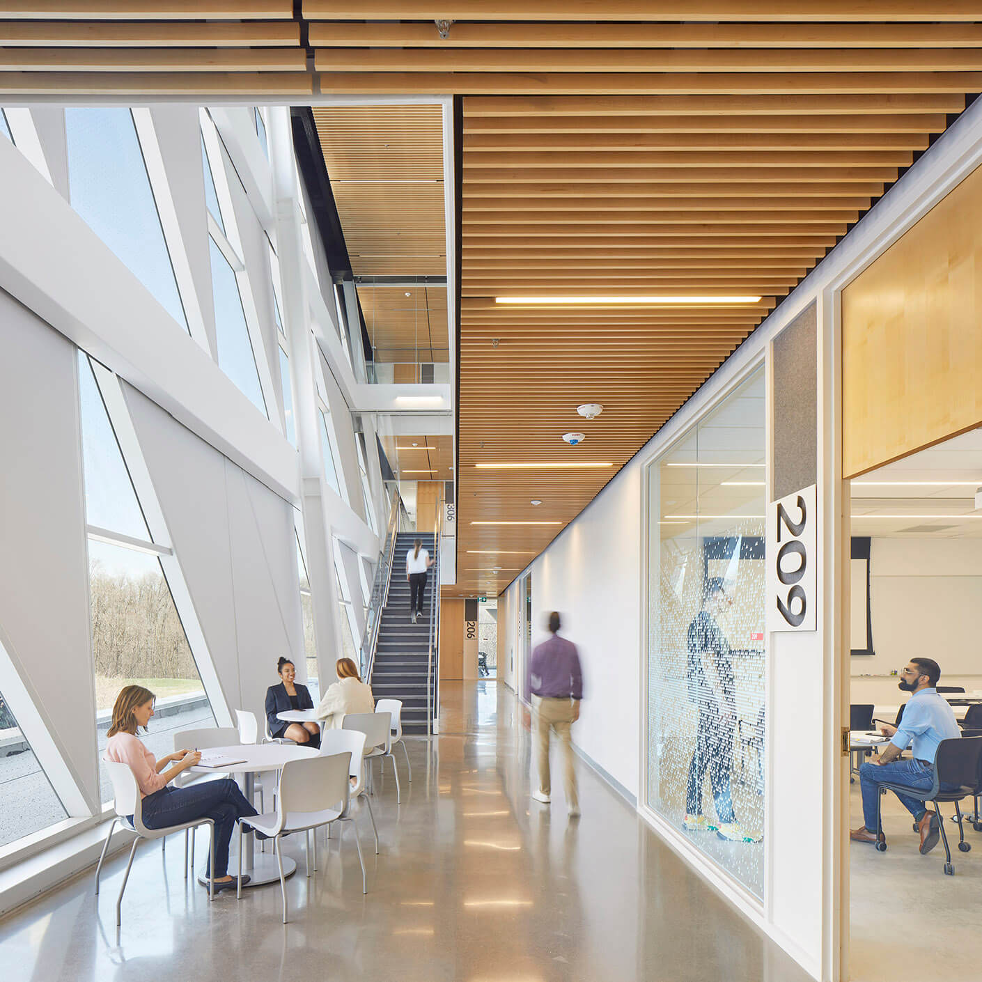
Students and faculty occupy bright modular learning environements and offices, rich interior and exterior gathering spaces to nurture collaboration and socialization, and amentities to support professional upskilling and reskilling in Canada for a diverse community of learners.
Shaping a Campus Gateway
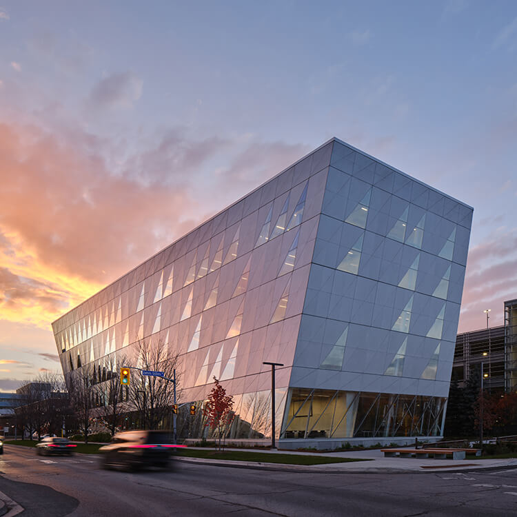
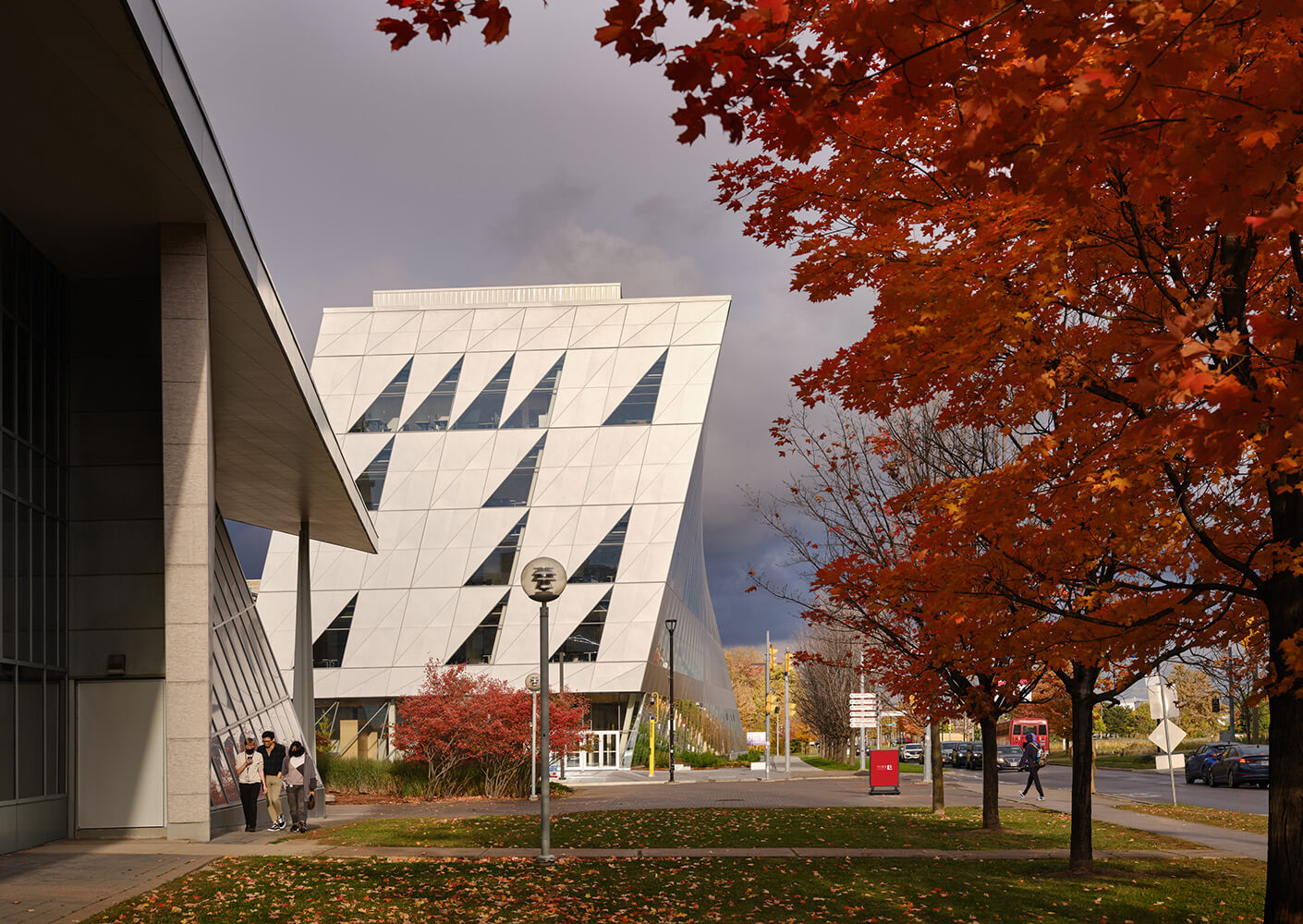
The building twists as it rises up and out of a master plan designated gateway site, creating a landmark gesture at the campus’ South East entrance and a new public plaza. The dramatic form is a calculated response to the campus public realm, informed by surrounding amenities including a TTC subway station, patterns of student movement, and the optimization of solar orientation. The building’s high-performance skin combines reflective brushed aluminum panels and glazed openings into a triangular diagrid that curves in response to the building’s twisting form.
—Rhonda Lenton, York University President and Vice Chancellor
Student Impact
The new School of Continuing Studies nurtures a sense of community with a visible identity at York. Students come to campus to learn and collaborate in bright, comfortable environments that support their well-being with wellness amenities like a lactation room and prayer space.
Living Design
At the core of the project are the goals of reducing embodied carbon and improving occupant health through intelligent use of resources. The low energy design anticipates a campus-wide switch to renewable energy generations, and targets LEED Gold certification. Strategies include a building envelope that is designed with a focus on airtightness and prefabrication, direct outdoor air ventilation, and active chilled beams throughout. The focus on high-efficiency design strategies combined with highly efficient HVAC and energy systems reduce energy loads greatly, minimizing the extent of the renewable energy production needed to aid the project achieving the Net-Zero Energy target.
Wellness amenities are centralized on the lower level – a signal to students that their well-being is paramount to the learning experience. Amenities include a private multi-purpose quiet room for prayer, meditation, or yoga, a lactation room with comfortable furniture and a fridge for storing milk, as well as a dining lounge for socializing where students can bring their own food to warm up.
Vibrant Public Realm
The rotation of the ground floor creates space for a generous arrival plaza at the main entry as well as a sheltered drop off and pick up area. Hardscapes and outdoor furniture encourage use of exterior spaces as part of the building’s experience. Ground floor spaces are open and dedicated to student engagement and events animating the streets and pedestrian realm.
Considered Landscape Integration
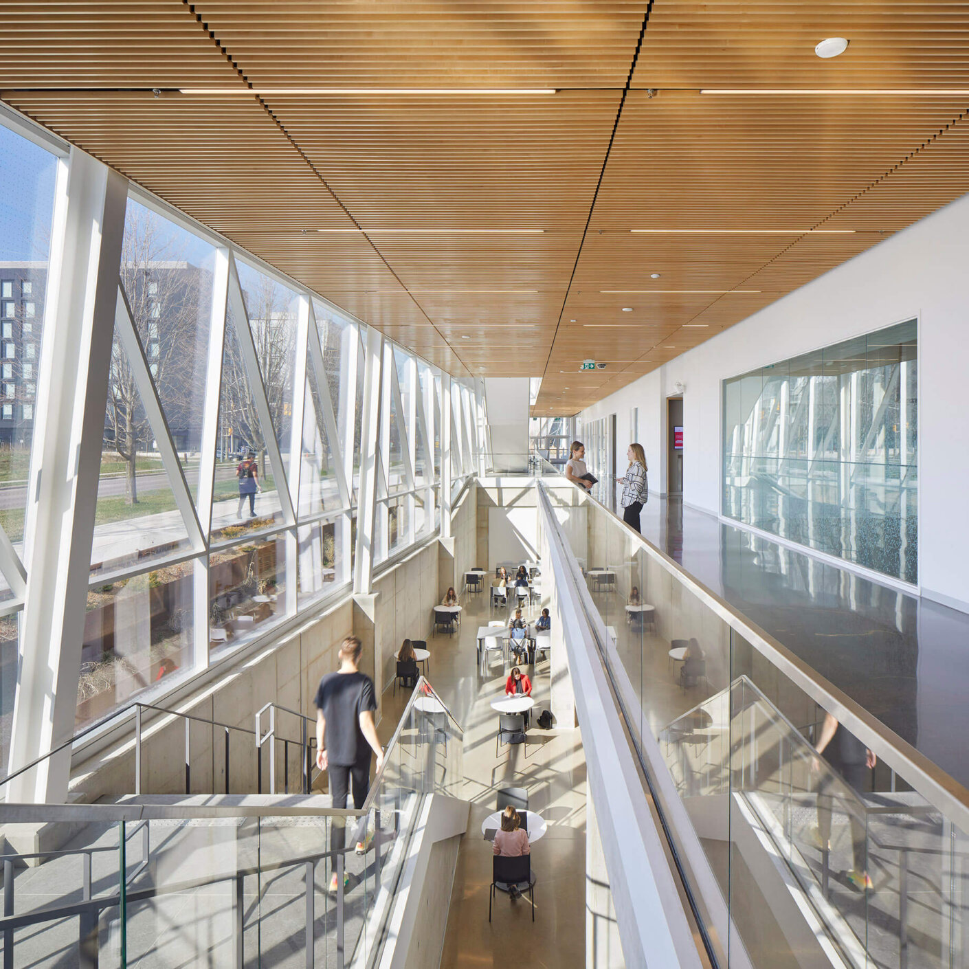
A set of terraced gardens at the building perimeter align with large expanses of glazing that bring nature and natural light deep into the lower level classrooms allowing them to be an integral and pleasant part of the building experience.
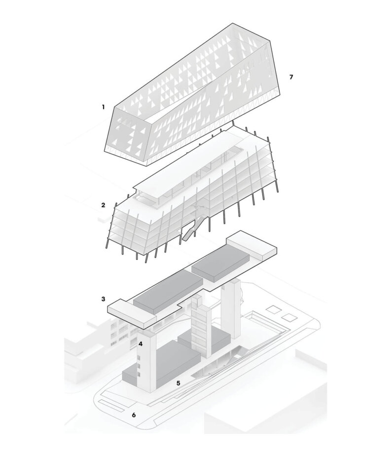
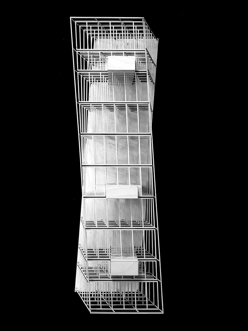
The building is a rational and highly adaptable container, albeit with a twist. The interior architecture is reduced to three key elements with clearly defined roles: programmatic containers, the building skin, and the structural frame.
1. Building Skin ― A high-performance unitized curtain wall creates a continuous, taut, and efficient building skin that maximizes views while reducing energy use to approximately 100kWh/m2a. Triangular openings allow seamless panelization and expansive eye-level transparency.
2. Steel Frame ― The building twists to create two new plazas on a tight campus site. Perimeter columns change angle along the length of the building, while inboard columns are plumb, reducing steel weight.
3. Interior Planning ― Program blocks are treated as interior pavilions, while student study and lounge space occupy the perimeter of the plan. These dynamic spaces offer a range of bright and distinctive environments for study and socialization.
4. Cores ― Low-carbon concrete cores efficiently brace the building’s twisted form.
5. Campus Room ― At grade and below, the building is an extension of the campus, with openings that bring daylight to all levels.
6. Gateway Plaza ― The building’s twisting form creates a new gateway plaza that connects to the campus’s evolving transit network.
7. Systems ― Direct outdoor air ventilation and active chilled beams throughout the building reduce energy use while maximizing fresh air, supporting occupant health and learning outcomes. A future PV array will support 100% of the building’s energy needs.
