Good or bad, you remember where you went to school for the rest of your life. If I, as a designer, can create a positive and even an inspirational memory of the built space, then I am doing something right.
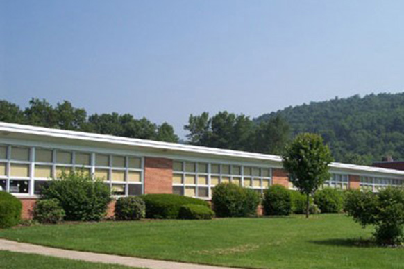
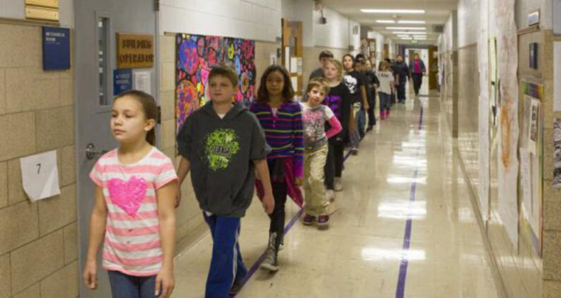
From my own elementary school days, I remember walking down the tan concrete-block corridor from kindergarten all the way through fifth grade. I would run my hand along the cold wall and feel the texture of the paint on the double-loaded corridor, with black-and-white checkered linoleum floor tile below. The corridor was filled with light from skylights, but the classrooms were isolated from the corridor. One small window at adult height provided the only glimpse into the classrooms. There was no real visual connection to the teaching that was going on inside, and there was no cross-pollination of knowledge between classes and between students of different ages.
Was my elementary school “well designed”? Maybe for the time. In the 1950s, when it was constructed, the approach for education in public schools was very siloed: students faced the teacher and the teacher talked to them. The spaces were designed to keep everyone apart.
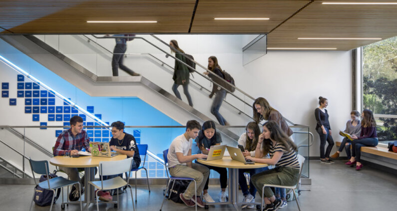
Now, schools are taking cues from workplaces like Facebook and Google and providing spaces for collaborative learning and studying. We want to connect the students visually—while still keeping them focused. This can mean introducing glass between the classroom and corridors and adapting spaces to have different-sized breakout areas.
Recent studies indicate that we need to push the boundaries of design to meet current educational needs. Three concepts form the basis for any contemporary school design: naturalness, individualization, and stimulation.
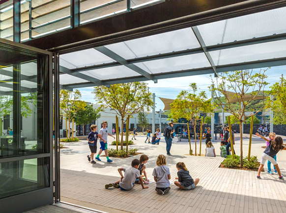
Designing for naturalness means paying attention to natural light and air, bringing daylight into the corridors as well as the rooms as much as possible while avoiding glare and maintaining comfortable temperatures. Individualizing means giving students a sense of ownership. A connection of home in the space as simple as a wood bench enhances the student’s ability to individualize. The materiality of a space with an ordered flow are strong design characteristics that should be included in these spaces. Flexibility is also important—classrooms should be connected to breakout spaces, and desks and other furniture should be easy to reconfigure so teachers and students can use them in different ways. The built environment can provide stimulation through complexity, balanced with a degree of order: this need for balance occurs at all scales for example at the Willows Community School we were worked with them at both the Masterplan and classroom scales. We were able to take their campus of 5 building and asphalt parking lot and create a beautiful space beaming with trees, play with a mix of quiet reflective spaces. The school now have outlets to express the vibrant energy that has always existed within their community. We were able to create a degree of order to their once maze of a campus. Along with their overall campus we were also able to enhance their classroom buildings. We changed their once dingy spaces into bright airy classrooms. Research suggests that bright, white backgrounds with accent colors help students focus.
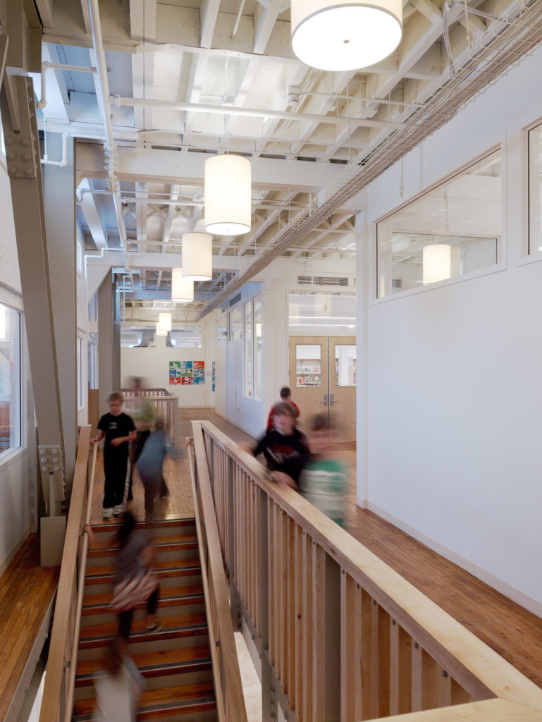
At San Francisco Friends School, we started with the principles of naturalness, individualization, and stimulation when converting an old Levi Strauss Factory to a K-8 school. The factory had a great open floor plan, and that openness of space was important to maintain as we developed the building.
We introduced transom glazing to allow natural light to stream from the large perimeter double-hung windows through the classrooms on through to the interior of the building. Radiant floor heating provides for a temperate climate while minimizing the visual distractions of ductwork and airborne dust. We created a commons, breakout areas, and study niches. The design supports the school’s Quaker values and pedagogy while highlighting the building’s historic qualities.
Even the nature of the collaborative spaces will depend on the school’s culture and the ways students interact. For Urban High School, when we visited the existing campus in San Francisco, we found that students would use various nooks and crannies to gather or to study by themselves. So the new academic center we designed featured study niches outside the classroom, as well as a day-lit commons that overlooks the gymnasium/event center.
In his book Business as Usual: The People and Principles at Herman Miller, Herman Miller CEO Hugh Dupree remembers a discussion with Charles Eames about the design of Herman Miller’s New York showroom. When someone said the words “good design,” Eames responded, “Don’t give us that good design crap. You never hear us talk about that. The real questions are: Does it solve a problem? Is it serviceable? How is it going to look in ten years?” Each school we design has to solve the problems of the school and of the times. If it does that well, then hopefully it will create good memories the students will carry with them for the rest of their lives.
