WarnerMedia
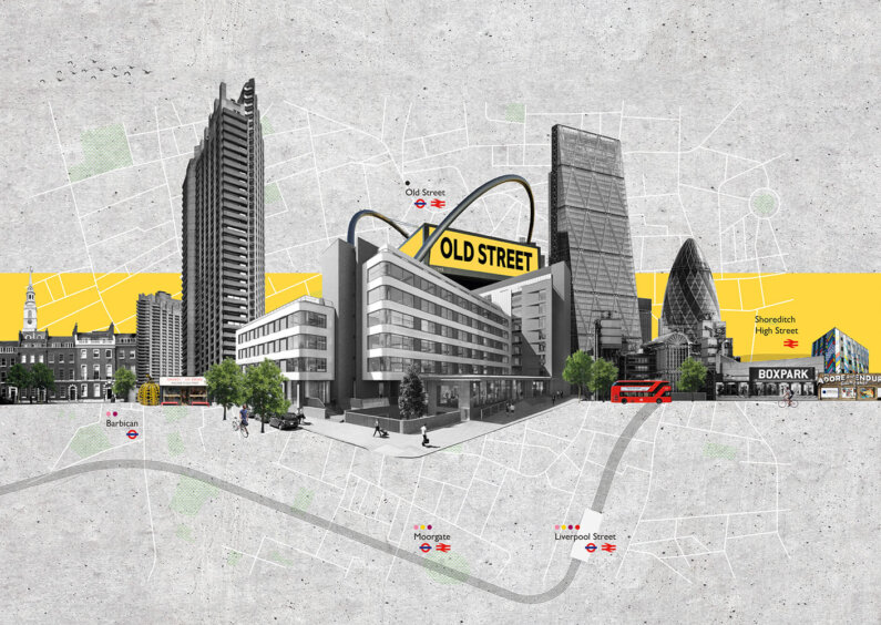
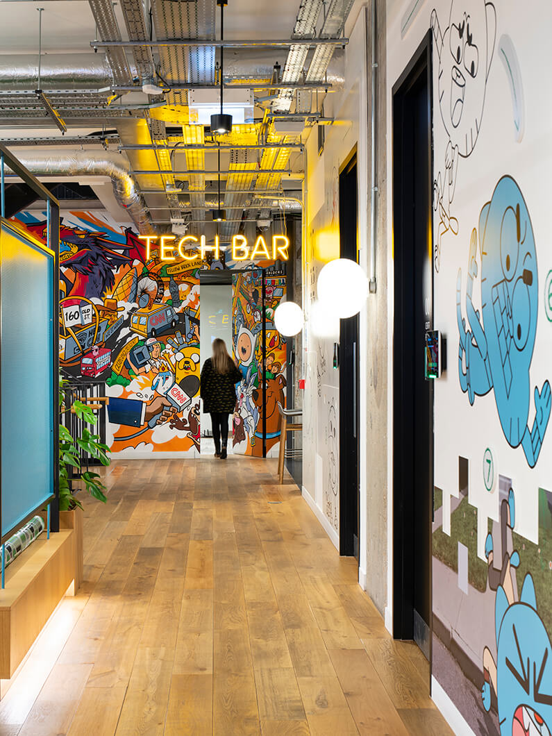
Surprising moments, being bold and fearless, a state-of-the-art digital landscape, and letting the light in were the foundations of the design for WarnerMedia’s relocation from Soho to the ‘Creative’s Playground’ of Old Street. WarnerMedia and its brands are storytellers, and it needed a building that befitted this rich history and helped it express its narrative to its audiences and people. The design of WarnerMedia’s new home at 160 Old Street needed to push the boundaries, defy norms, and promote its products and culture. WarnerMedia wanted to embrace new ways of engaging and creating, whilst being true to its exceptional brands, CNN, HBO, Cartoon Network, and Boomerang amongst others.
WarnerMedia strives to be an innovative and industry leading organisation. Relocating to 160 Old Street provided a more suitable, and future proof home to embrace the future of broadcast media and digital content.
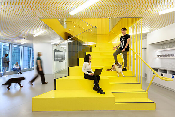
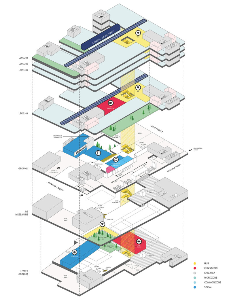
WarnerMedia’s previous premises were fragmented and divided, so its new home needed to be open, transparent, and connected. The design for 160 Old Street aimed to create a community within the building, allowing and encouraging staff to mix across floors, teams, and brands. This is achieved through the introduction of a central connecting staircase, increased shared offices and team rooms, and relocating executive offices throughout the building. Our client wanted to introduce a best-in-class digital landscape, fit for a 21st century media company. Simple, yet sophisticated, a new, broad digital interface includes broadcast facilities, editing suites and sound rooms through to the viewing and pitch room, meeting rooms and on floor ‘hives’ (central hubs).
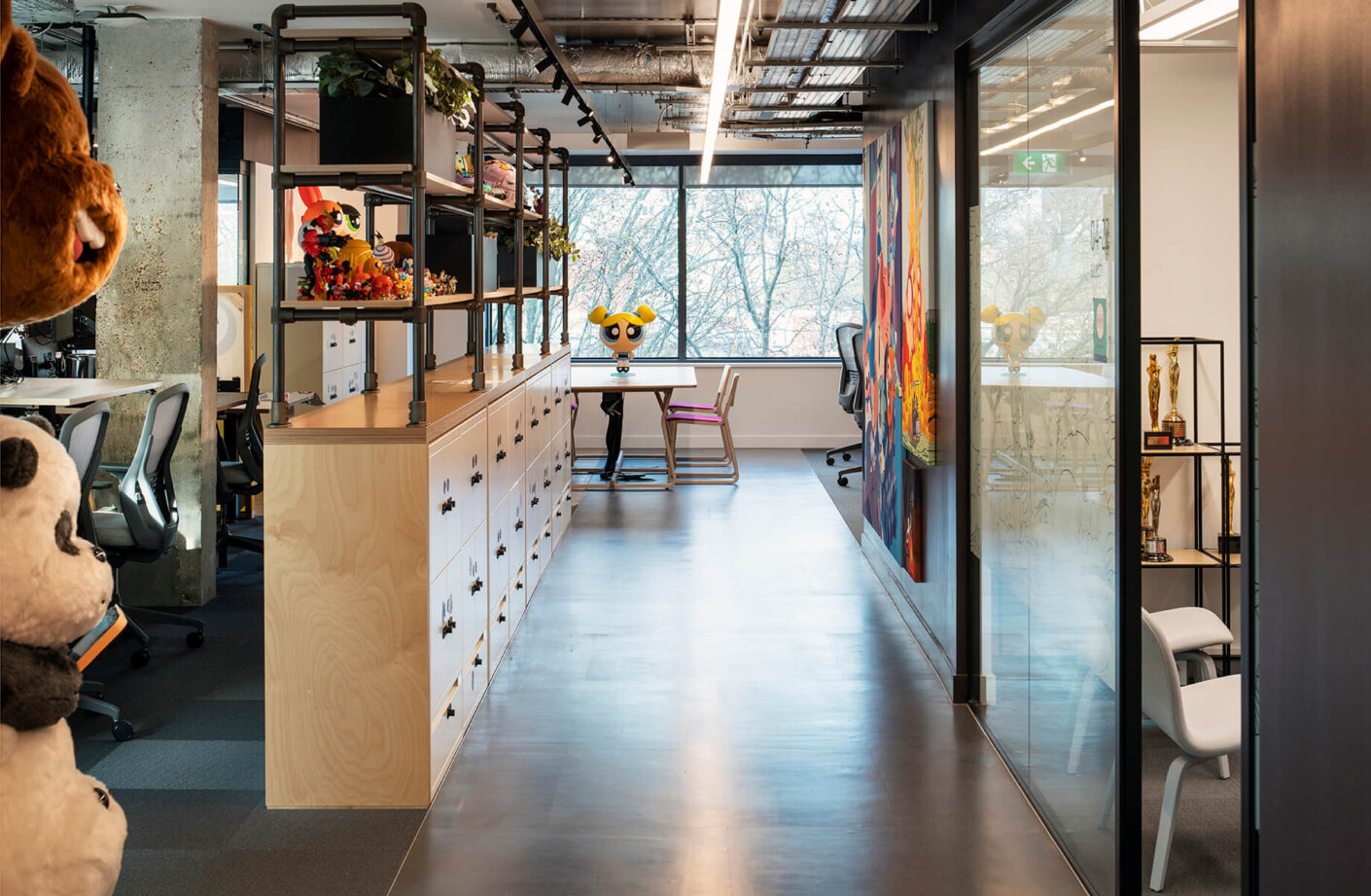
WarnerMedia’s aspiration was to create a more spacious workplace, that has opportunities for product showcasing and storytelling, and encourages staff to interact and collaborate. Embracing new ways of working and adopting activity-based working ensured an efficient use of space and afforded the future flexibility WarnerMedia needs.
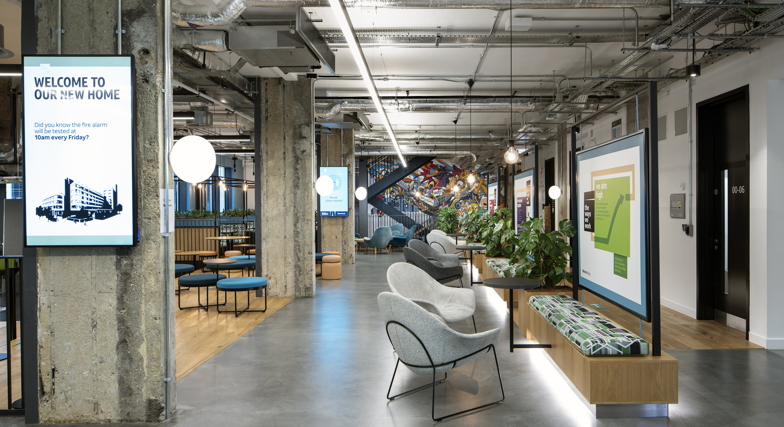
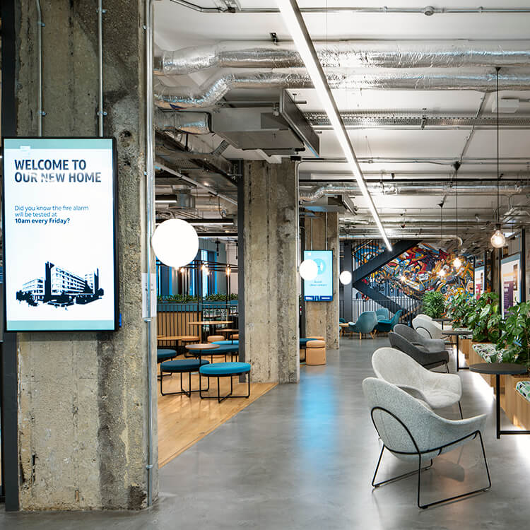
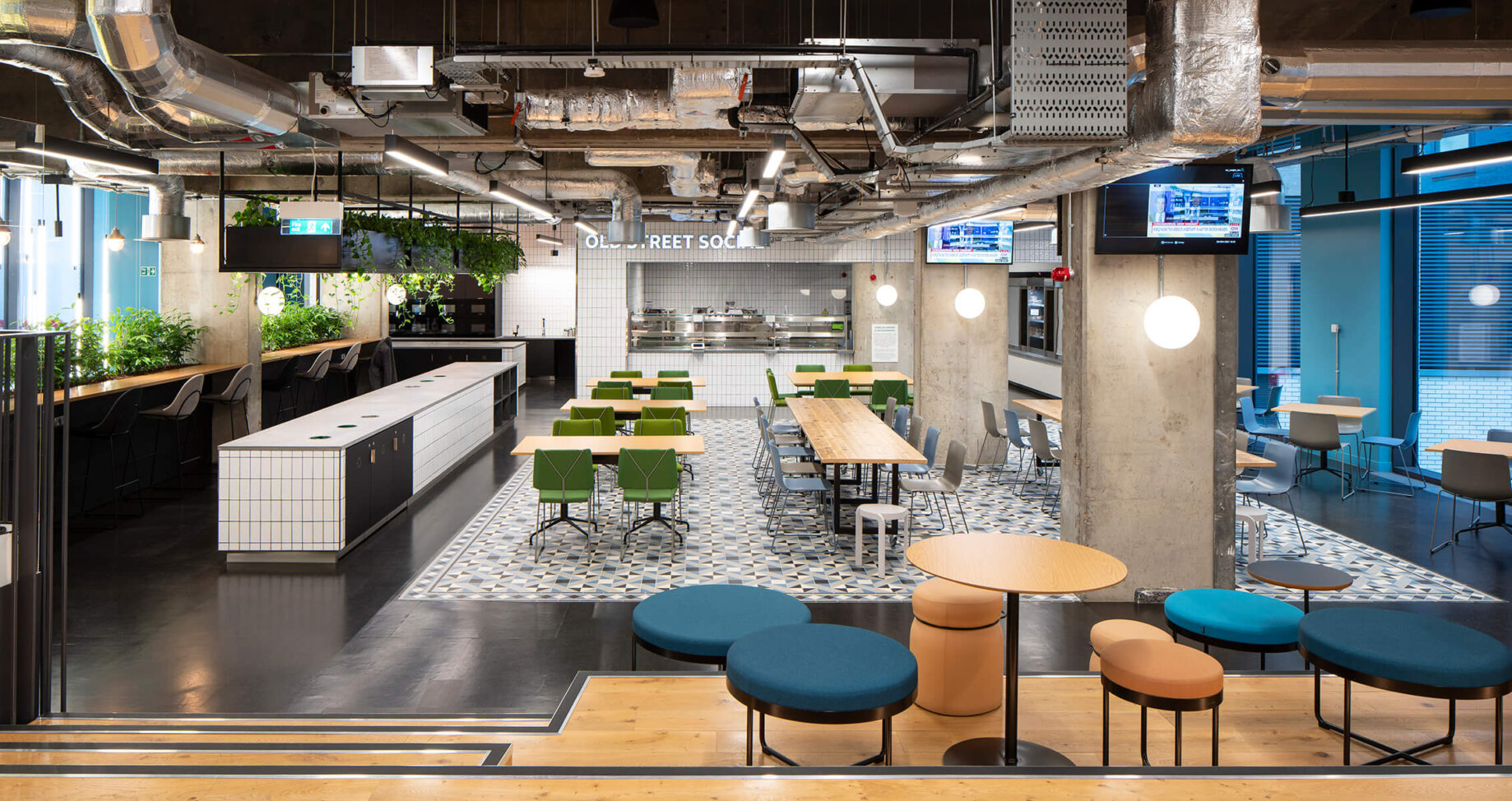
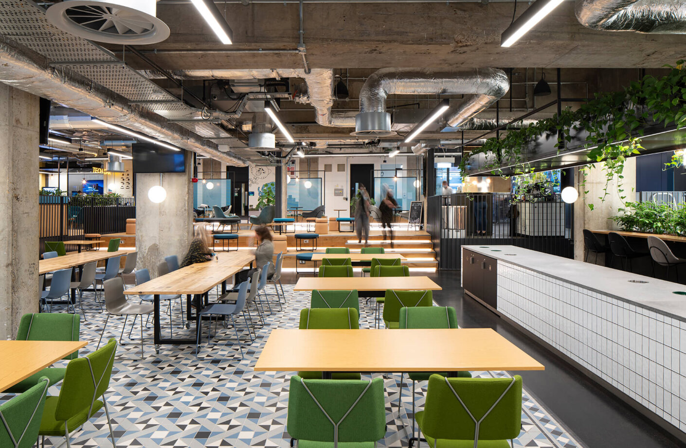
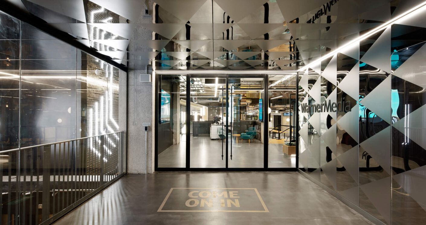
Bringing people together and enhancing collaborative experiences was crucial to WarnerMedia in its new space. The entire Ground and Lower Ground floors are social spaces that utilise the architecture and raw materiality to create the canvas for changeable brand and storytelling opportunities.
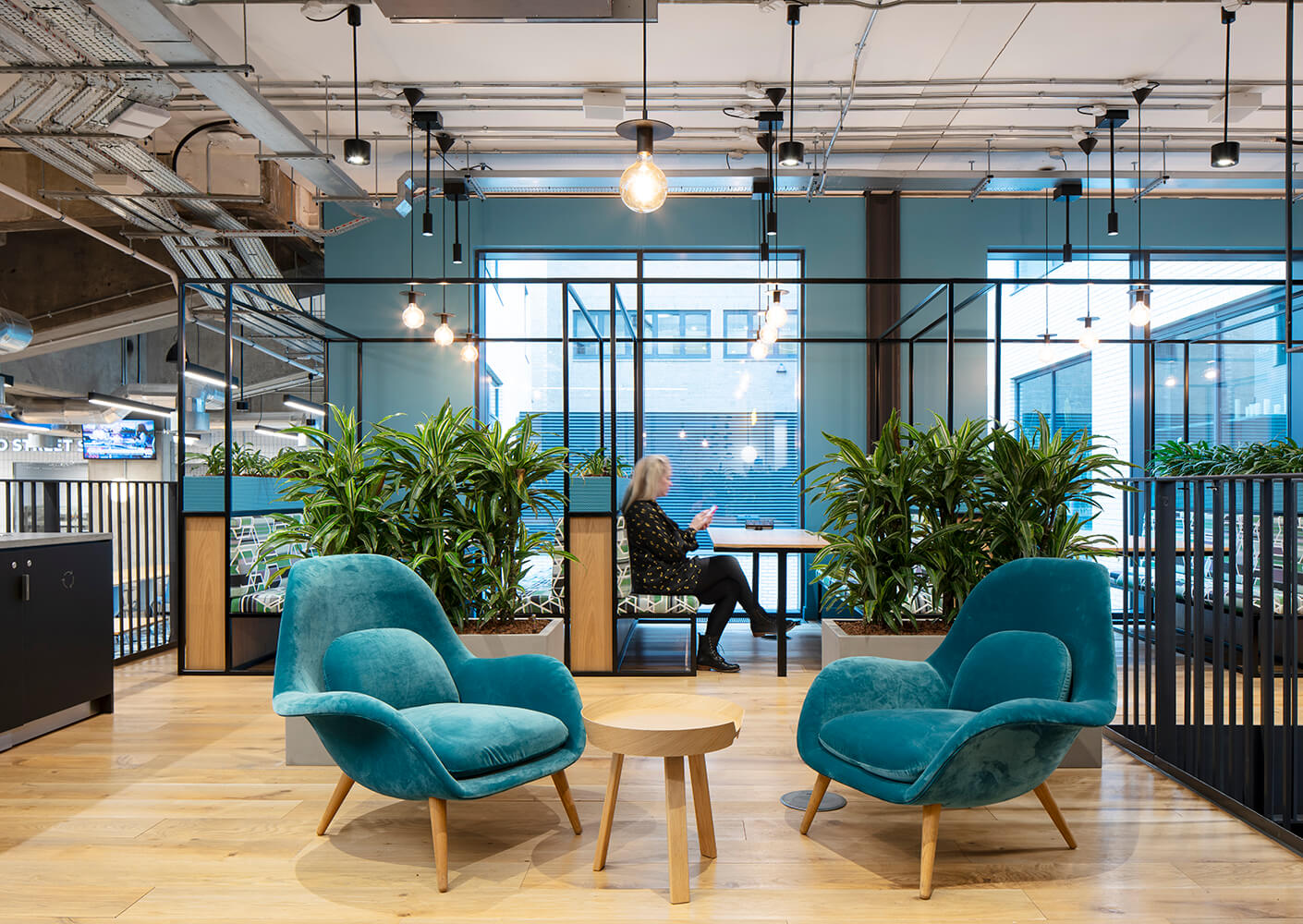
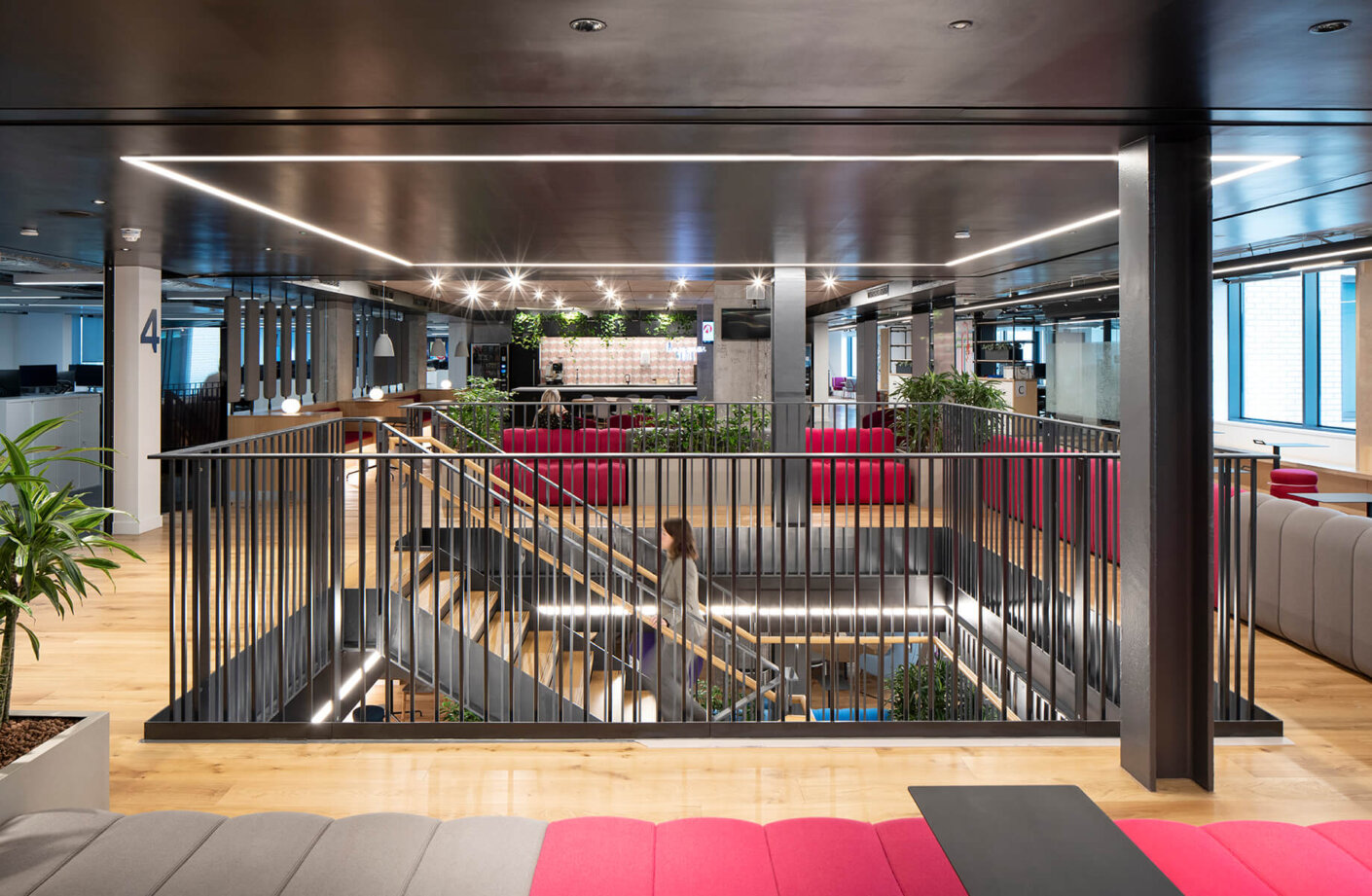
Achieving BREEAM Excellent, continuing the language of the building refurbishment, and ensuring a low carbon design was also paramount. Design interventions, with a careful selection of materials, were made to ensure minimal or low impact to the environment, whilst maintaining the ‘honesty’ of the building.
A healthy, sustainable, and safe environment was a key consideration for WarnerMedia, with key drivers achieved, including: BREEAM Excellent for the fit-out; the introduction of active design; biophilia; designing with light and colour; and the use of healthy materials.
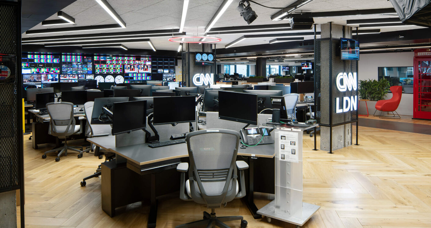
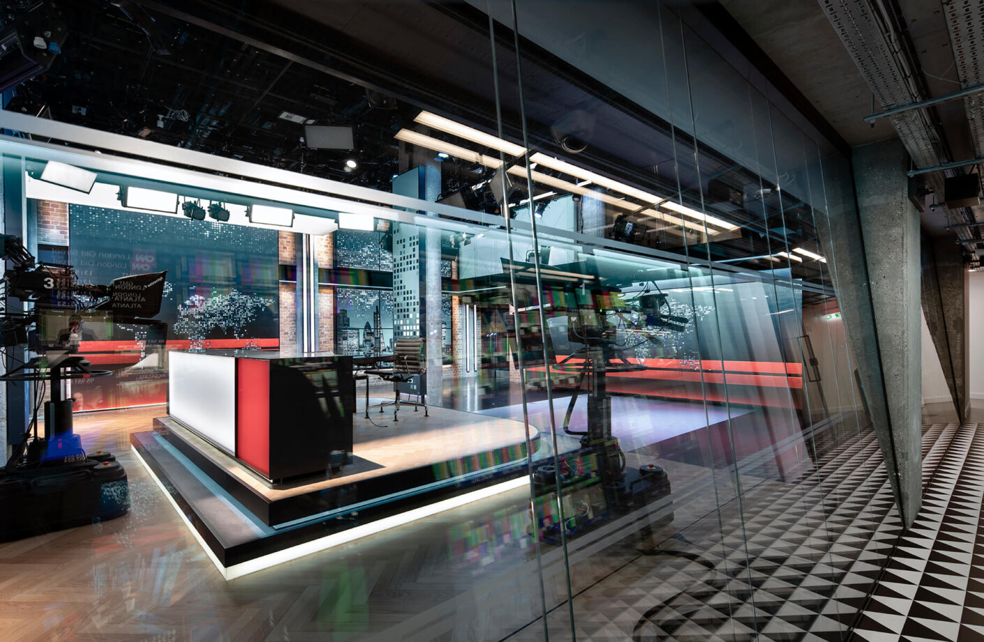
One of the biggest challenges that the team faced was the design, dual running, and replication of a live broadcast studio and news desk for CNN. The brief for these spaces was elaborate and needed to be fully designed and commissioned prior to occupation, with no margin for error. Agreeing the right location for the studio was challenging, particularly in a multi-level refurbished building.
The CNN studio and news desk are centralised making the newsroom a more dynamic and collaborative working environment. The studio is double height, built within the void space of two floors, with a viewing gallery at high level for customer tours. Warm materiality and dynamic lighting further provide the backdrop for stories to take centre stage and adjust accordingly when news is breaking.
