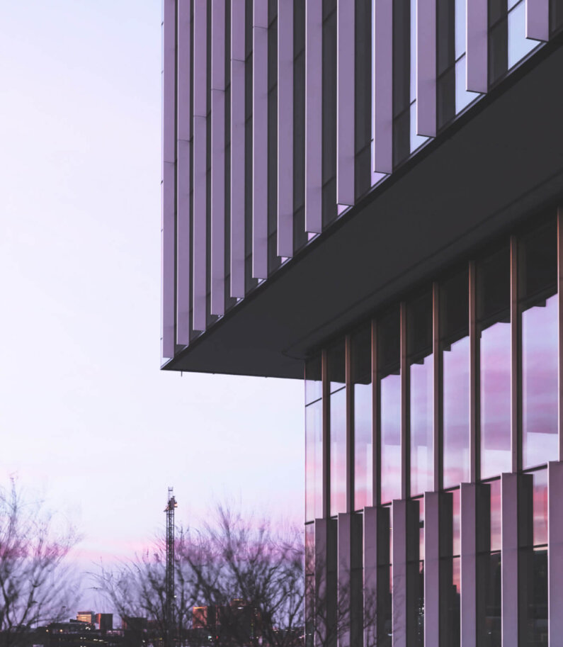
Ron Stelmarski: Connecting People and Places
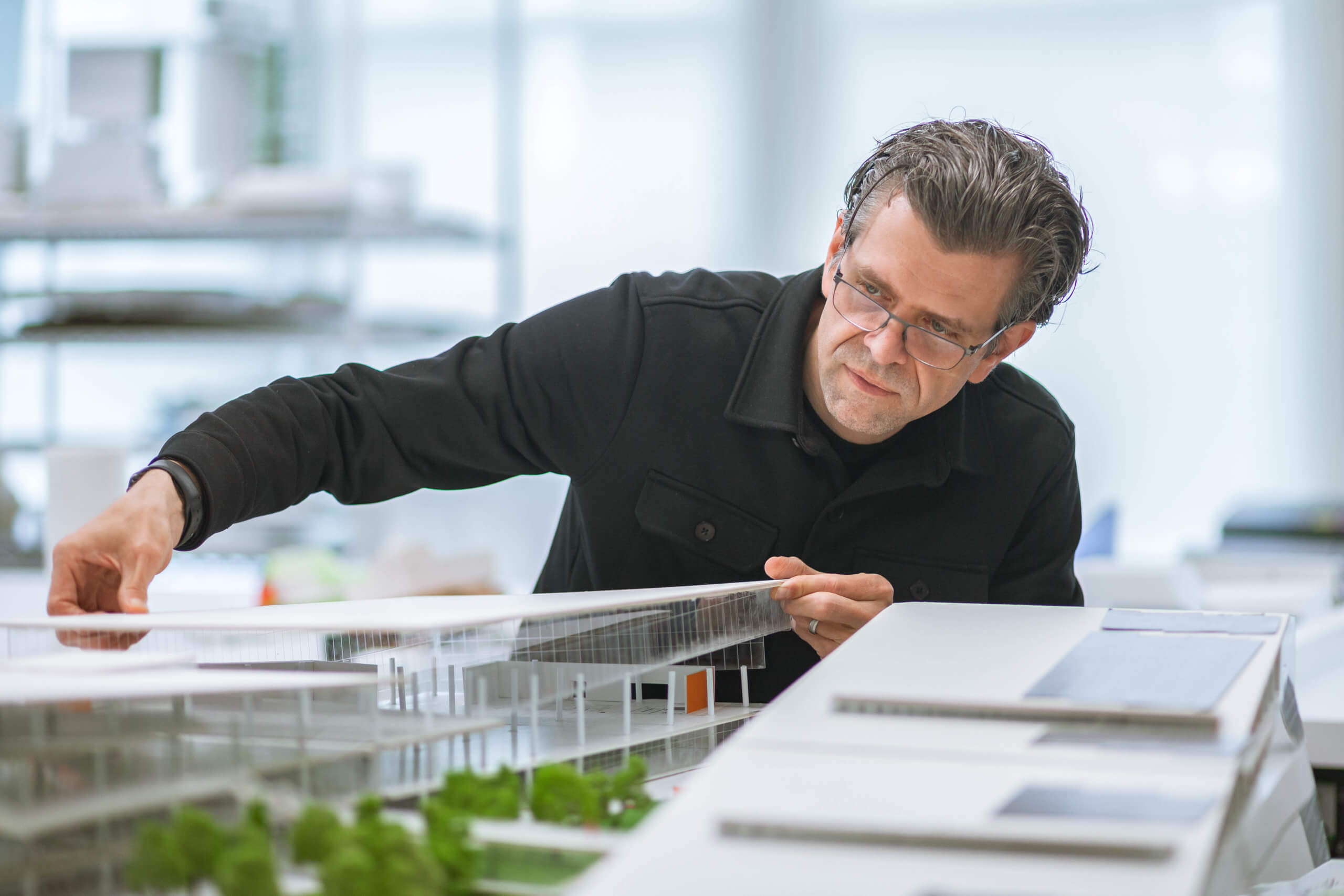
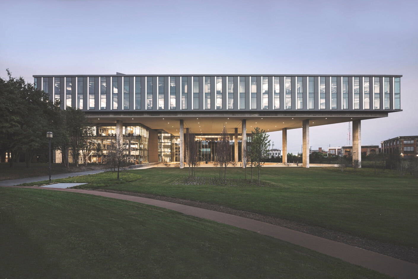
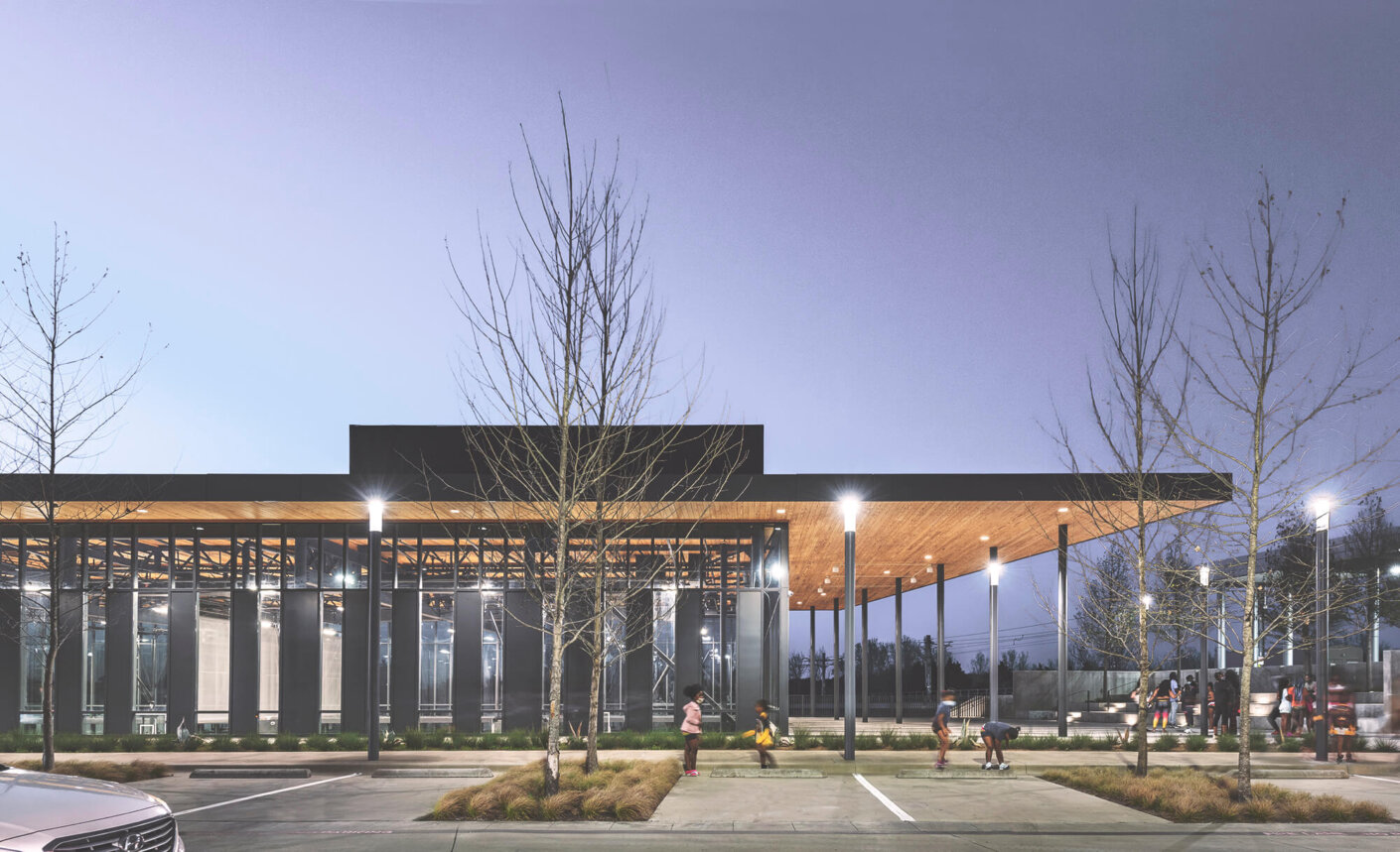
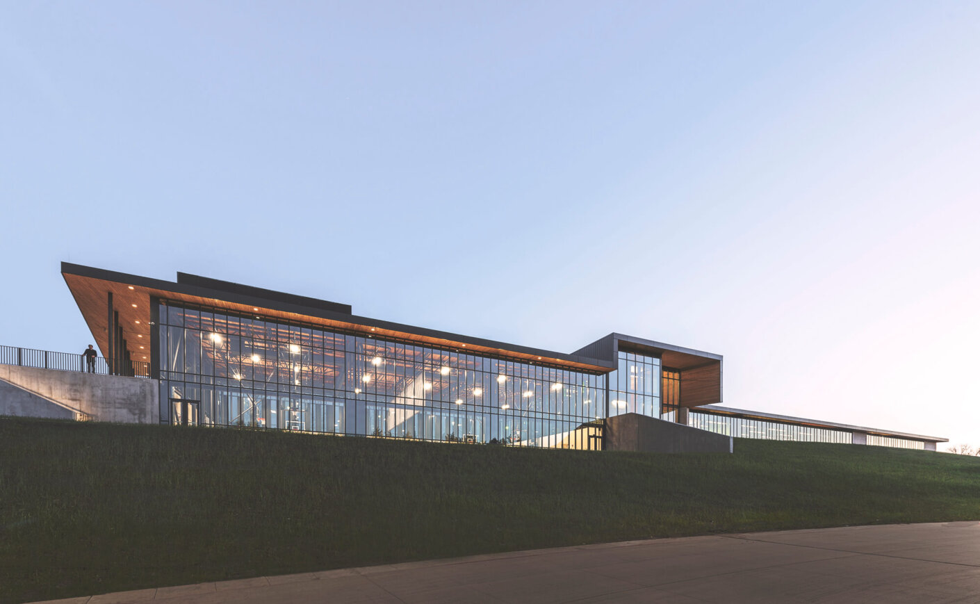
Design director Ron Stelmarski sees architecture as a connective tissue, one that binds cities and people together. His buildings adapt to their sites in unique ways, heightening the relationship between landscape and architecture. The result is a body of work that is as engaging on the drawing board as it is on the street.
Stelmarski’s projects grow out of his love of theory, history, and film. For him, the built environment is cinematic: a carefully composed story that, like frames of a motion picture, unfold as a viewer moves through it. “The trajectory of a film is not rigid, but elastic,” Stelmarski observes, “Both film and architecture have a spatial and a temporal component that bring them to life.”
The architect started his career working in a specialized area of interior design known as “branded environments,” which uses symbols to tell the story of place, vision, and brand. “There is strength in a film’s ability to use motif and imagery to simply convey complex ideas. Capturing the collective essence of a client or a product and translating it into the physical realm is not so different.” Stelmarski says. This approach has allowed him to craft a portfolio of corporate, commercial, and civic-minded projects that succeed through storytelling and uplifting the communities they serve.
Stelmarski’s affinity for architectural narrative is evident even in his early projects. The University of Cincinnati Lindner Athletic Center, a collaboration with architect and theoretician Bernard Tschumi, employs boldly deconstructed geometries and signature red accents. But all these details cumulate in a unique, linear plan whose walls tell the stories of the university’s brightest athletic and academic stars. “An architect takes a person through space, letting the story of a project unfold simultaneously with the viewer’s own journey,” Stelmarski says. “Just as a film director captures actors on a set.”
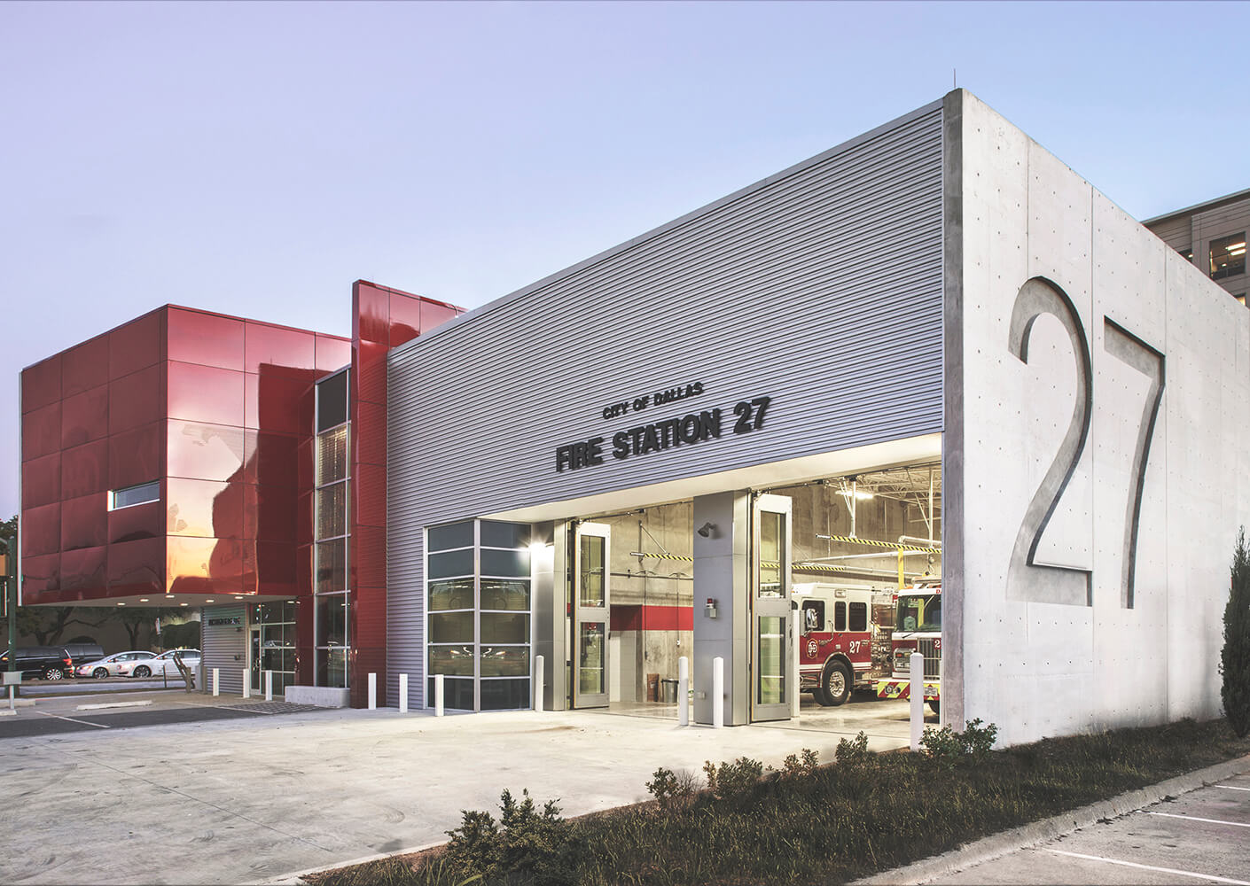
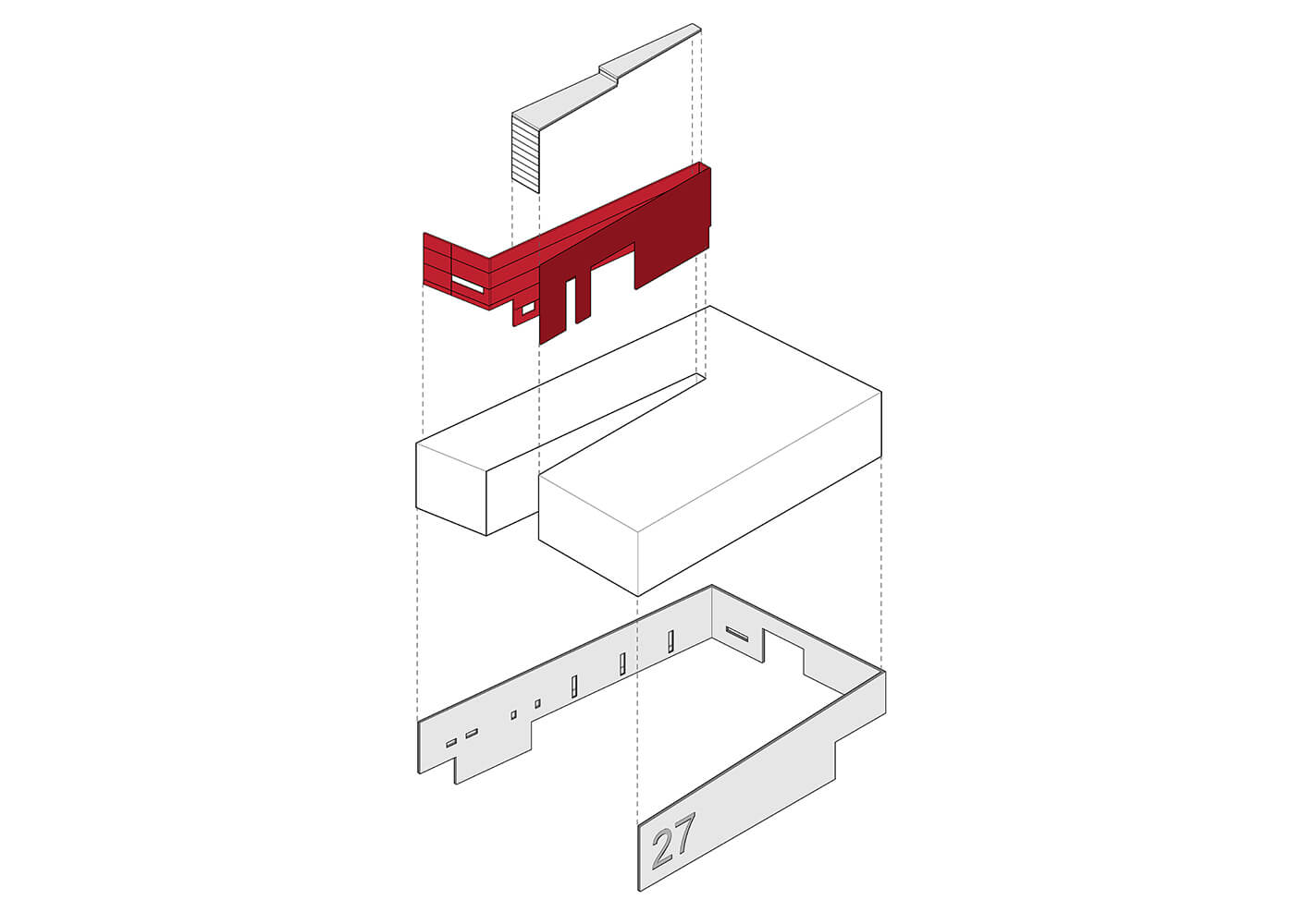
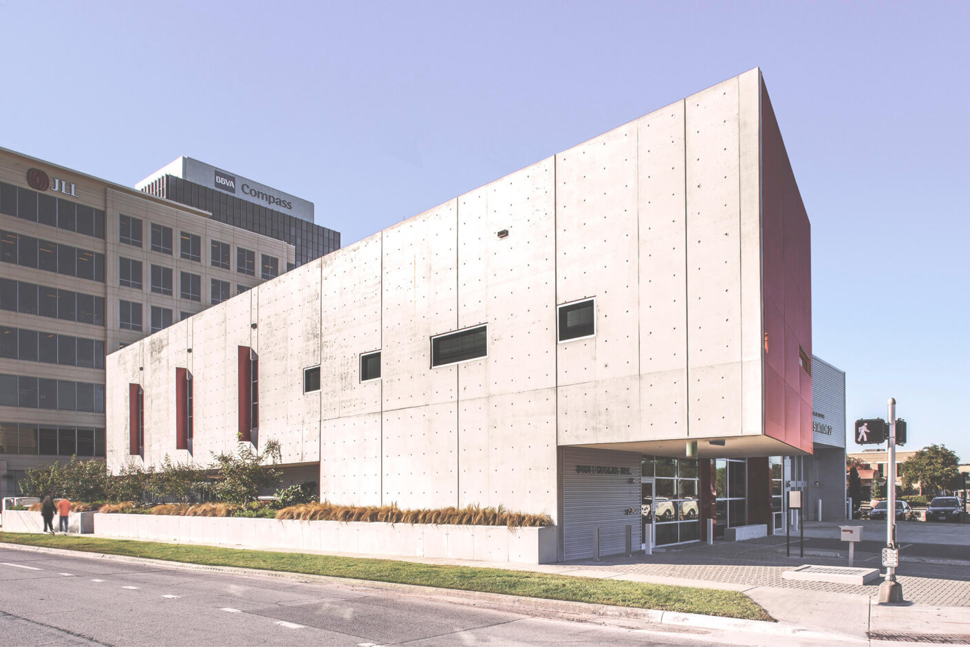
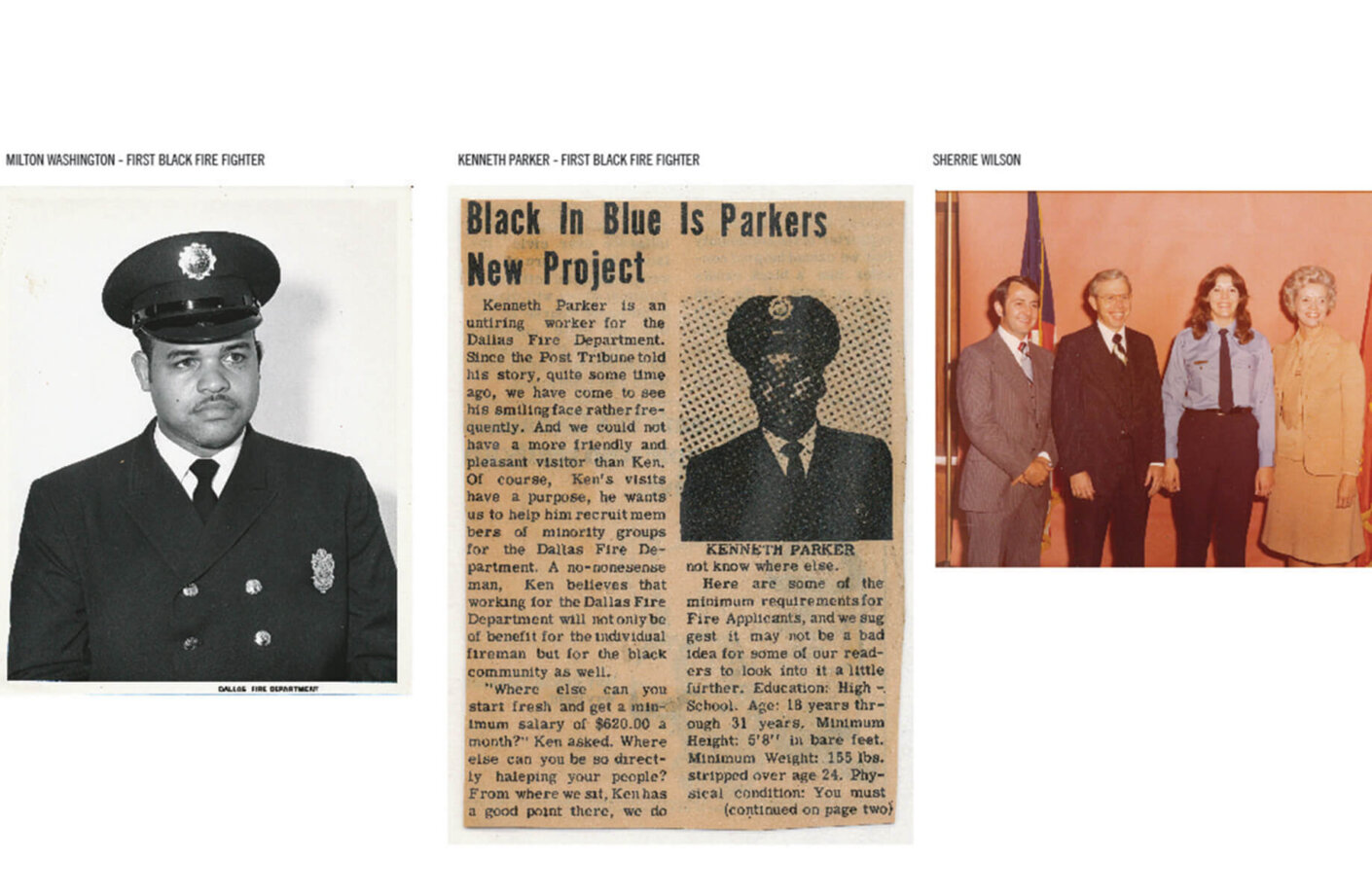
When the Dallas Fire Department announced the need for an imaginative new Fire Station 27, Stelmarski and his team brought their passion for storytelling to the civic project. The 3-story design helps to tell DFD’s renowned history: No. 27 was one of the nation’s first integrated departments, and home to one of the city’s first Black firefighters, Milton Washington, hired in 1969. The new fire station, which opened its doors in 2015, is made of concrete, but lush landscaping and climbing plants keep it verdant and alive. The façade communicates strength, yet firefighters live comfortably inside with their families and enjoy the bright red atrium whose murals tell the stories of trailblazing brigades like Milton’s through a museum-like lens.
Oklahoma University (OU) Medical Center in Oklahoma City is a project that also connects people to their city’s history. The project coalesced around Stelmarski’s design interpretation of the region’s “Glass Mountains,” natural rocky outcrops rising 200 feet above the plains that have an unusual crystalline sparkle. “New modes of thought about what design can be, or how it can deliver, encourage people to act differently and relate to one another in new ways,” he says. The reference grounds the project in its site-specific context, and the connection between building and site, story and metaphor, sparks conversation.
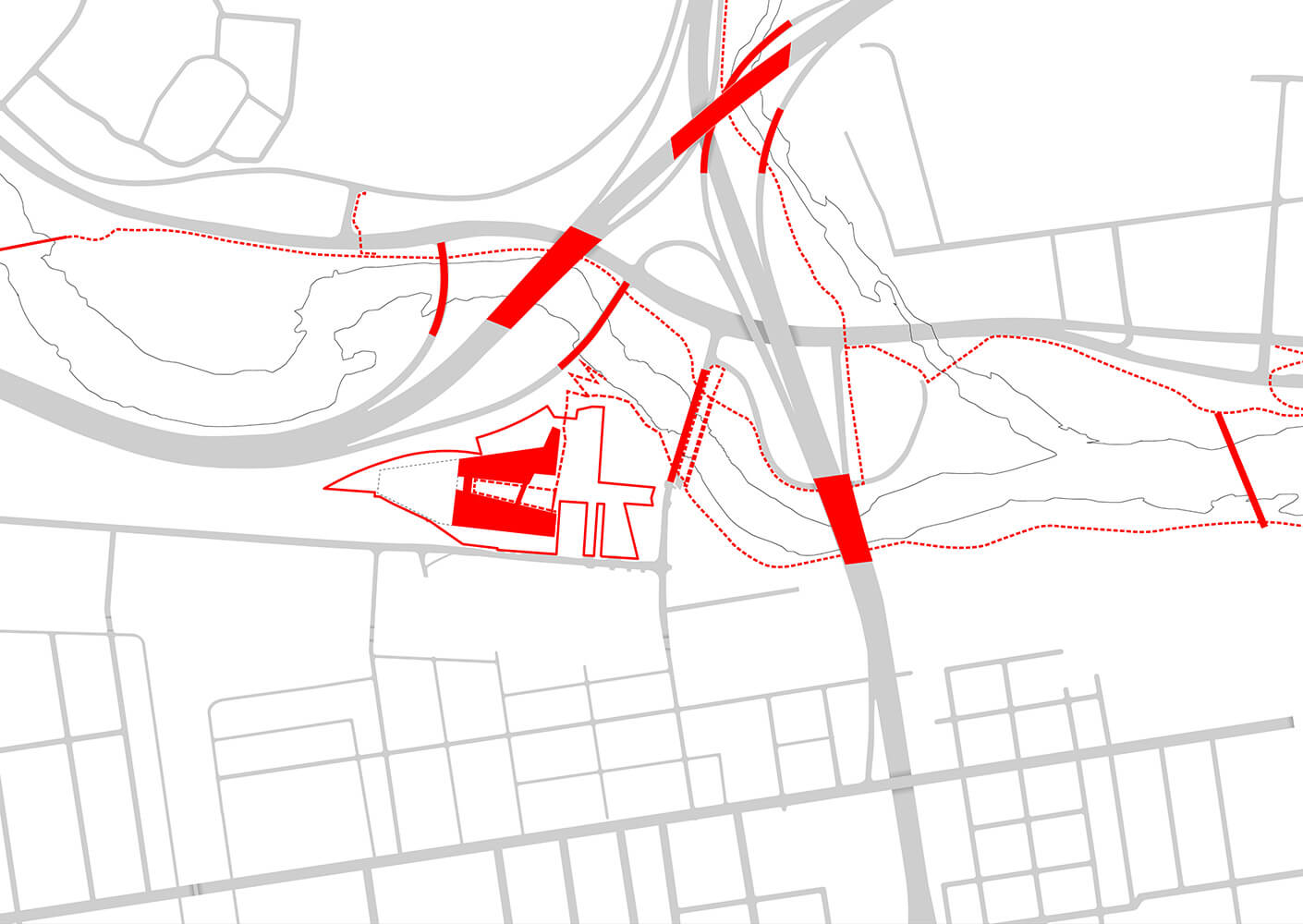
Many of Stelmarski’s projects have started as pieces of bigger-picture master plans. This broad way of thinking about a neighborhood or a city means that Stelmarski envisions the buildings as extending beyond a single street address, just as a film is much more than a single scene. Currently, Stelmarski and his team are focusing on an emerging arts district at the edge of Dallas known as Deep Ellum.
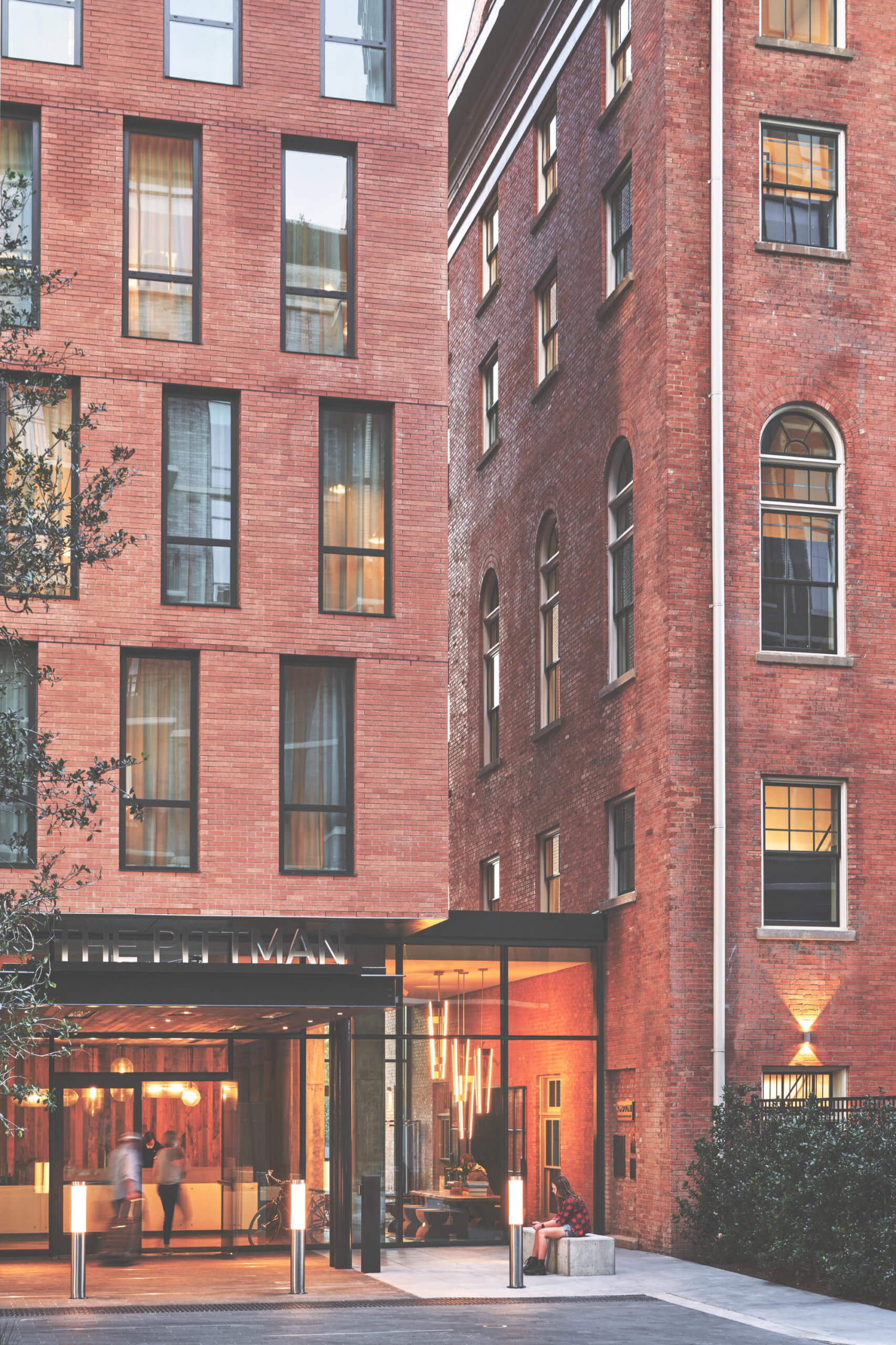
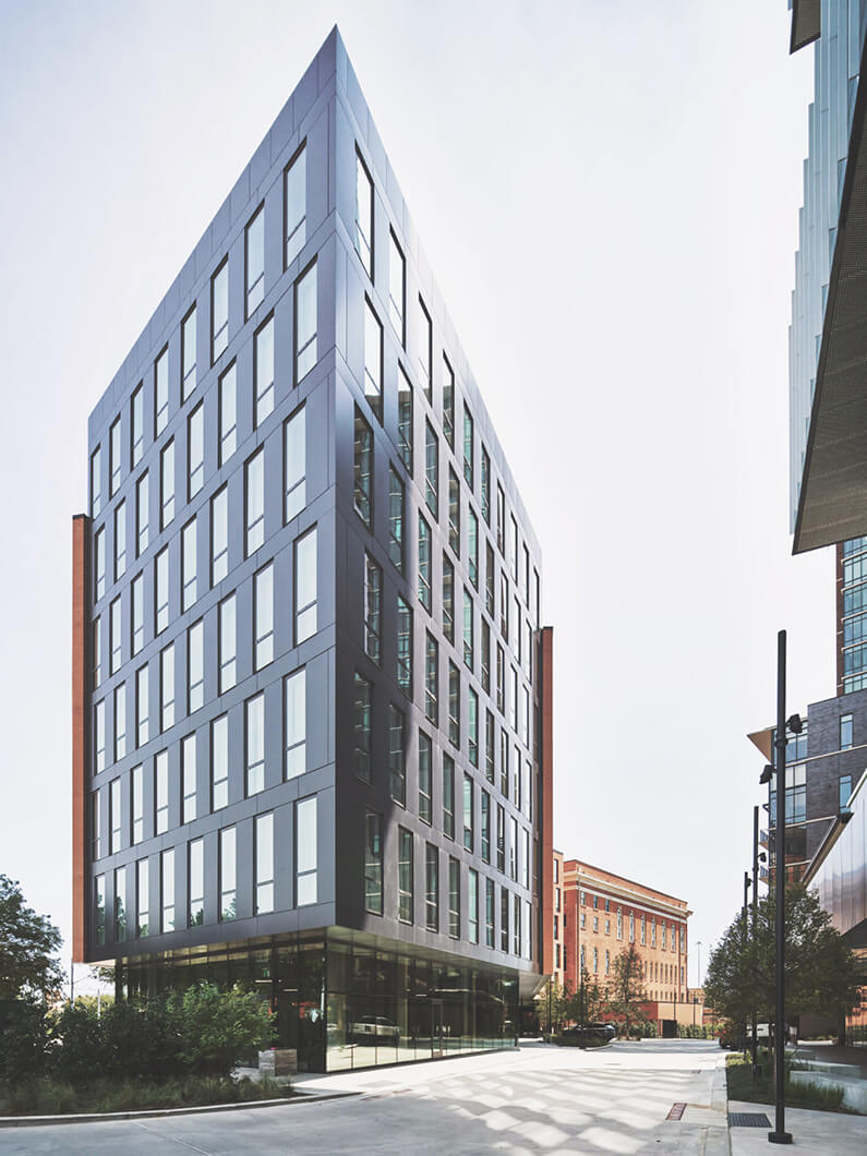
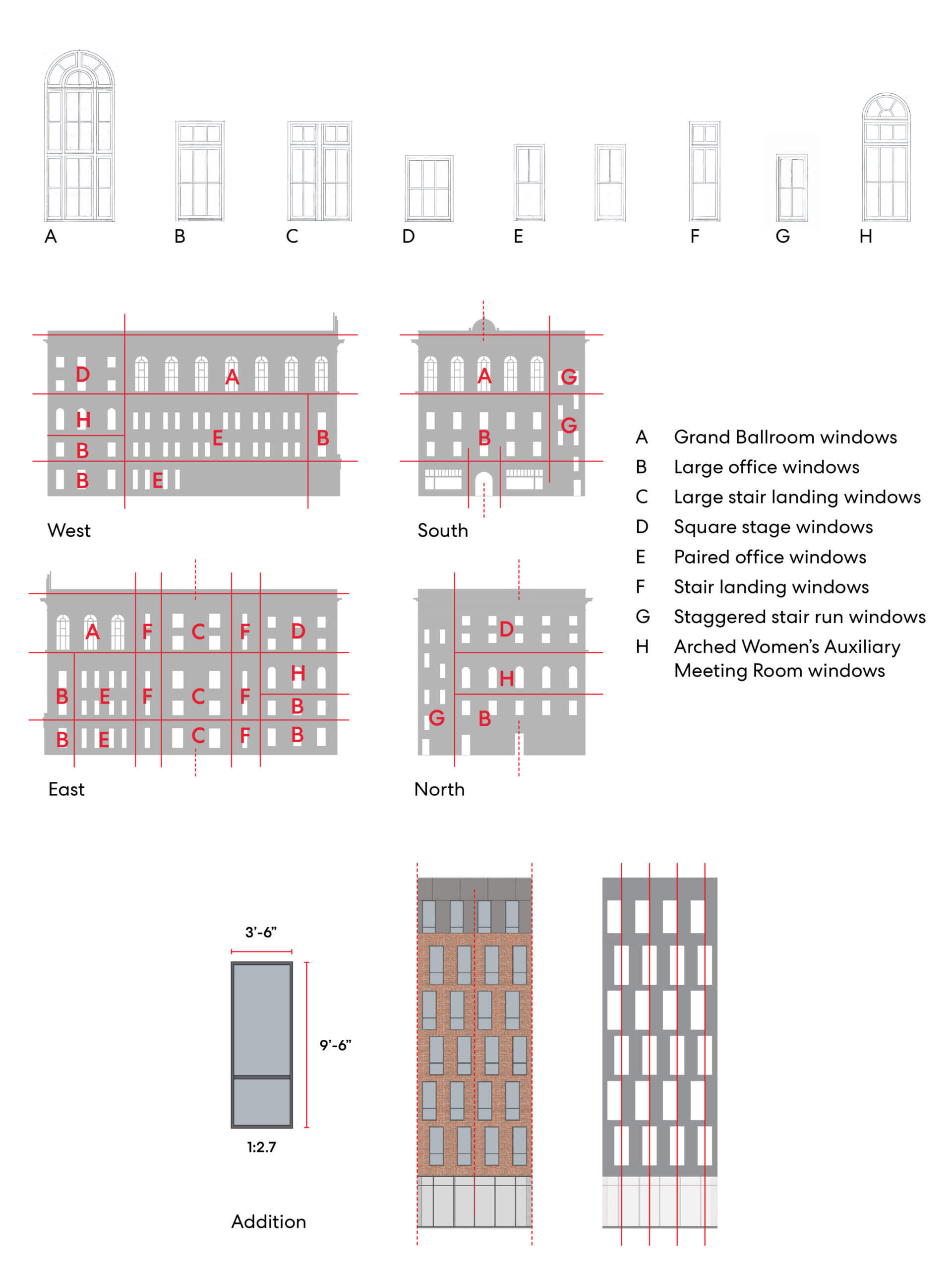
The streets of this historically Black neighborhood are lined with an eclectic mix of architectural styles, but one landmark structure is the Pittman Hotel. Designed in 1916 by William Sidney Pittman—a relative of Booker T. Washington and one of Dallas’ first Black architects—it originally housed the Messianic Temple Society, as well as the city’s first elevator open to Black citizens. Stelmarski and his team took the opportunity to breathe new life into the historic structure through adaptive reuse. By preserving its essential character, the design honors its lineage and connection to the Black community, but updates the site for modern use as a hotel.
Today, the building is a registered landmark, so Stelmarski’s approach demanded both technical conservation skill as well as historic and cultural research. “Bringing the two together was integral to sensitively integrating the old and the new,” he says. The transformation from semi-abandoned site to thriving hotel and leisure center embraces the unique history of the Pittman, placing the story at the core of the design and vision. “When you uncover something about a site’s history, whether social or geological or structural, it’s a rallying call for clients, designers, and the public alike.” The project connects people to their own history, bridging the past and the present through design.
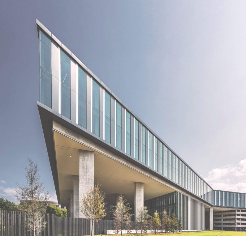
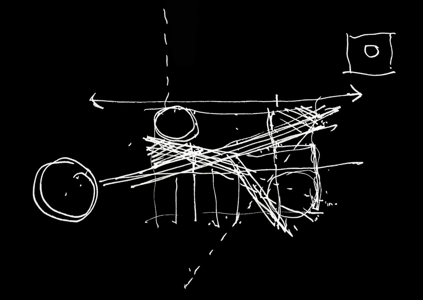
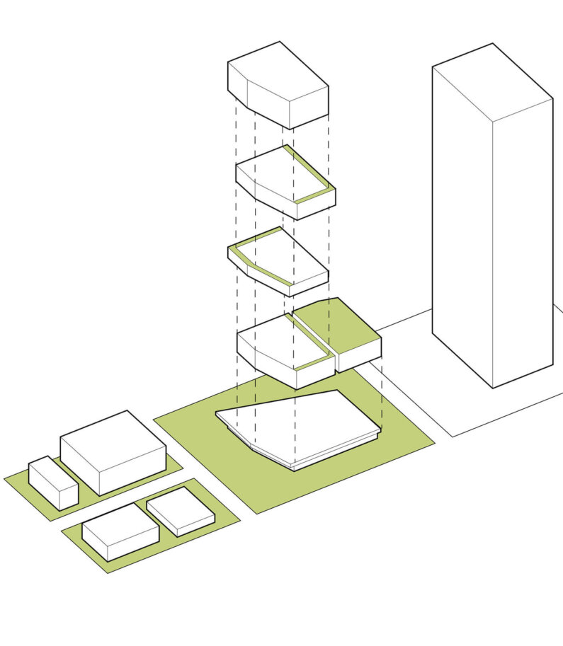
These design interpretations are rooted in a rigorous creative process in Stelmarski’s studio, and a deep understanding that the details of a design matter even when they’re part of a large-scale plan or neighborhood. These details are how the architect organically aligns his work within a streetscape, and often in unexpected ways. Currently, the designer is experimenting with strategic voids to give his buildings a three-dimensional life. By cutting out pieces to create shade or balcony spaces, he is breaking out of the standard, rectilinear box format, opening his project sites up rather than encasing them.
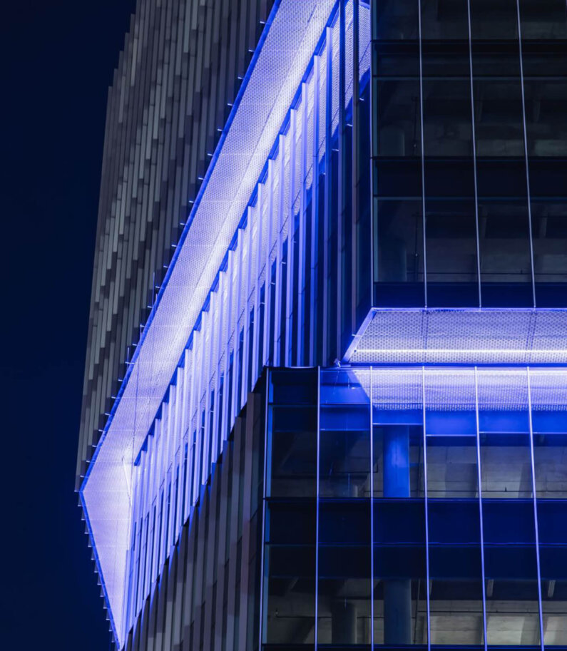
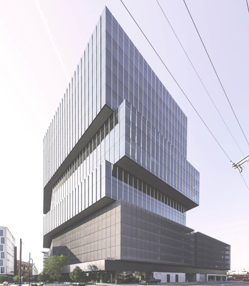
The Epic, a multi-use office and retail tower in Deep Ellum, showcases Stelmarski’s playful use of light and shadow in architecture. The building presents itself to onlookers like a balancing act—a series of three asymmetrical forms stacked on top of each other, like children’s building blocks. The resulting overlaps and undercuts in the façade are, in fact, calculated voids and cantilevers. Each offers outdoor patios for fresh air, but they’re also shaded, protecting users from the hot Texas sun. “The recesses are my way of playing with visual variety at a large, urban scale,” he says. “They allow my projects to offer depth and atmosphere.”
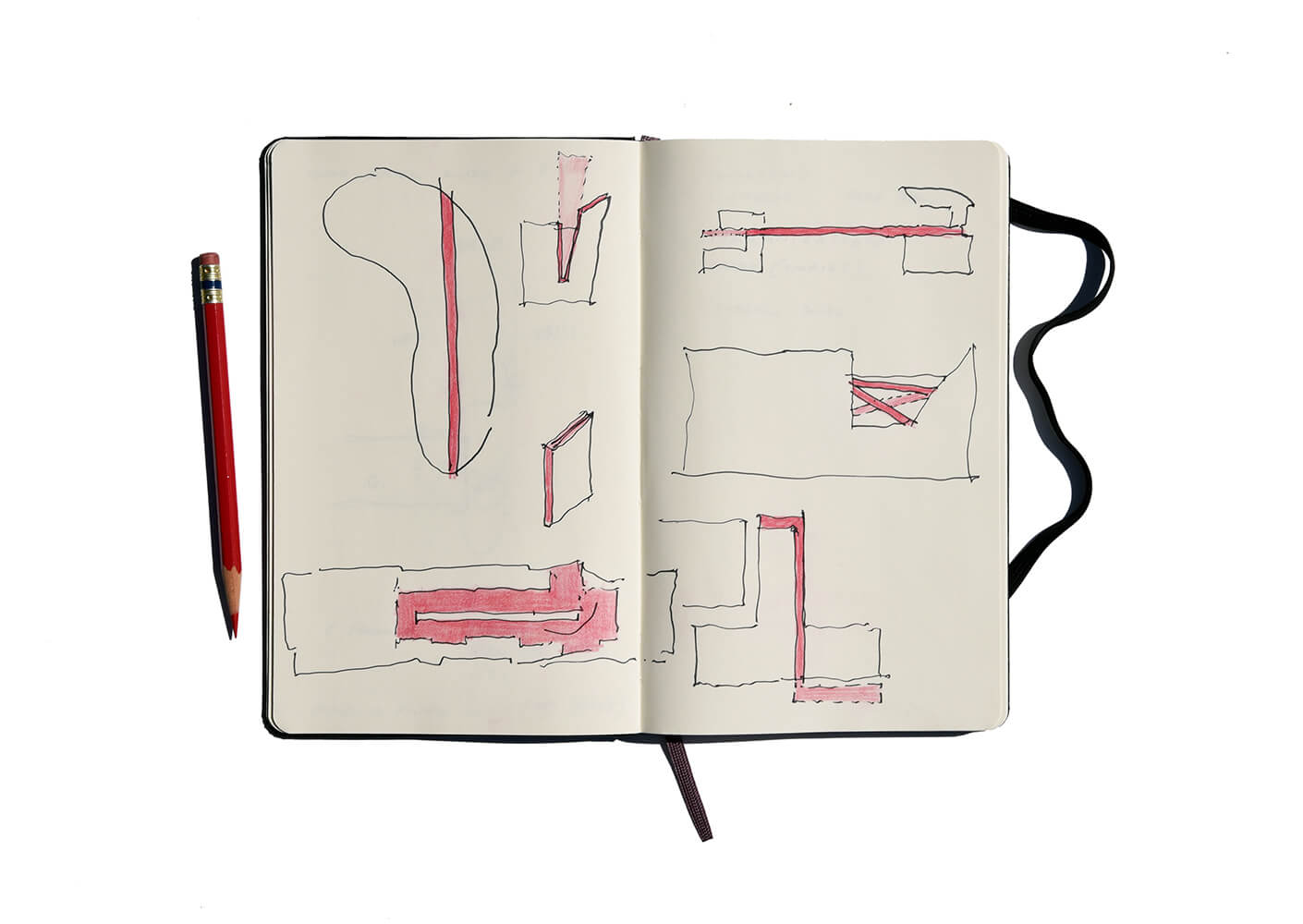
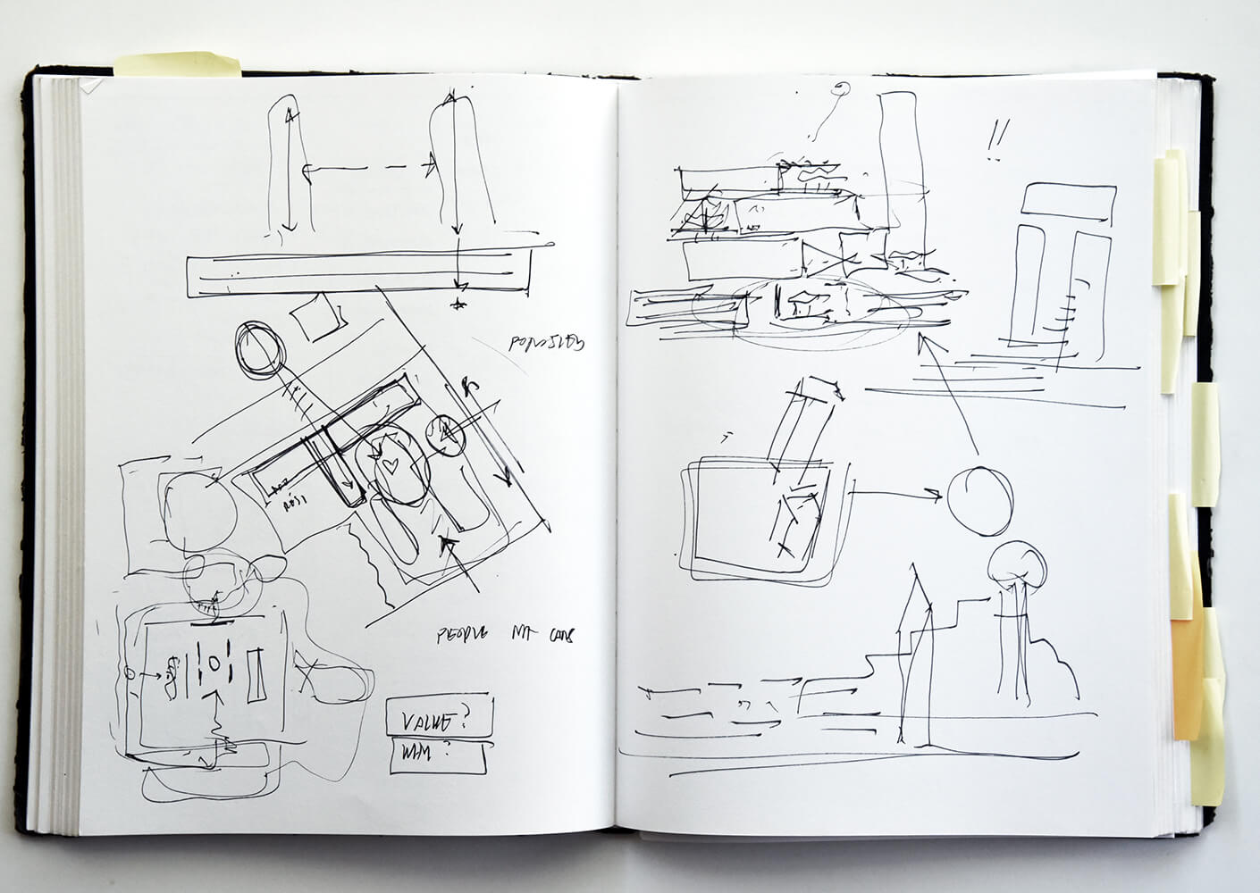
Whether Stelmarski is taking photographs of his travels, watching films, or sketching in his Dallas studio, there are journeys unfolding in his mind. His design interpretations are rooted in the rigorous creative process of an architect who understands that details matter, even when they’re part of something larger. From the boldest incisions to the smallest details, Stelmarski finds the key to an organic alignment between architecture and streetscape, bringing the stories of people and places together.
