As the market continues to change and buildings trade hands, it’s a great time to invest in older commercial buildings. Picked up at a lower cost, these buildings present the opportunity to unlock the latent potential of existing structures and infuse them with new purpose through reuse and repositioning. Weaving together the threads of economic viability, sustainable practices, and community development, adaptive reuse creates meaningful design and economic solutions for our city.
As an architect, revitalizing old buildings is perhaps my favorite design challenge. Over the years, our studio has built an impressive portfolio of local adaptive reuse projects. These transformations have often been driven by external factors, like San Francisco’s PDR zoning or historical registry requirements, but sometimes are inspired by the desire to capture a special slice of history or preserve a captivating artifact in some capacity. Regardless of city mandates or the initial condition of the building, creative design remains a critical component, key to achieving a positive return on investment. A bold design move can transform a nondescript structure into a sought-after destination for working, living, and socializing.
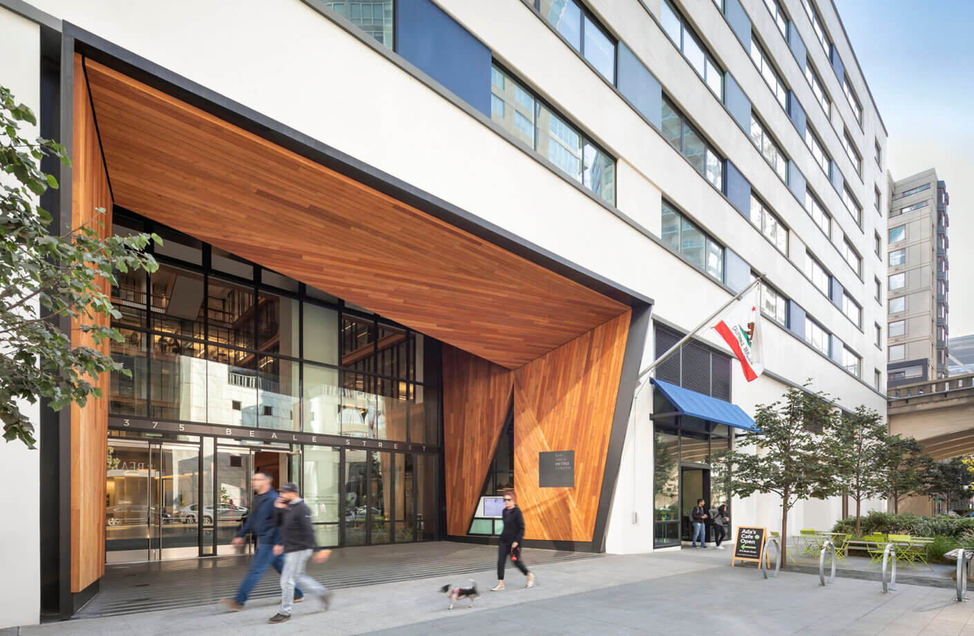
Some noteworthy examples of these transformations include 375 Beale Street (also known as the Bay Area Metro Center), the McClintock Building, and Boston’s Prudential Building. Guided by carefully considered design interventions, each of these projects have become an icon within their respective neighborhoods.
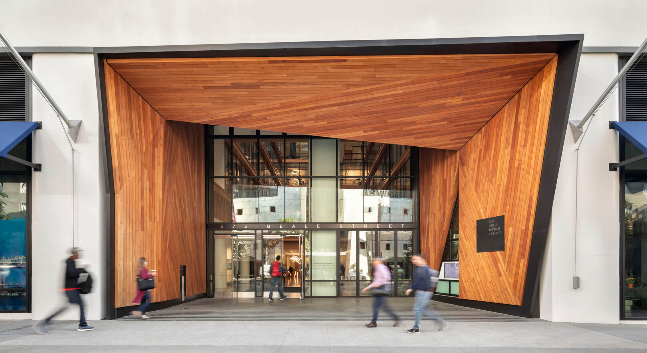
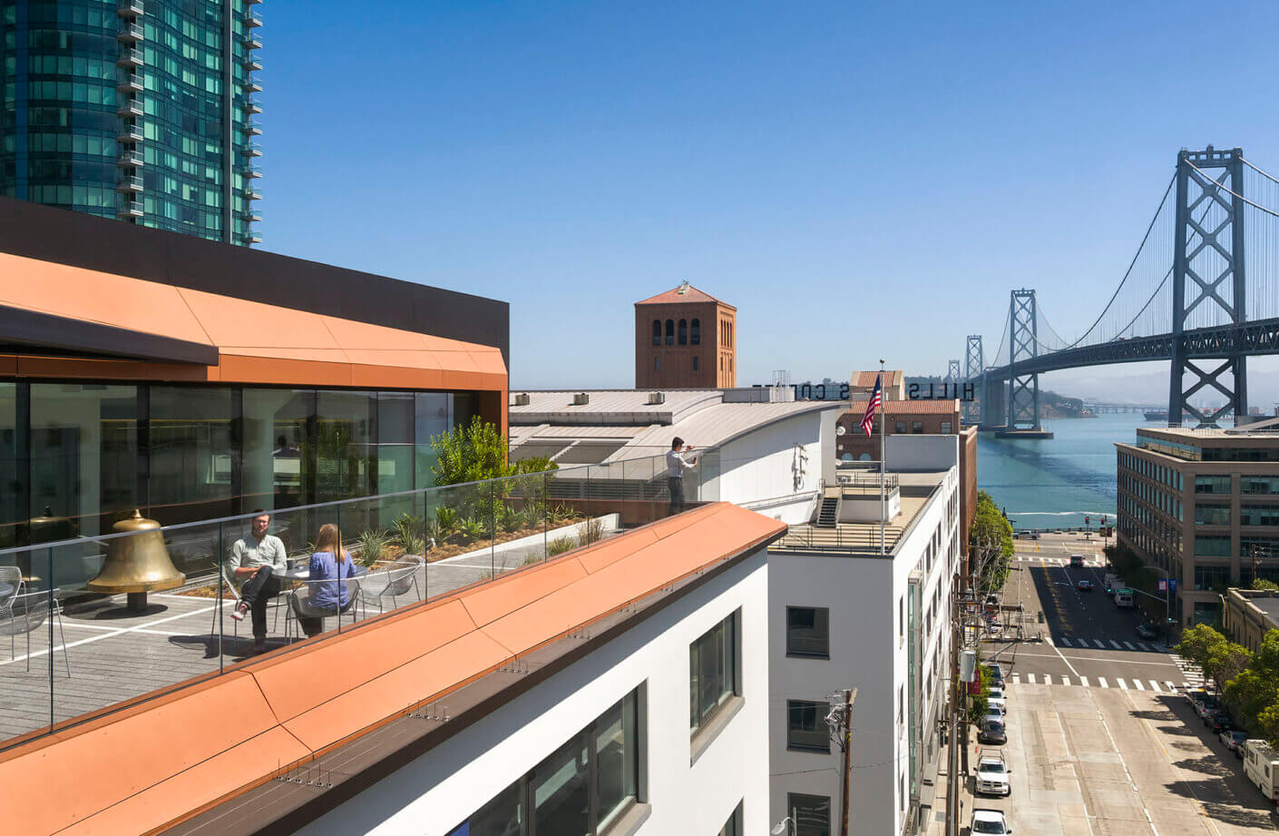
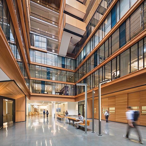
Our task for this project involved repurposing a 1940s-era army warehouse building into a modern office space for four government agencies. The focus of this transformation was to give these regional agencies a public presence while providing a community asset in the evolving Rincon Hill and Transbay neighborhoods.
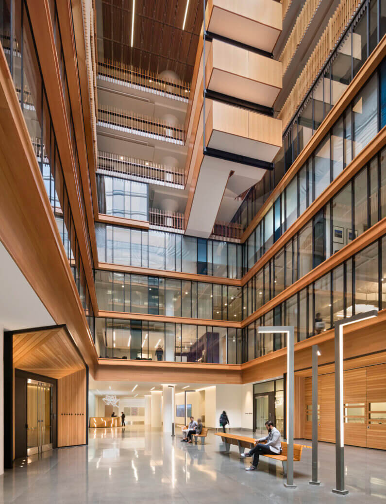
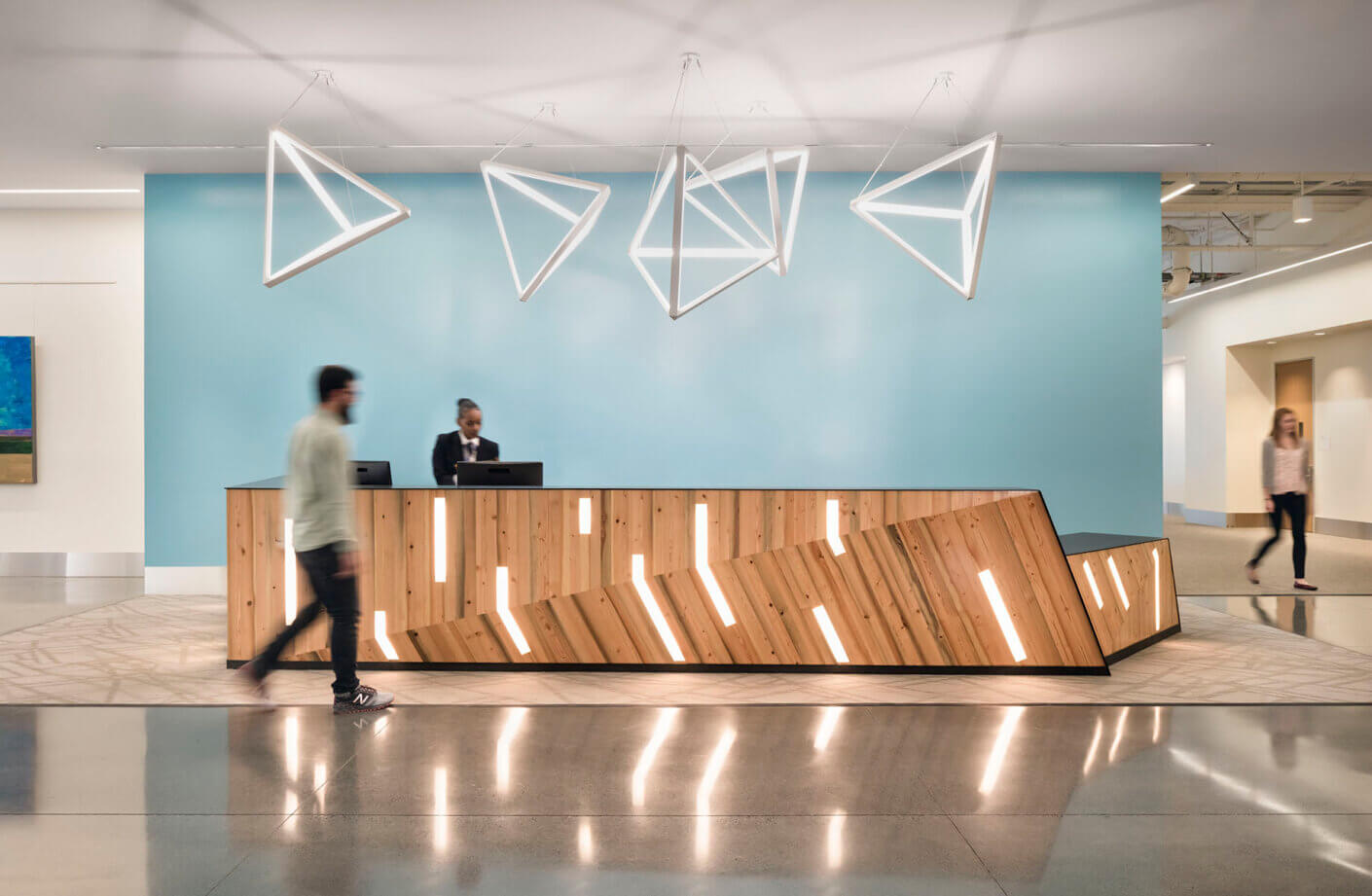
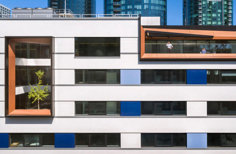
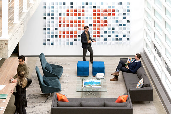
The newly repurposed building introduces an atrium as the focal point of a spacious lobby, creating an indoor crossroads for the four regional agencies housed inside. Paying homage to the neighborhood’s history, we utilized salvaged wood from the 40-foot-long Douglas Fir logs that once served as pilings for the old Transbay Terminal. Rich with character accumulated over 70 years submerged below the waterline, this repurposed wood now adorns the first-floor lobby’s security desk, the boardroom dais and wall paneling, as well as the coffee bars and lobby paneling on the partner agencies’ office floors. Playful design elements, like the creation of a three-story cutout allowing space for a ginkgo tree to flourish within the building, help breathe new life into this old structure.
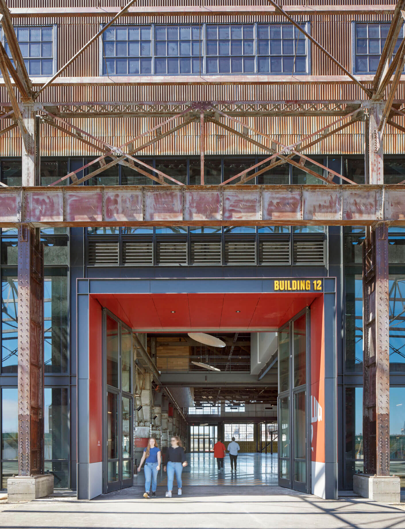
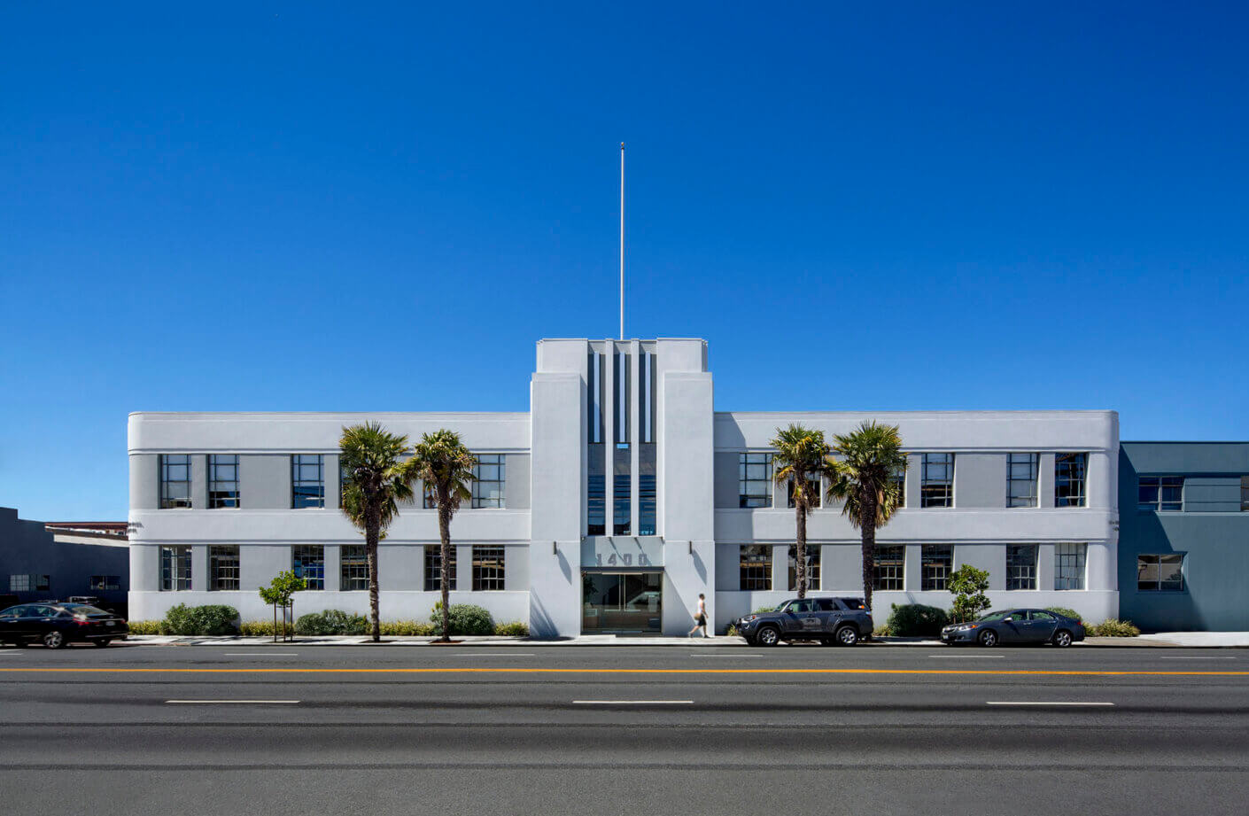
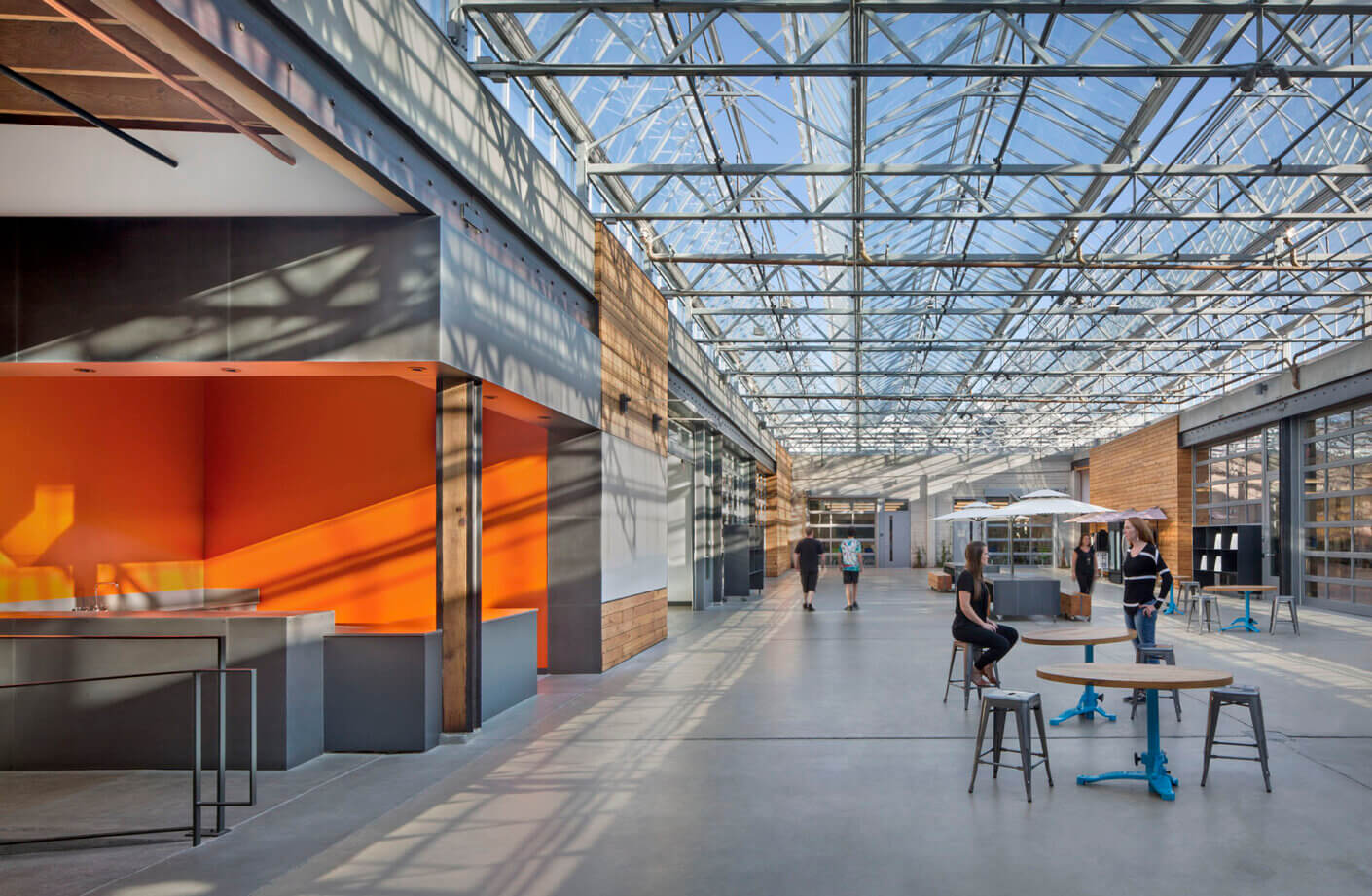
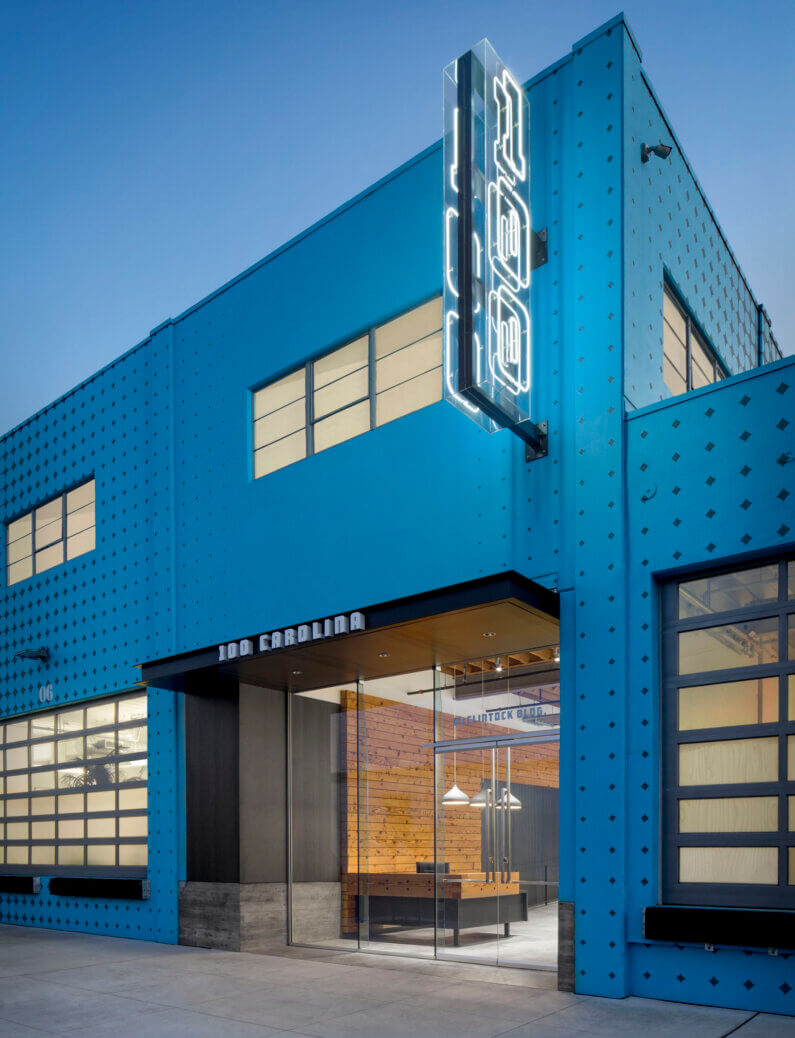
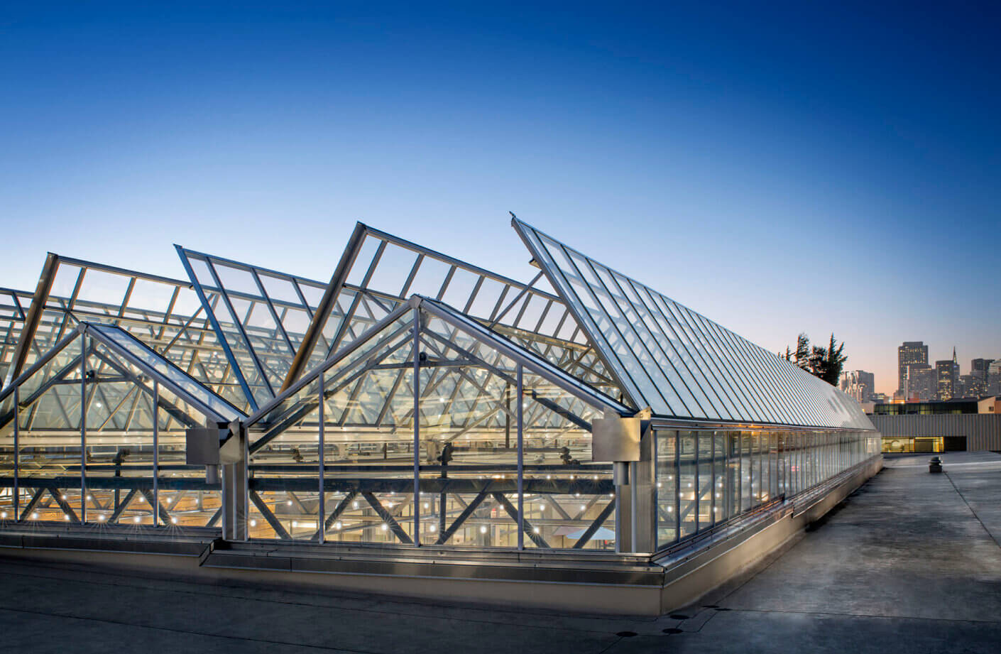
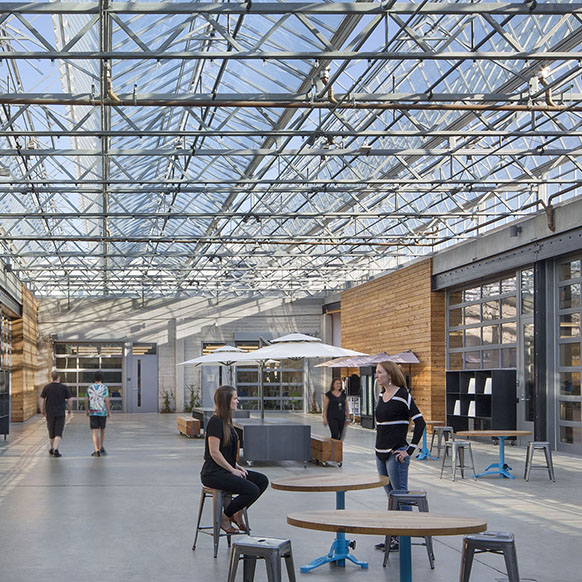
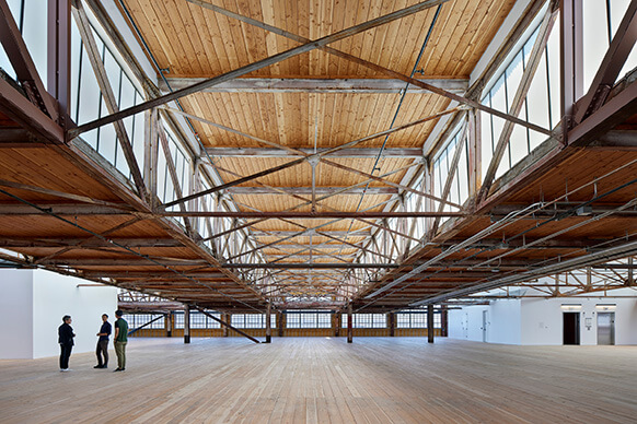
For this project, we were tasked with crafting the third act for the former industrial and creative hub. Originally erected as a chemical factory in the 1930’s, it was expanded upon in the 1950’s to house Jessica McClintock’s iconic formal wear brand. The revitalized building pays homage to its rich history, while adapting to a new forward-thinking environment. While we meticulously preserved the historic Art Deco façade facing 16th Street, we embarked on a bold endeavor: carving away sections of the roof to introduce an abundance of natural light. Now, a striking operable glass roof adorns the structure, serving as the centerpiece for a communal space flooded with sunlight and fresh air. The addition of roll-up doors on the adaptable units encircling the atrium further encourages engagement, providing effortless access to the central gathering area. On the warehouse side, we injected a sense of whimsy with playful graphics and vibrant paint colors, ushering in a new era and welcoming visitors through a revitalized entrance.
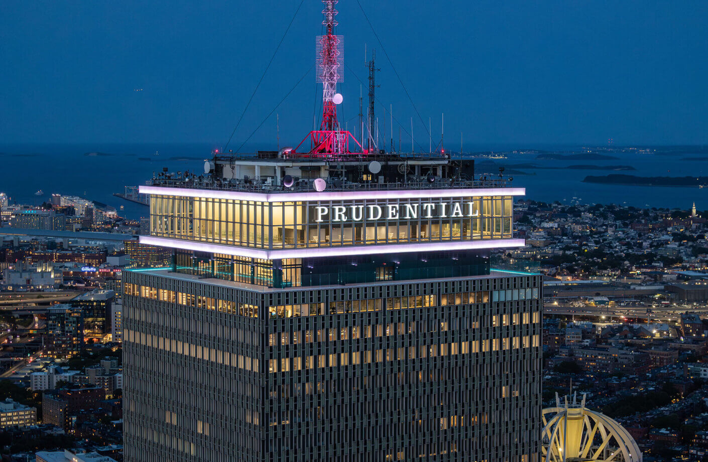
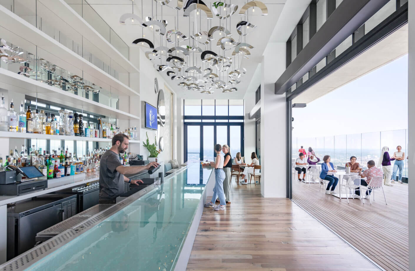
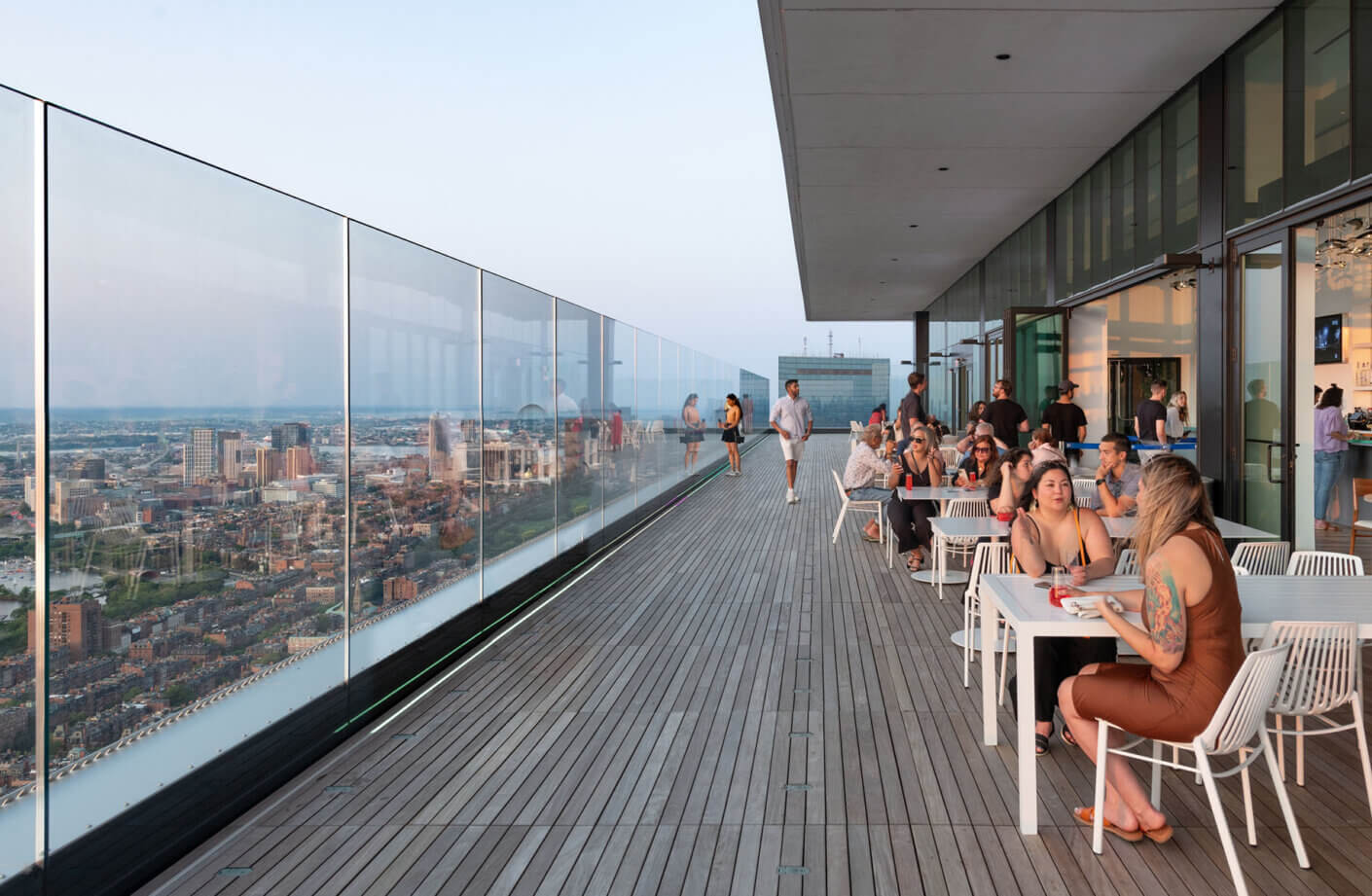
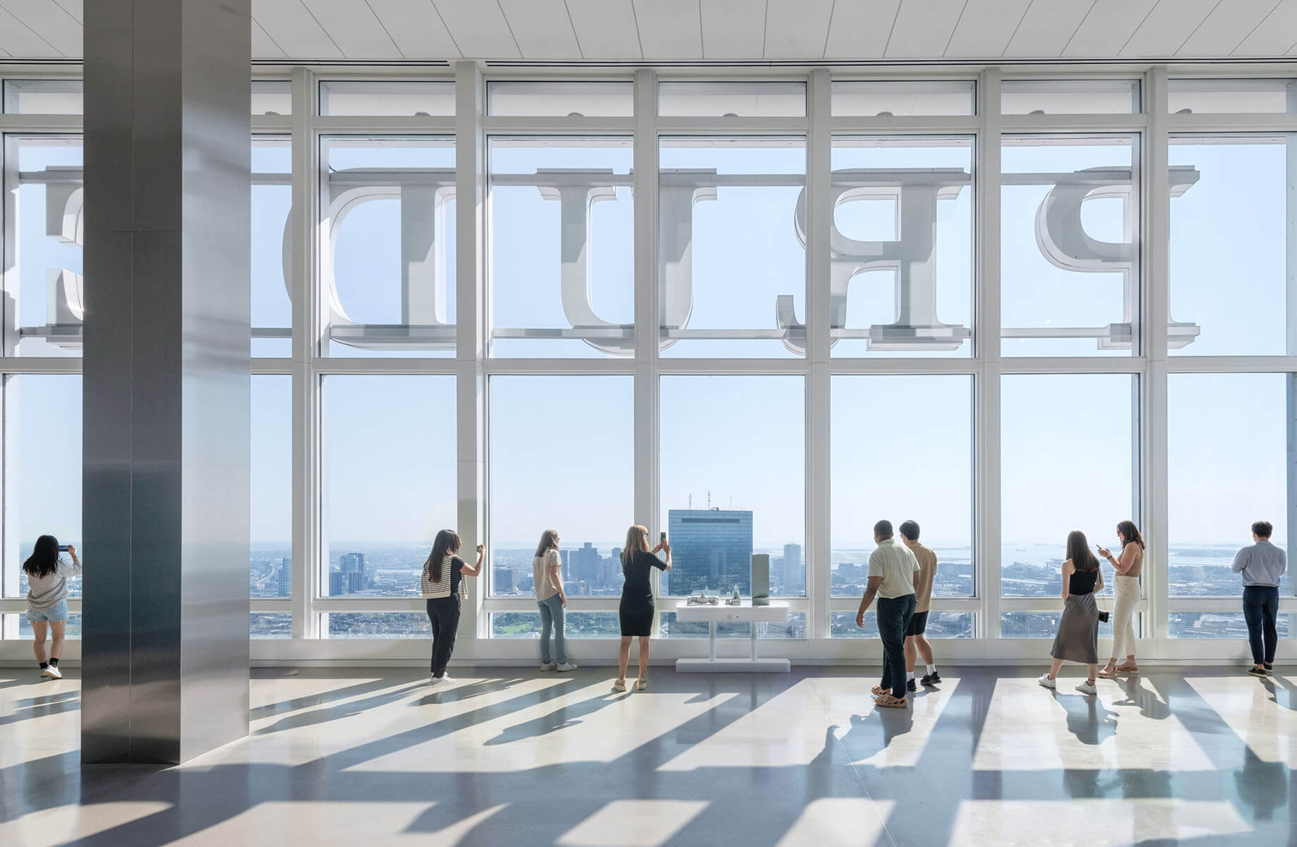
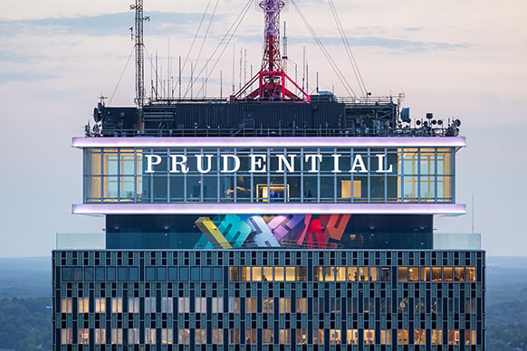
Originally designed by Charles Luckman & Associates and completed in 1965, the Prudential Tower is an iconic example of mid-century modern architecture in Boston. An upgrade to the tower’s mechanical systems catalyzed a transformative adaptive re-use project to renew an iconic landmark. This project not only revitalized previously under-utilized spaces but also elevated the building’s infrastructure to current sustainable and energy-efficient standards. By upgrading cooling systems, we reclaimed interior space for a new purpose, freeing up space for the creation of a year-round exterior observatory deck and hospitality area on the 51st floor. A new eight-foot-high frameless glass windscreen was installed to ensure comfort and safety while offering the community and visitors unparalleled views of the city.
In today’s competitive market, innovative design outshines additive amenities like steam rooms, gyms, or golf simulators. Creative thinking is the key to reimagining old assets in a fresh and economical way providing value that will last. In the quest to attract and retain tenants, work environments must transcend the comforts of home. Recognizing the transformative potential of bold design moves or a new use can make all the difference in captivating and engaging tenants.