For nearly a century, cities have approached growth in predominantly one direction: up. Skyscrapers may be a logical option for a dense metropolis, but cities with room to expand outward have recently been taking cues from architecture that includes rather than excludes, and that spreads rather than stacks. The “groundscraper” is emerging as cities look to create not only more egalitarian workspaces, but healthier ones, too, as the COVID-19 pandemic pushes us to question the status quo.
Groundscrapers are defined as buildings that are as wide as skyscrapers are tall. The typology has its origins in the industrial architecture of the early 20th century. Fine examples of these monoliths still exist in Chicago, such as the U.S. Post Office (1932) or the Merchandise Mart, (1930). These buildings hug the Chicago River for as long as they possibly can, a design choice fueled by the desire for waterfront real estate. But in more recent years, Big Tech companies like Apple and Google have also harnessed horizontal forms as their calling card; the “campus feel” of their headquarters stems from the connectivity of the ground-hugging structures, clustered to create a shared and vibrant streetscape.
Cities with room to grow outward, like Dallas, home to design director Ron Stelmarski, are at the forefront of this trend toward connectivity as workplaces adapt to the COVID-19 pandemic. By alleviating the need for a cramped elevator ride, groundscrapers keep people appropriately distanced, as well as more active. They also break down outdated hierarchical systems, placing teams side-by-side to eliminate the elitism of the penthouse.
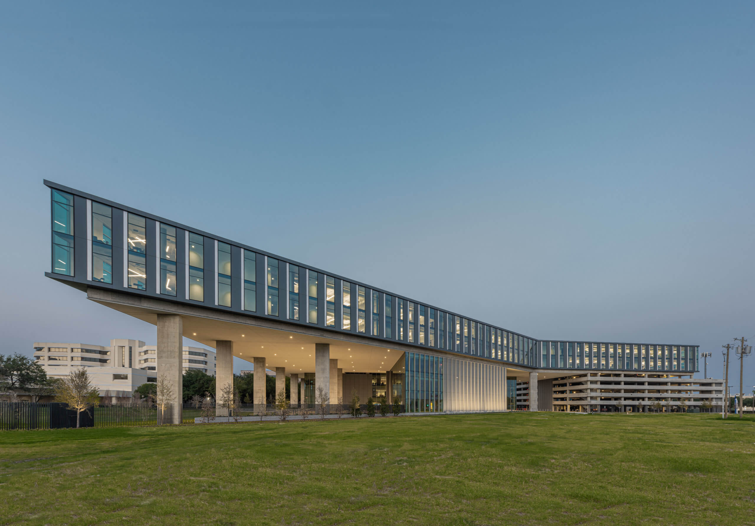
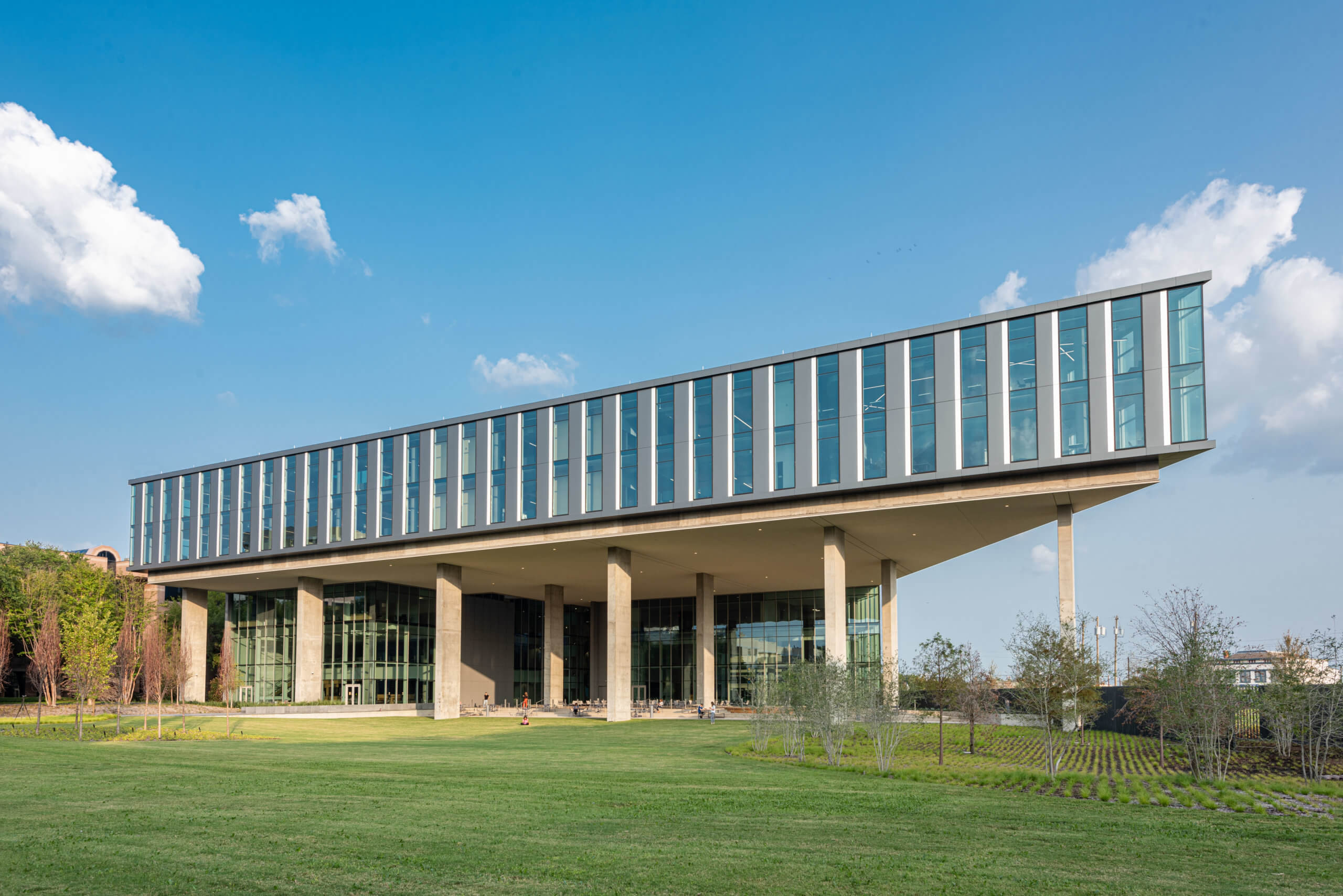
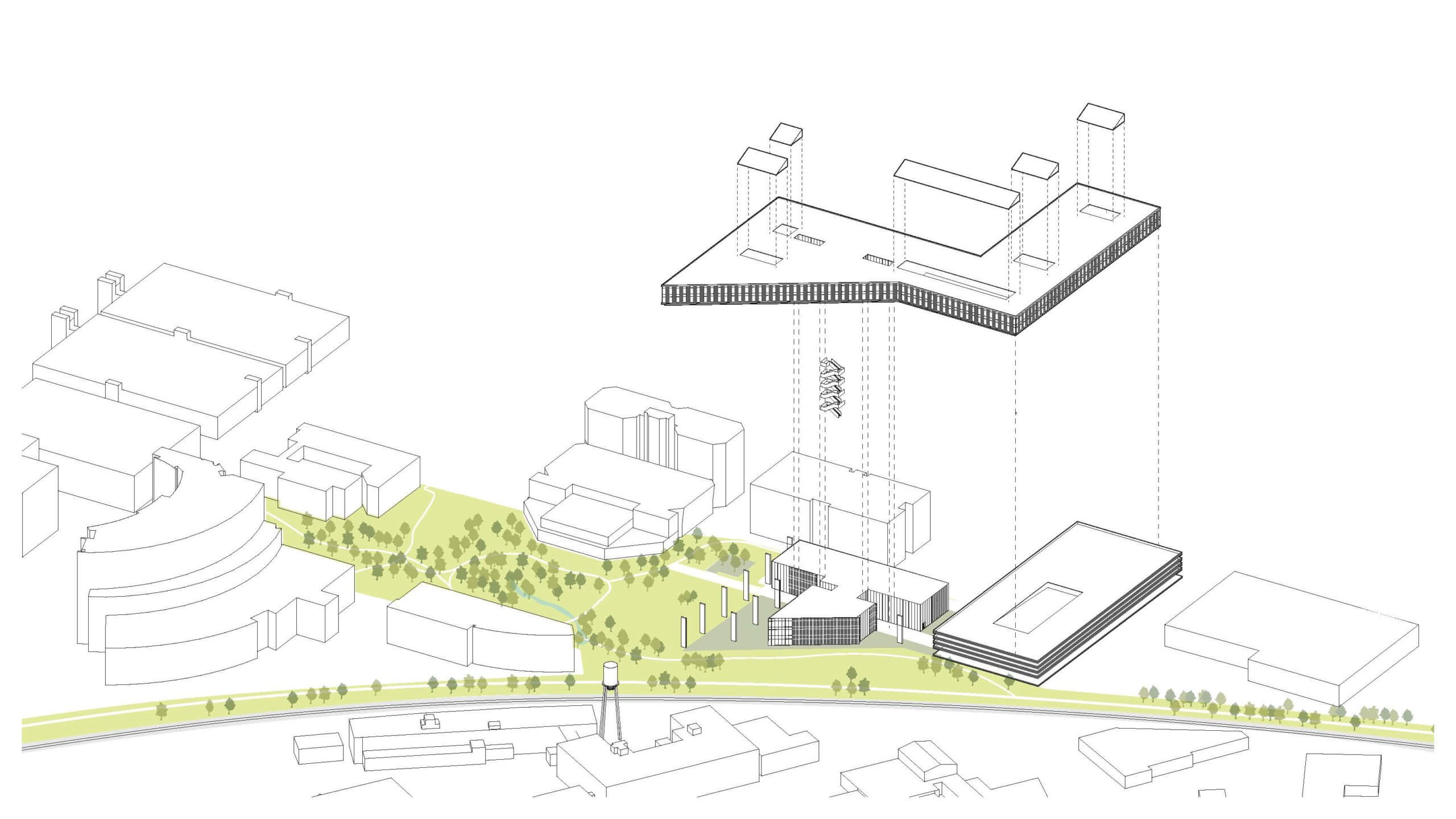
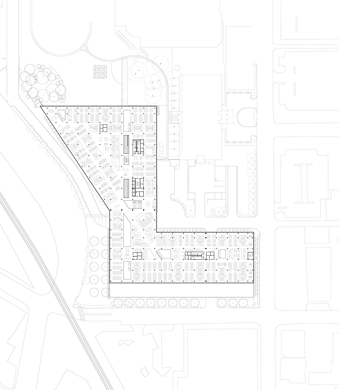
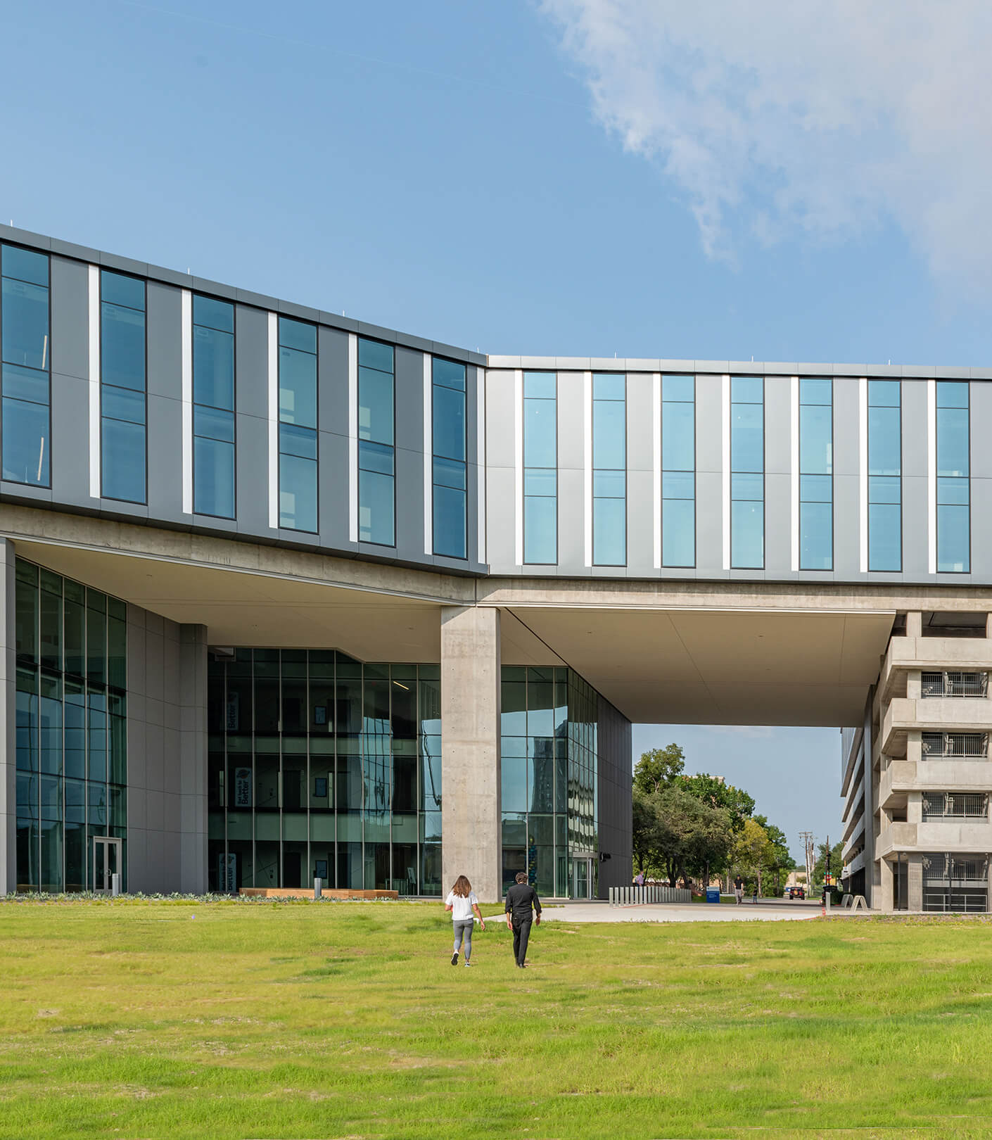
Stelmarski and his team have recently completed the Baylor Scott and White Administration Center at the edge of the city’s emerging Deep Ellum neighborhood, a project that called for 3-acre floorplates for a monumentally horizontal footprint. The building was envisioned to house the administrative needs of the eponymous hospital across the way. Even though a large amount of square footage was required, the team didn’t want to dwarf the hospital by creating a soaring new tower. Stelmarski, who studied the theory of horizontality in art and architecture during his university years, knows very well that verticality is translated in terms of power and influence in today’s visual culture. It also segregates, rather than connects, inhabitants.
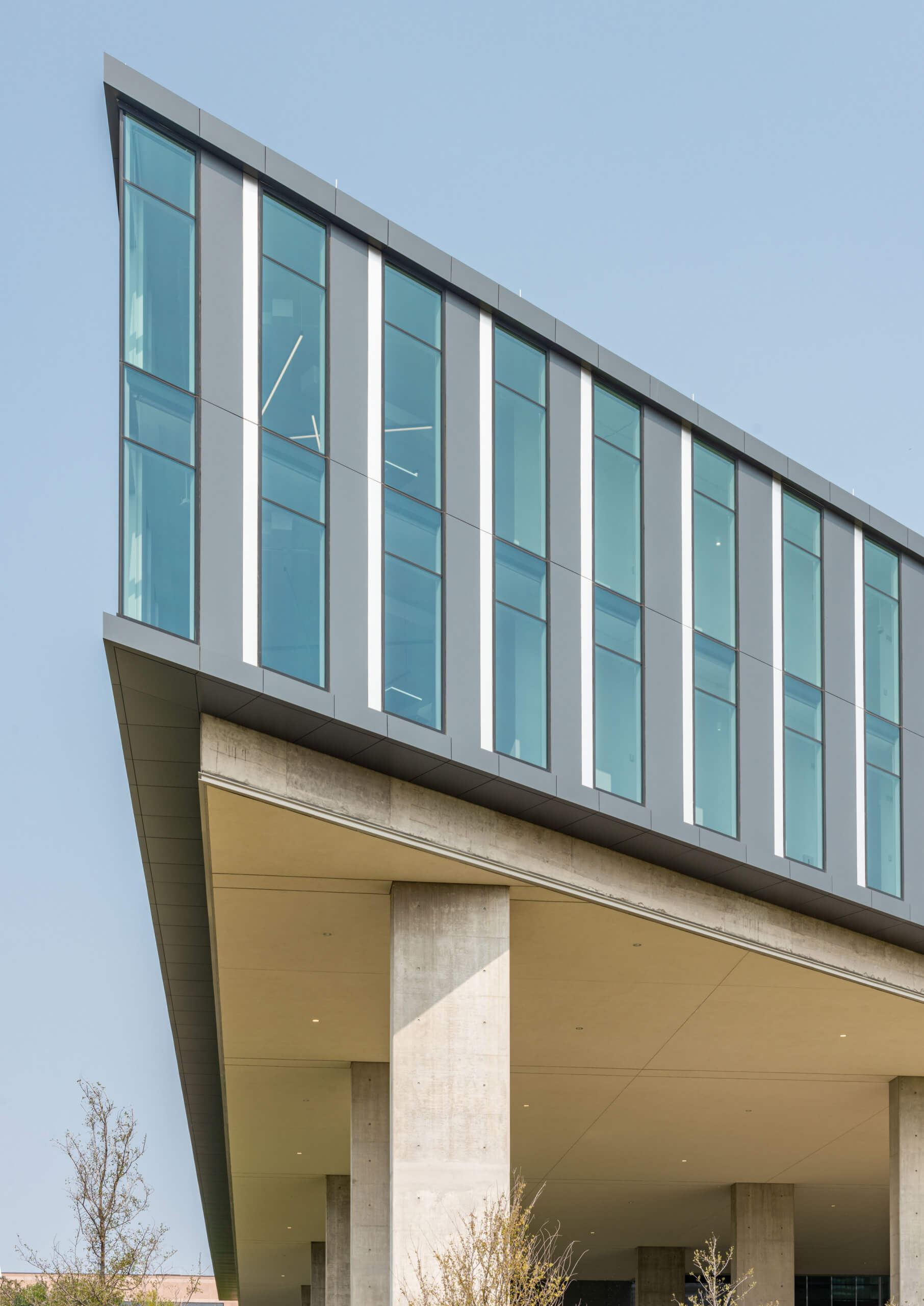
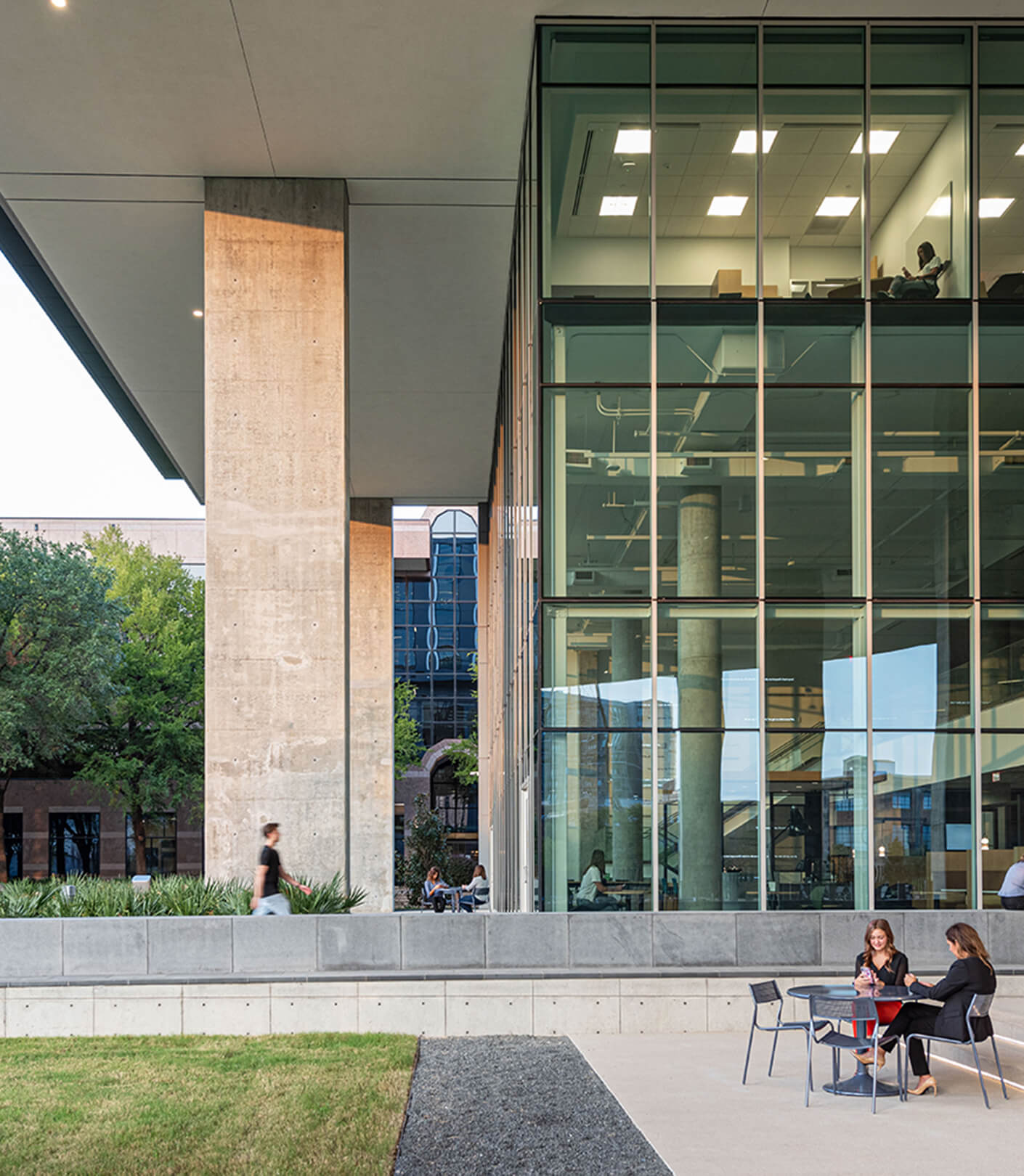
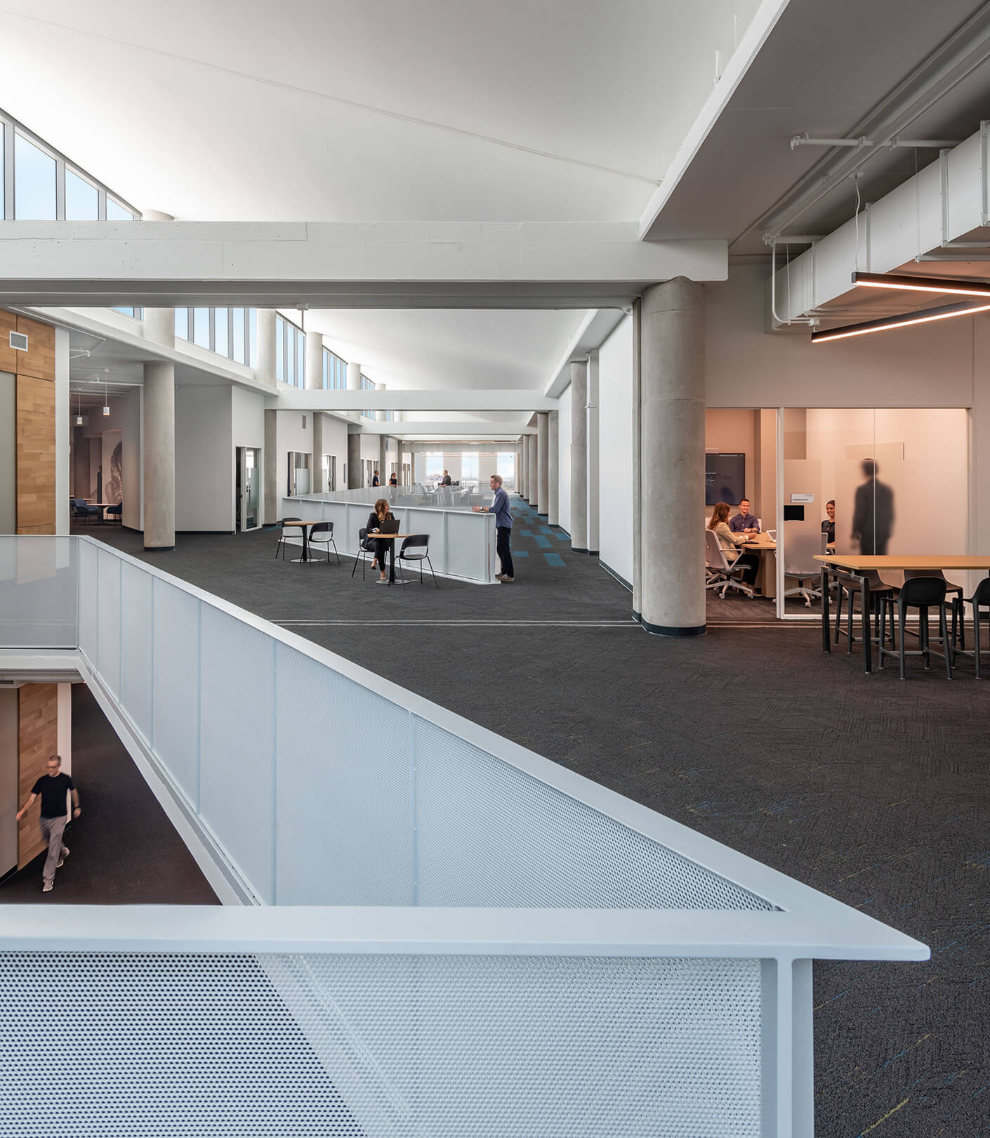
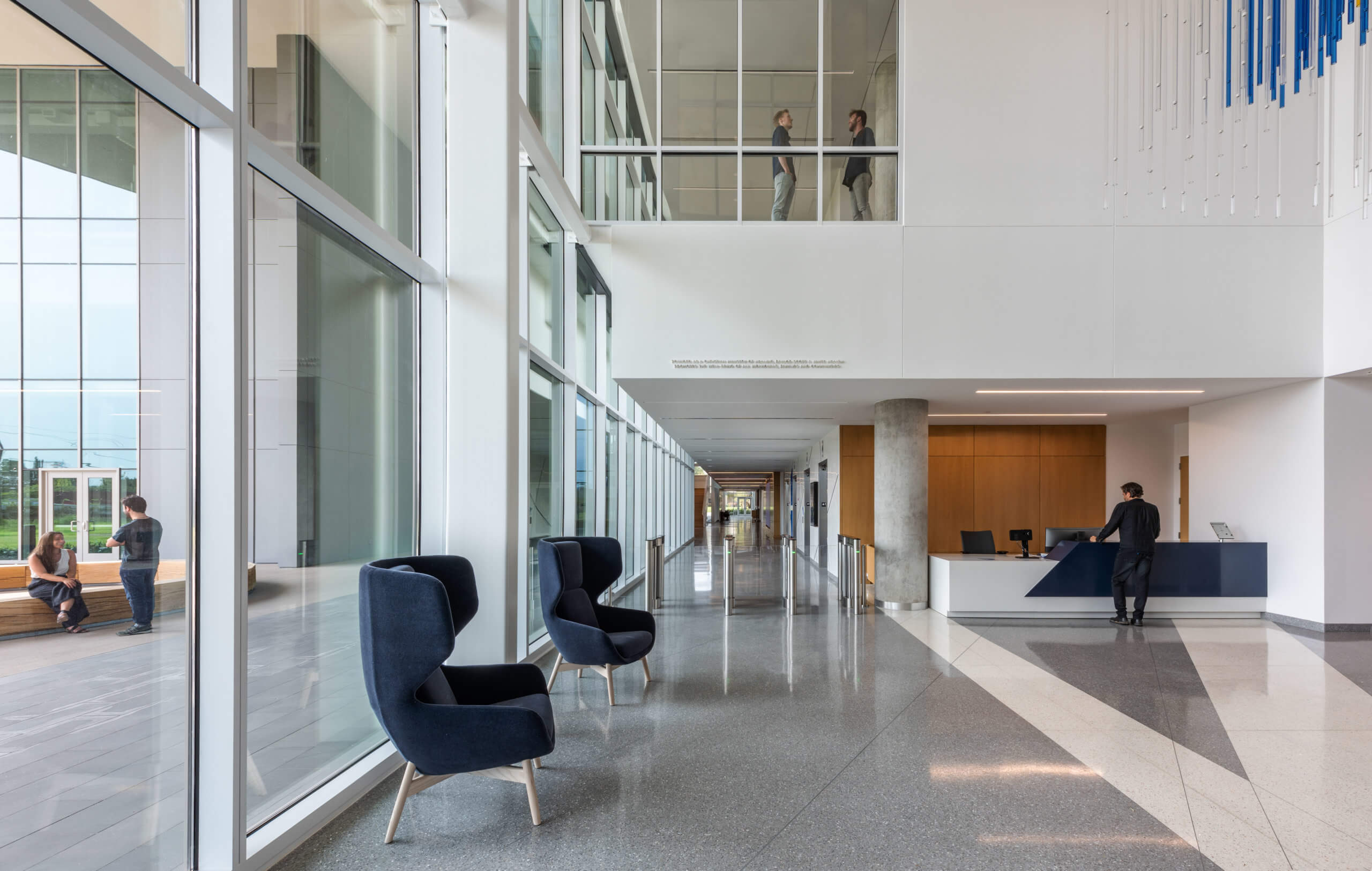
Marked by an emphasis on long windows, like keys on a piano, the design takes daylighting to another level. Accentuating transparency between the indoors and the outdoors, departments and individuals, its open floor plan minimizes barriers to entry or exclusive workspaces, and cantilevered floorplates create canopies over outdoor gathering spaces, offering shade in the Texas heat. The lower height also allows for clerestory light to penetrate the deep floorplates, making access to light and air a priority no matter where you choose to work, gather, or collaborate.
This radical realignment of square footage allows employees and tenants alike to share the same sweeping views and enjoy easier connections between workplaces and social hubs. Horizontal floorplates offer multiple points of entry as well as connection, a facet of permeable design that Stelmarski and his team are interested in exploring.
“Permeable design leads to more transparency in the workplace, and supports our goals for equality,” the designer says. He sees it as a sign of greater—perhaps even wider—things to come. “We are combining groundscraper theory and practice to reimagine the future of Dallas’ architecture.”