Freedom Park Conservancy
The land that makes up Freedom Park was originally slated for a toll highway. Trees and houses already bulldozed, the next step was pouring concrete and erecting steel.
But a fired up group of citizens said, “Not so fast. And not without a fight.” After a decade of civil disobedience, the project was rejected and handed over to the community to form Freedom Park and its conservancy.
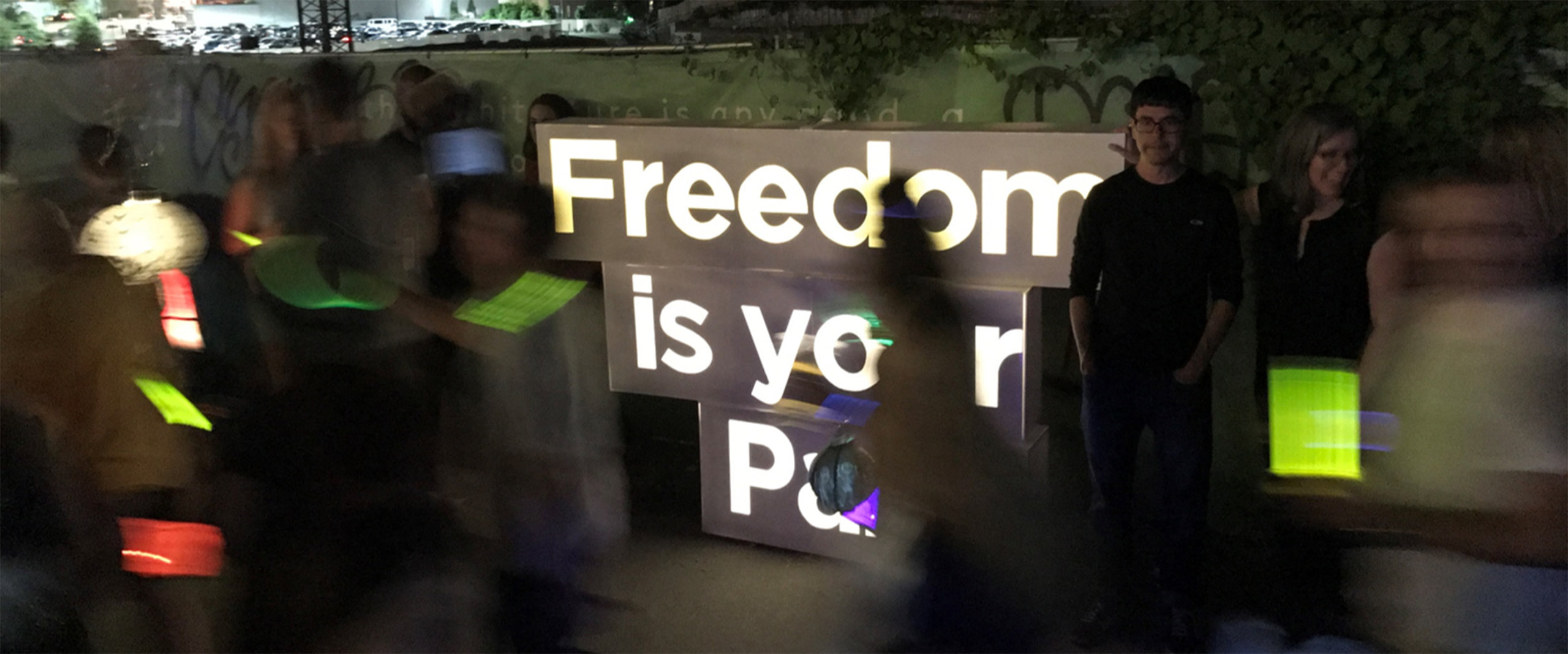
Over the years, art installations and sculpture have been used to draw people to its spaces. Today, the conservancy’s vision is more grand and requires just the right messaging.
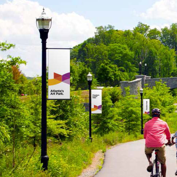
To help, we created a Capital Campaign mantra: “Freedom is your Park.” From its overwhelming success, the board then rallied around the next major pieces: Communications Strategy and Brand Identity System. Bright and cheery, it’s an identity system that’s found on trail signage and brochures, all over media, and a quite a number of fun little tchotchkes.
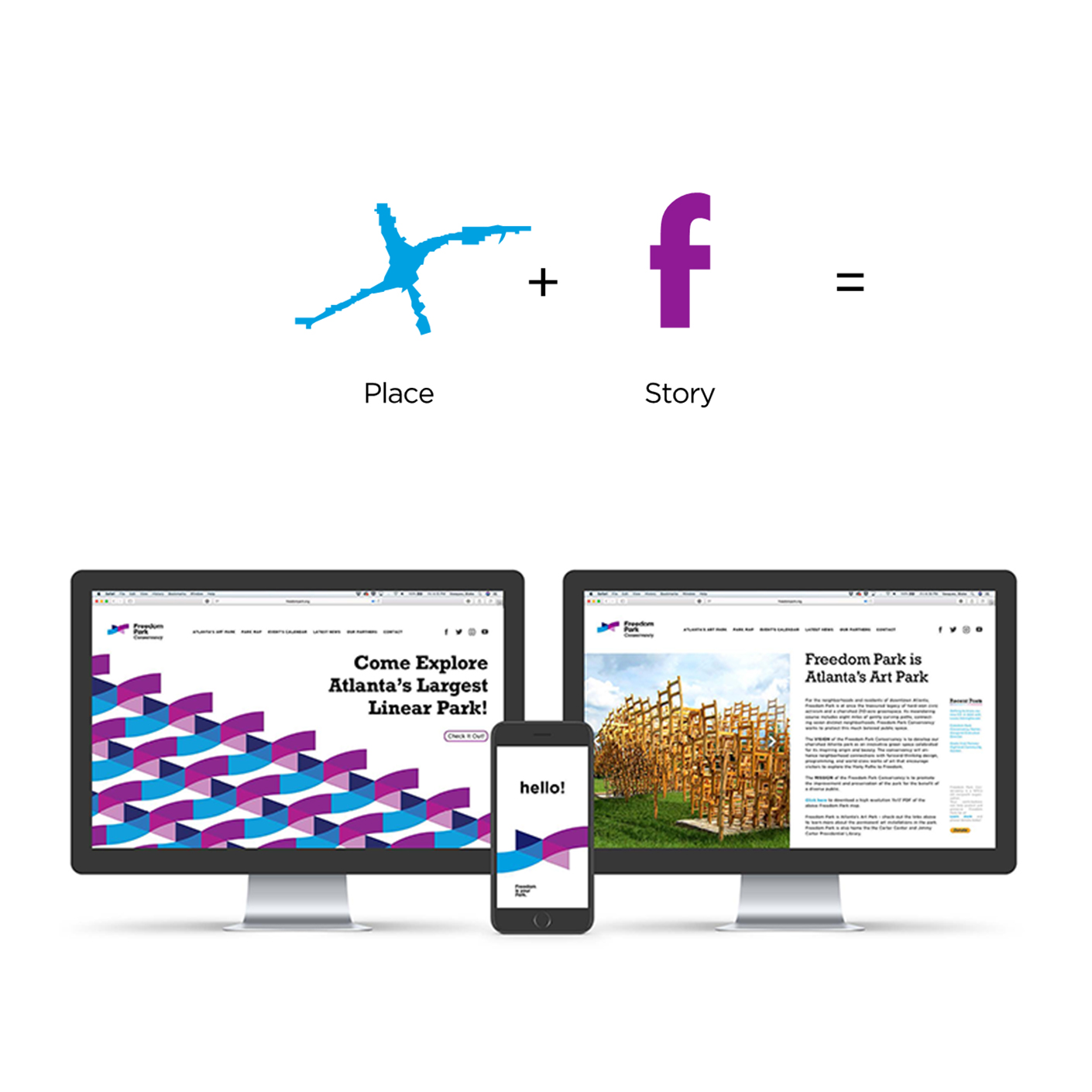

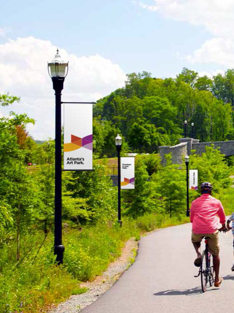
Freedom Park not only connects seven of the city’s most historic neighborhoods, it links all of Atlanta to its storied past. So how to capture all that in a logo? Well, that’s certainly asking a lot.
An identity mark has to embody so much—story, place, emotion—and for this project, it also meant capturing the past, present, and future. Further complicating matters, the word “park” immediately brings the color green to mind.
Yet the team arrived at something progressive, civic-minded, and fresh: a blend of blue and purple that hint to both the name and shape of the park.
