Martin Williams Headquarters
When award-winning advertising agency Martin Williams (MW) decided to relocate from a multi-storied location with views of the skyline to a single floor plate with half the square footage and limited views, MW needed to think differently about how they work.
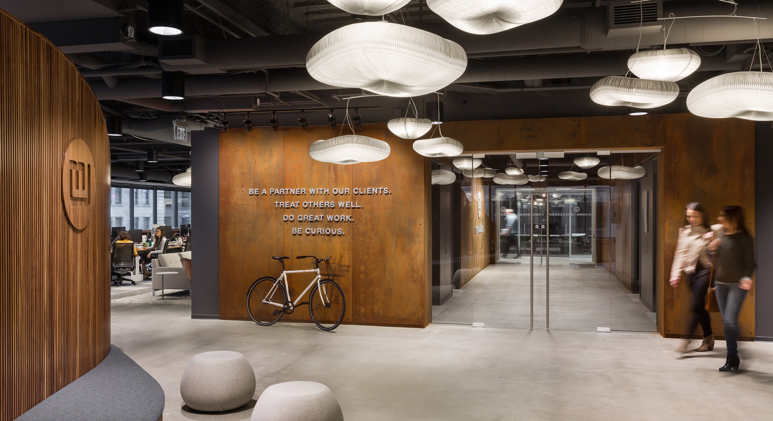
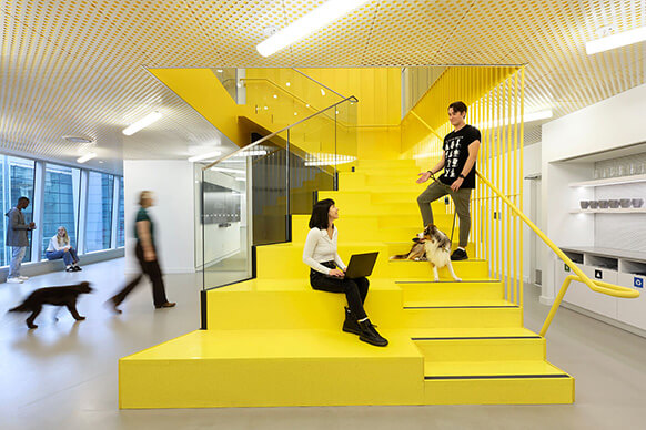
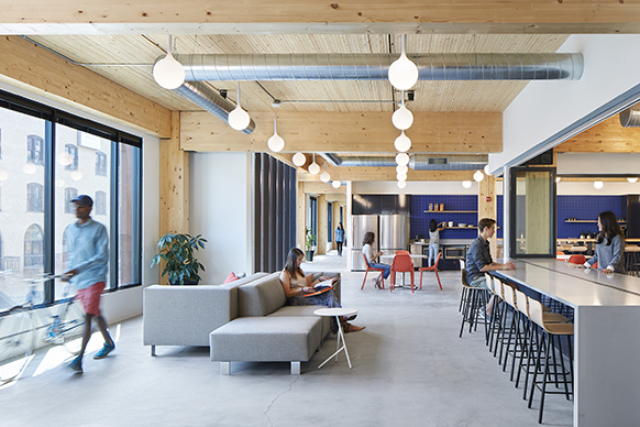
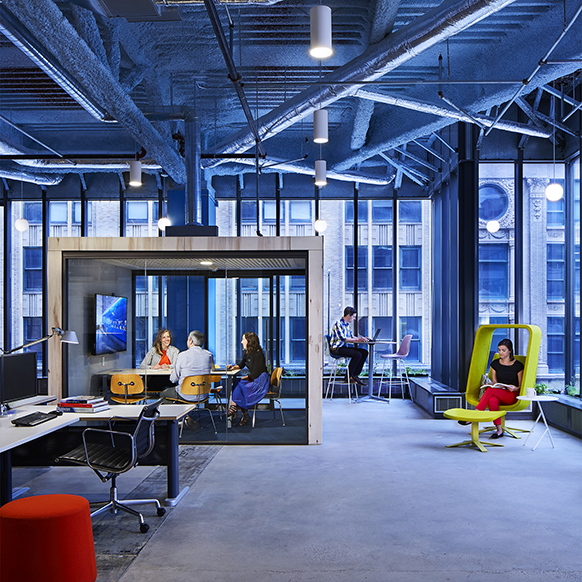
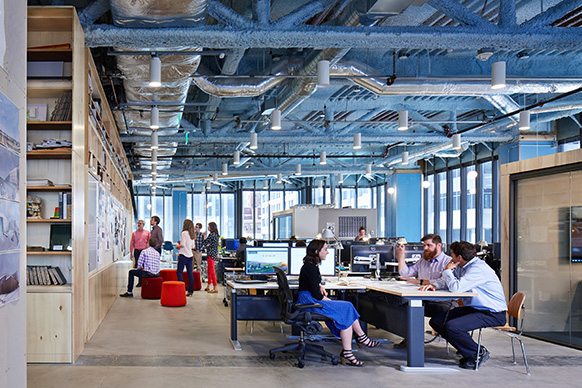
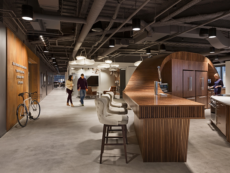
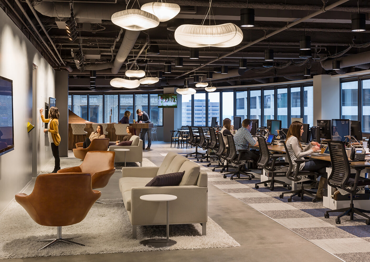
We laid out the office with principles of mobility in mind. Workstations are minimized to provide room for a variety of activity based work settings—booths, small and large huddle rooms, standing height counters, and collaboration lounges to name a few.
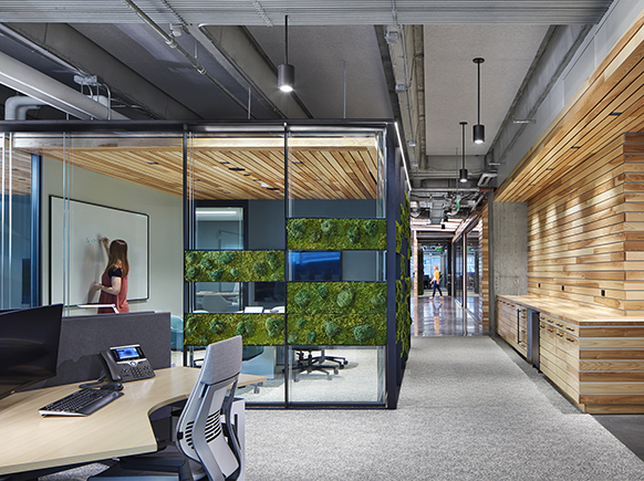
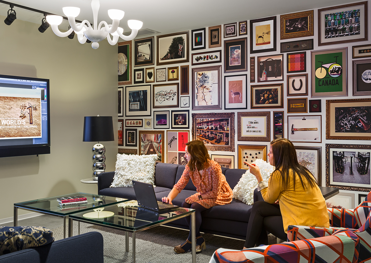
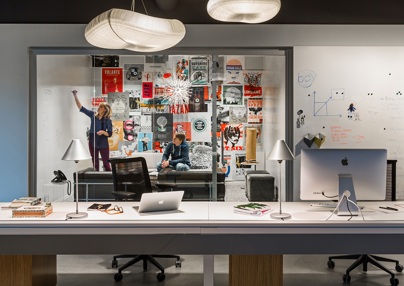
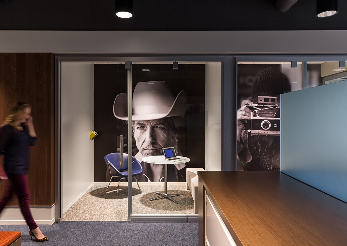
The limited space meant nearly every surface became writable, tackable, or housed technology. Huddle rooms feature oversized graphics of creative vanguards from Bob Dylan to Maya Angelou and meeting rooms are laid out like living rooms to foster collaboration, each taking on a unique character and filled with objects to inspire the creative workforce and pay homage to Martin Williams’ past.
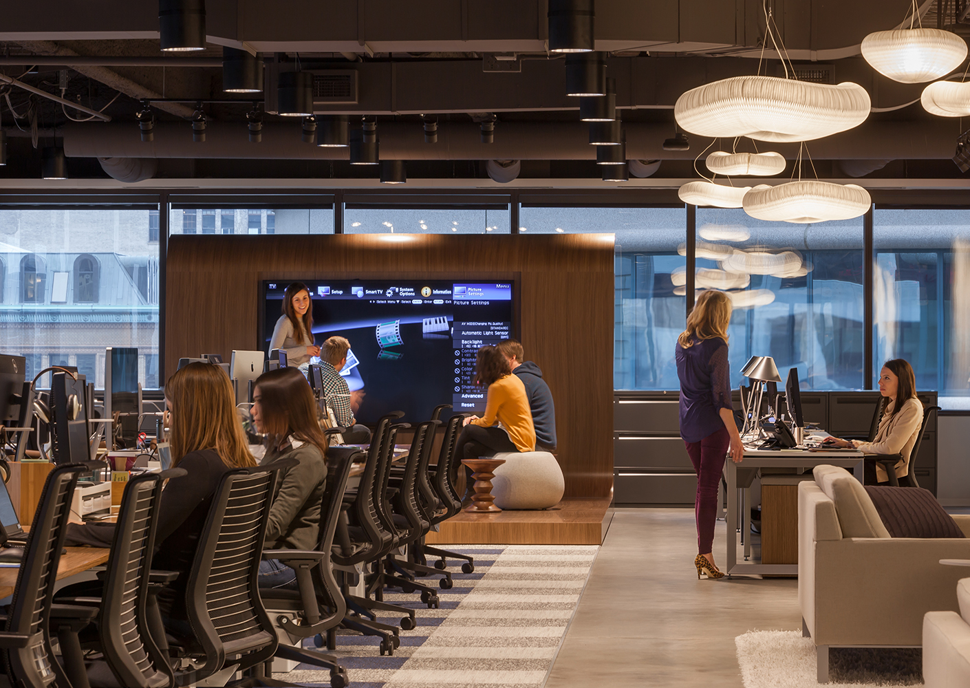
When Martin Williams made the decision to move into a new workplace, they used it as an opportunity to think more strategically about how and where they do their work. By adopting an unassigned work strategy, they were able to reduce the number of dedicated workstations and increase the amount of collaboration space that edges the open office and is infused throughout the corridors.
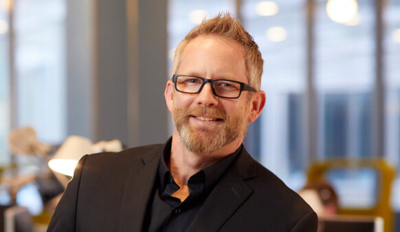
Tom Moudry, Former Creative Director, Martin Williams
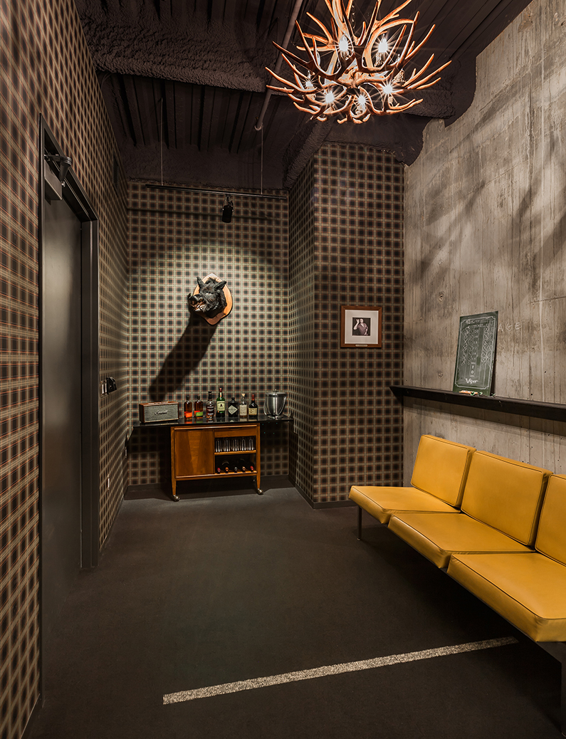
Being curious is not just encouraged at Martin Williams, it’s fundamental to the work they do. Because of this, we treated enclosed rooms like a cabinet of curiosities, each with its own personality, to foster inquisitiveness and stimulate the creative minds that work there. These include a huddle room wallpapered with Minneapolis concert posters, a conference room with local artwork hidden like Easter eggs amongst a floor to ceiling gallery installation, and a hidden dart room that only those who are in-the-know can find— complete with scotch cart and vintage taxidermy.
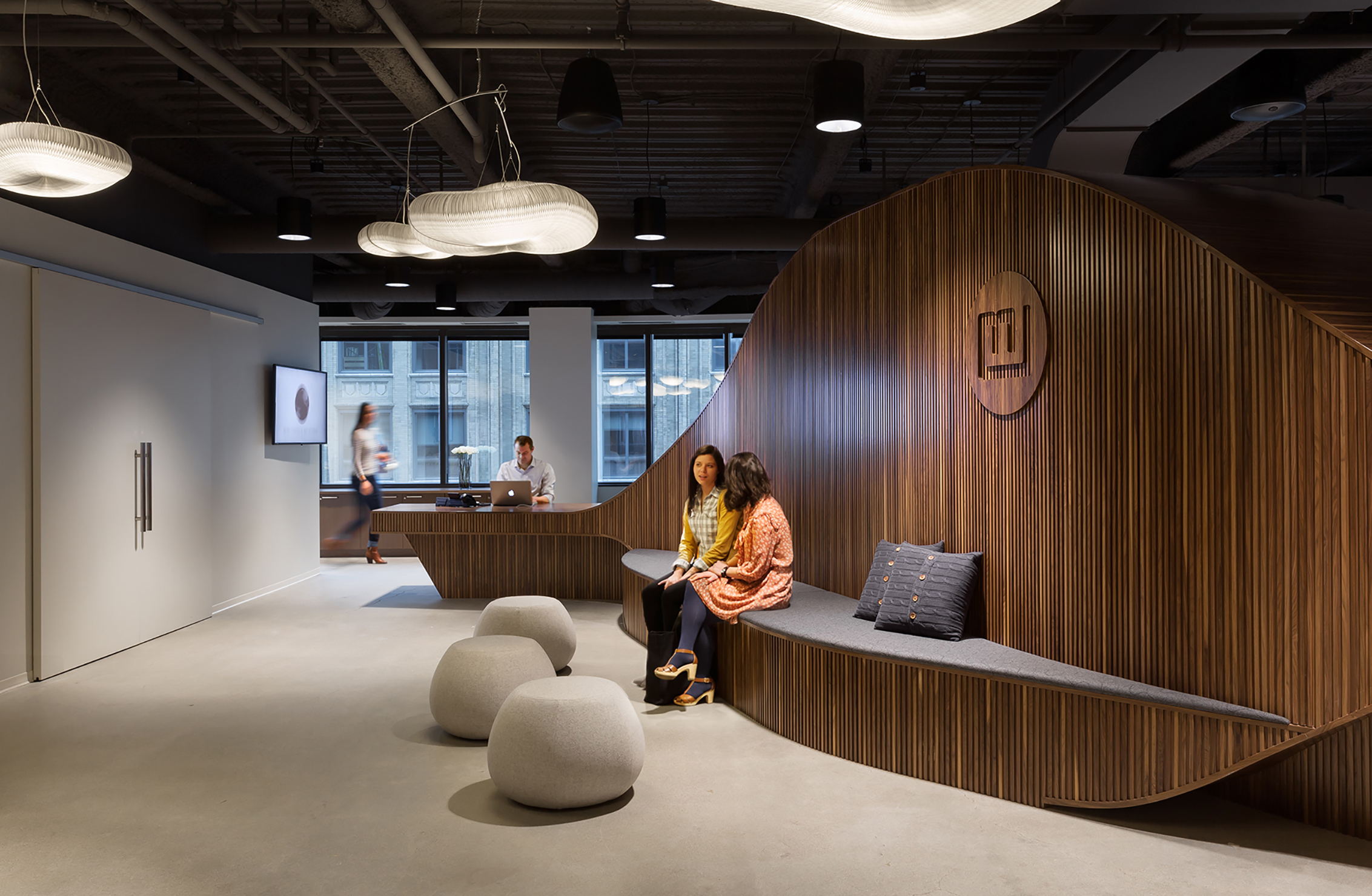
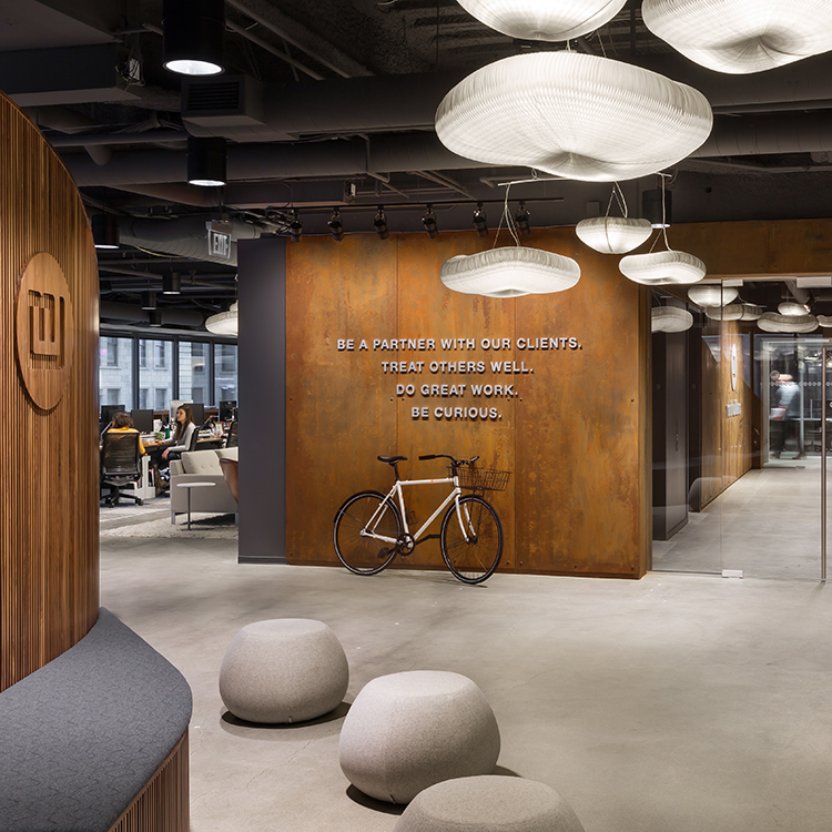
Everyone that enters Martin Williams is treated like family. This made it important for guests to be able to walk directly into the employee kitchen, as this is the heart of every household. Keeping this experience front and center while hiding all the back of house function, the design team created a multi-functional sculptural object, part reception desk, part bar that puts their “Director of First Impressions” next to the entry, organizes the kitchen equipment and keeps it hidden from view, and provides seating that wraps into the kitchen, complete with a pancake griddle to fuel morning meetings and beer on tap brewed by one of their customers.
