Designing Our Austin Studio
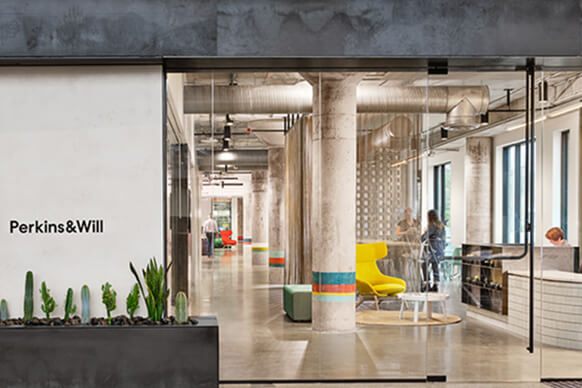
Featuring a blend of Austin’s urban identity and the new branding of Perkins&Will, the space is experienced through a series of intimate vignettes connected through the story of color.
Fresh off the heels of our firm’s global re-brand, the design of the 15,000-square-foot Austin studio reflects the firm’s new visual identity—including its core values—while celebrating Austin’s unique character. Warm and welcoming, the workspace reflects the firm’s commitment to human-centered design with a distinctly Austin setting.
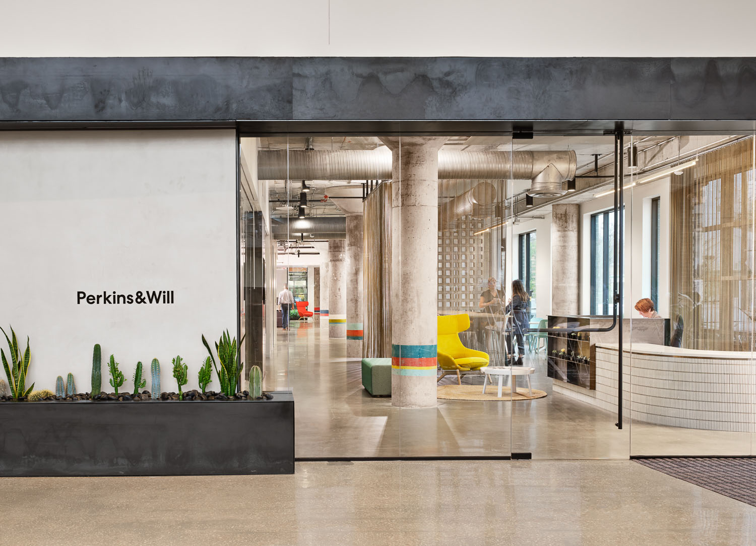
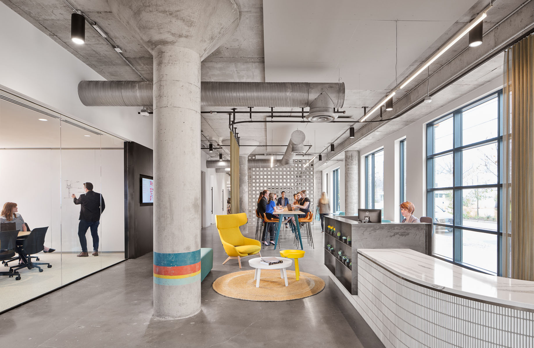
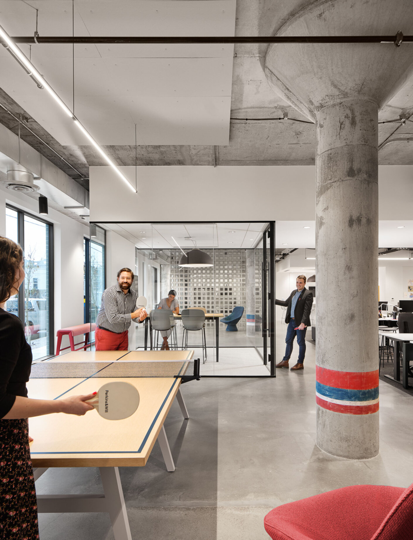
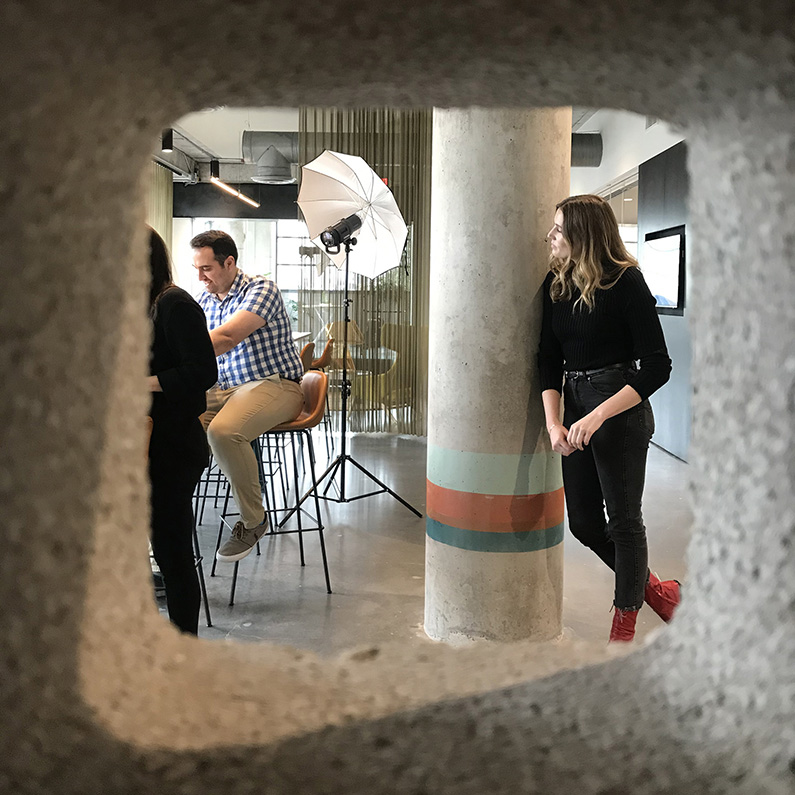
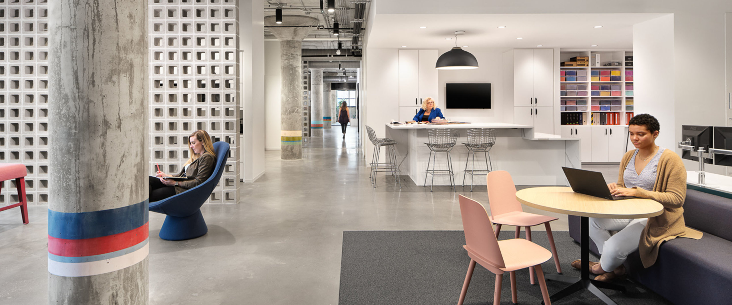
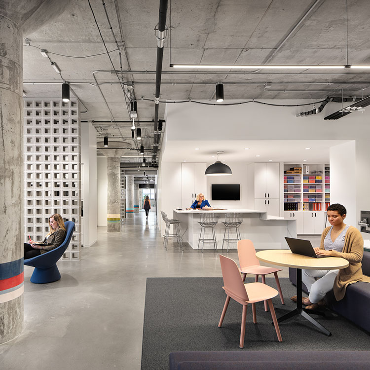
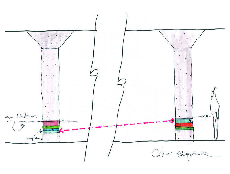
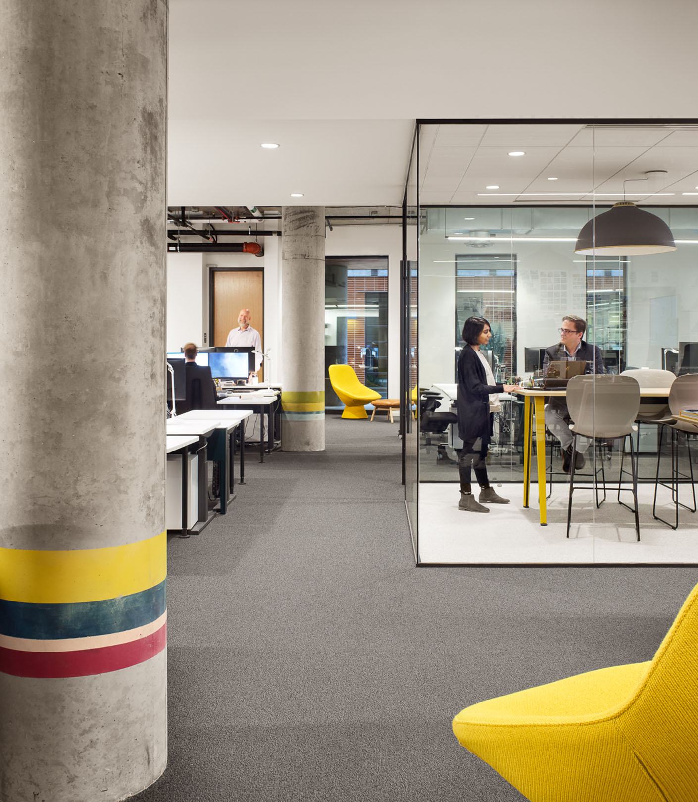
Inspired by the spontaneity of Austin’s street art scene, the office’s columns feature bright pops of Perkins&Will brand colors as a representation of the unified practices and diverse cultures that set the studio apart from its contemporaries. These stripes also help define work zones into vignettes that are outfitted with furniture pieces informed by the color combinations on each column.
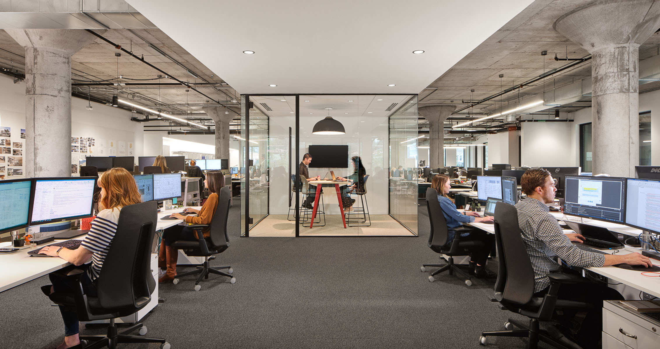
Locally sourced materials help define the space and connect it to its locale, and the design prioritizes access to daylight. Designed to be LEED Gold certified, sustainable healthy building materials, recycling, composting, optimized energy performance, water reductions, and daylighting throughout the space make our studio a healthy and environmentally responsible space to work.
Designed to earn Fitwel certification, the open-plan workplace features a high walk-ability score, outdoor courtyard space, active workstations, and a wellness room. The studio is equipped with flexible walls, free-standing conference rooms, movable technology, a high tech model workshop with 3D printers, and a materials library. This adaptability ensures design teams can meet evolving client needs. Spaces were further defined through semi- or fully transparent dividers such as glass-fronted huddle rooms, breeze block partitions, and chain mail curtains that added to the minimalist and raw aesthetic of the space.
Manuel Cadrecha, Global Design Principal
