Timbro
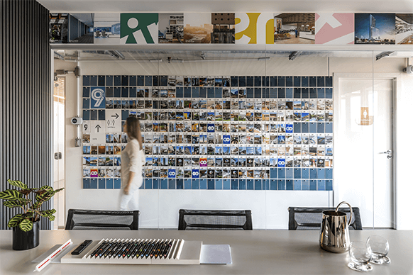
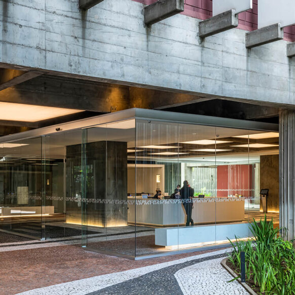
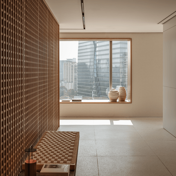
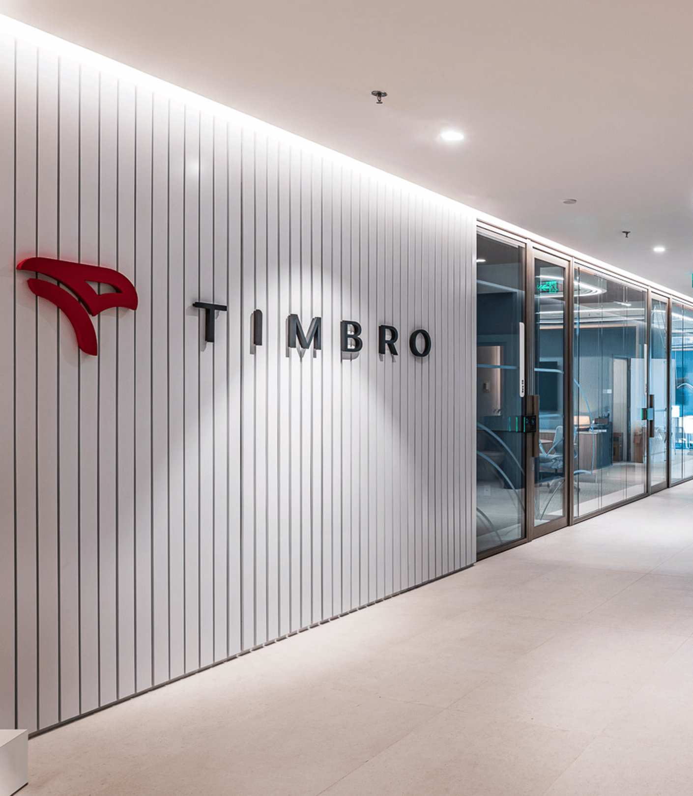
The Brazilian foreign trade company Timbro entrusted Perkins&Will São Paulo with the mission of shaping its current situation. The building chosen to host the new office has a facade with details in oxidized copper sheets, in a greenish hue, referring to one of the products imported by Timbro, copper. This was the starting point for the design of the interiors, which sought to refer to easily identifiable and representative elements of the company’s activities.
Photo credit: © Renato Navarro
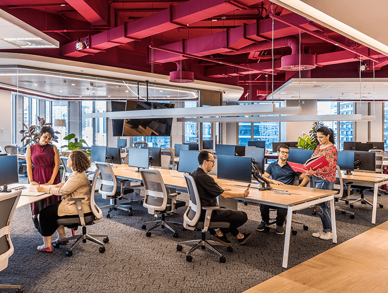
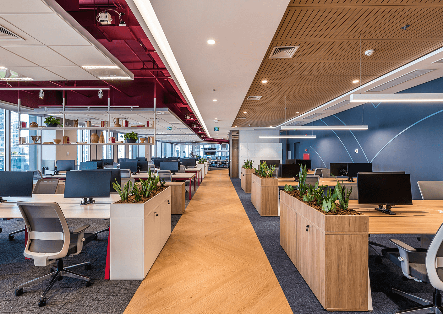
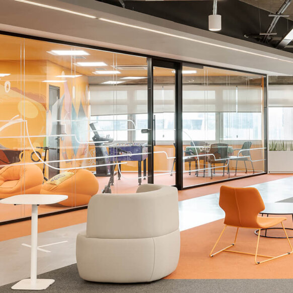
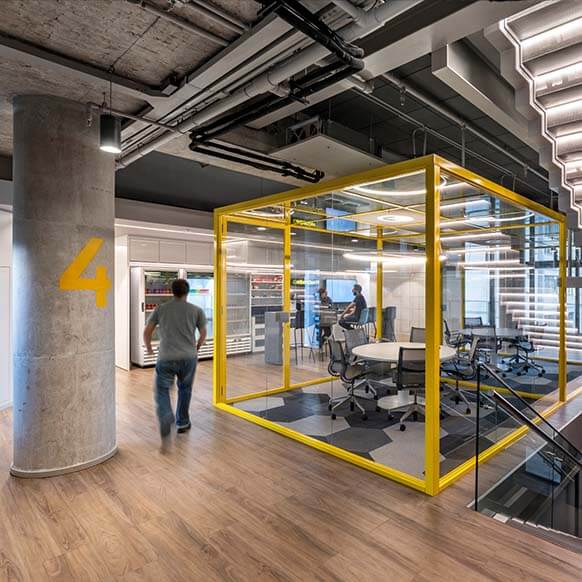
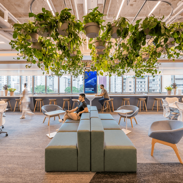
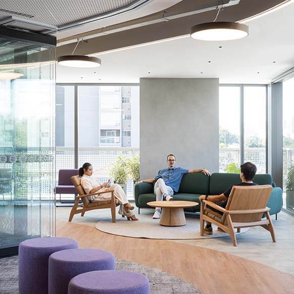
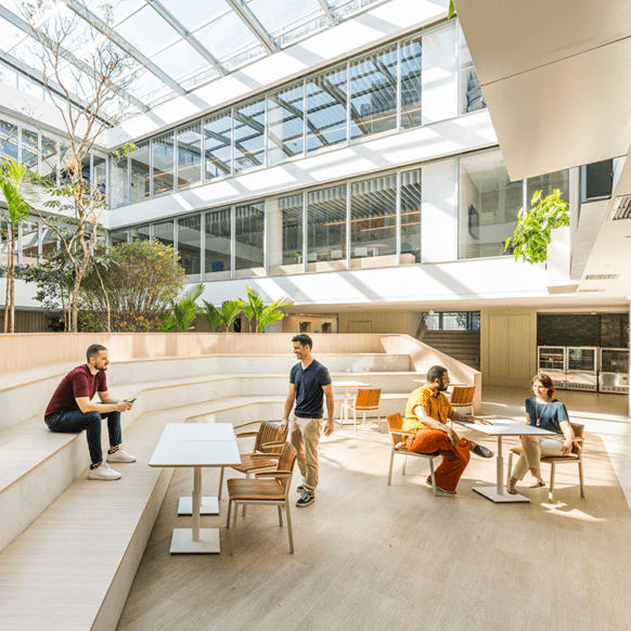
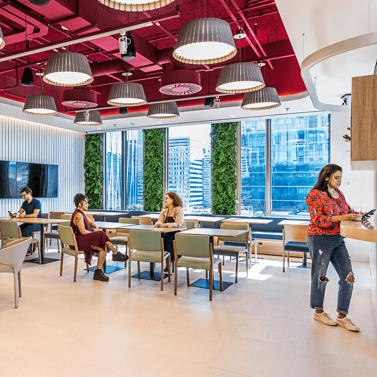
The central core of the building, measuring 300 m2, contains the elevators and technical areas. Around it, 1,500 m2 are arranged, on an entire floor with almost three times the area of the previous office, of 600 m2. Such an arrangement led the architects to look for an enveloping circular design, with concentric flows. The circular organization of the flows dispenses with the use of partitions, emphasizing the general and integrated view of the entire environment.
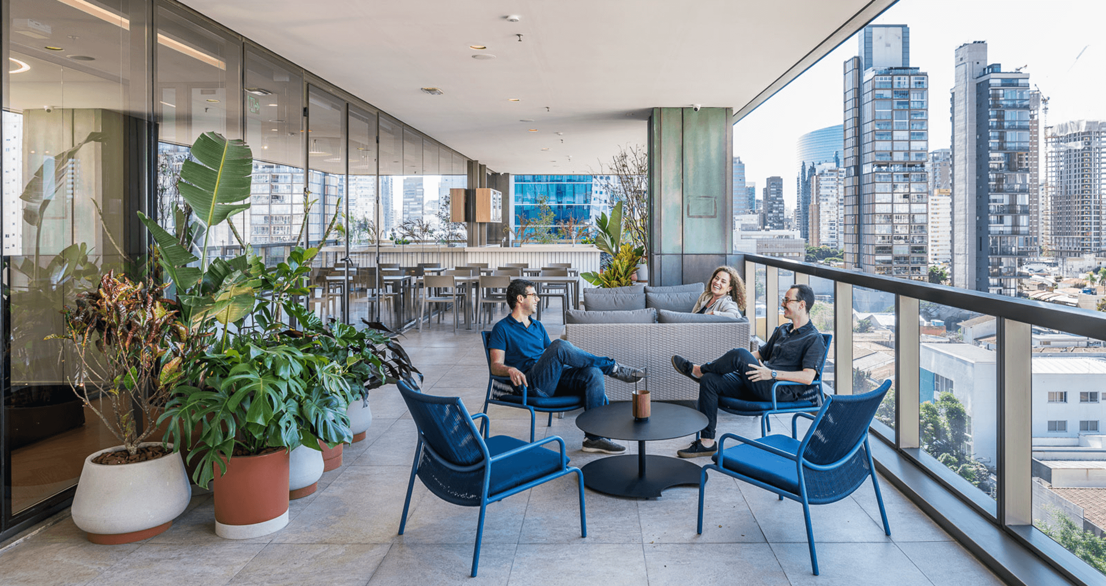
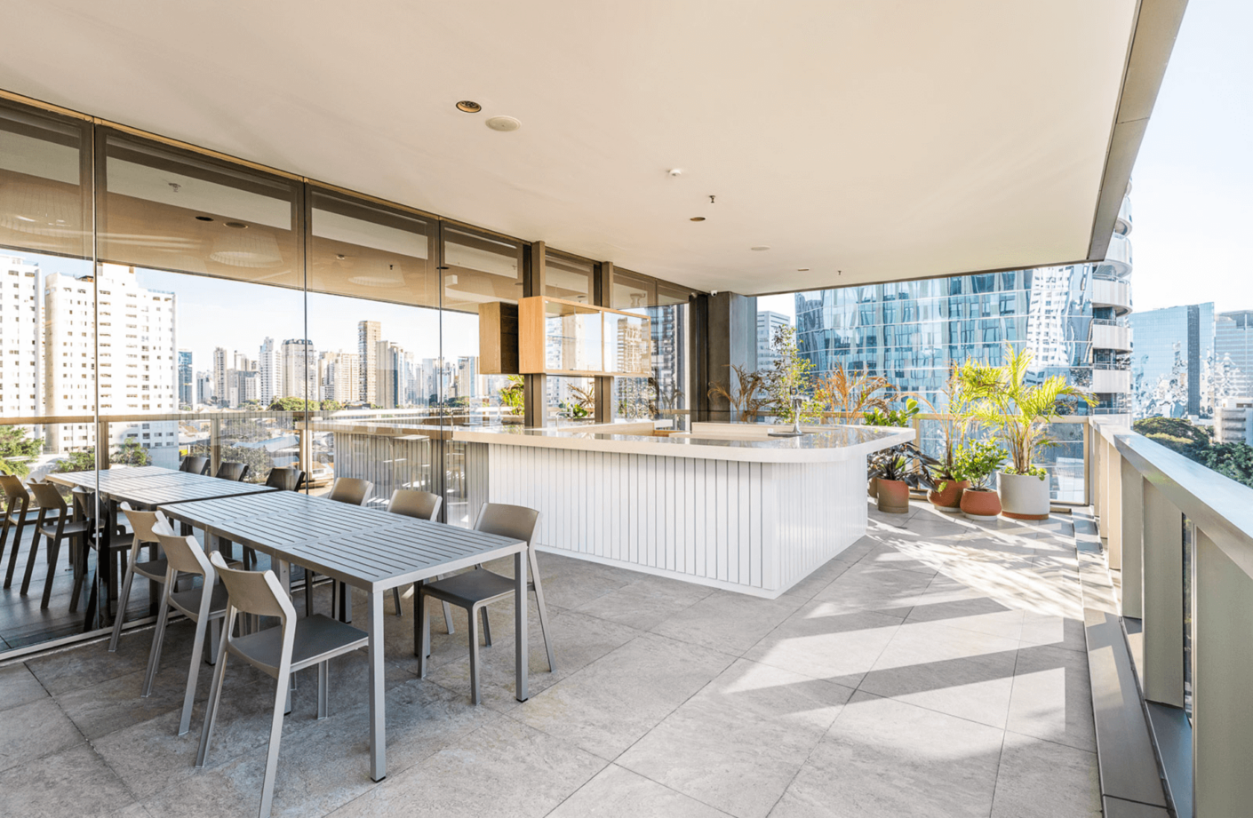
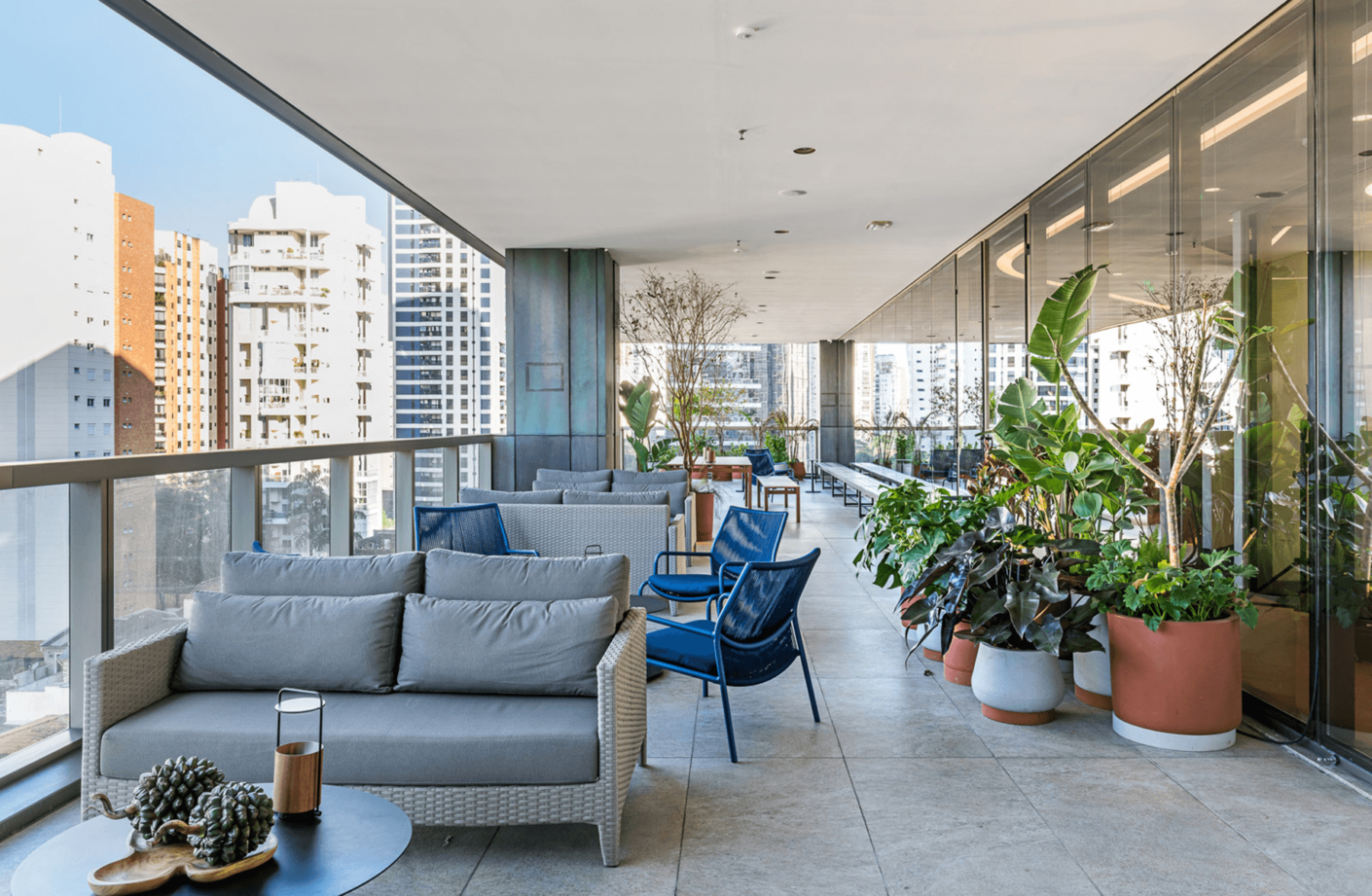
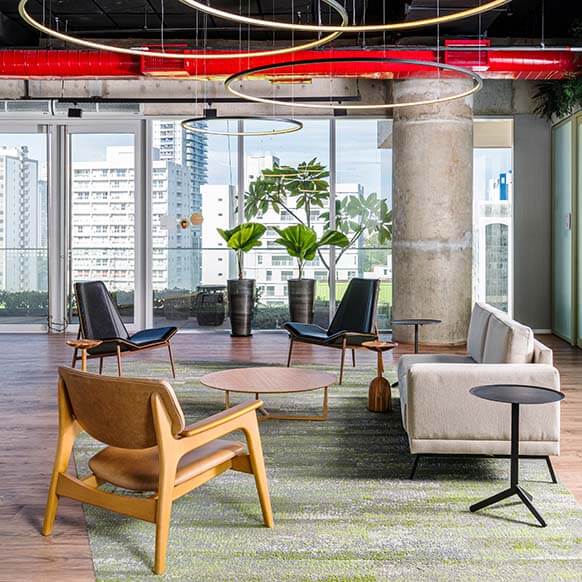
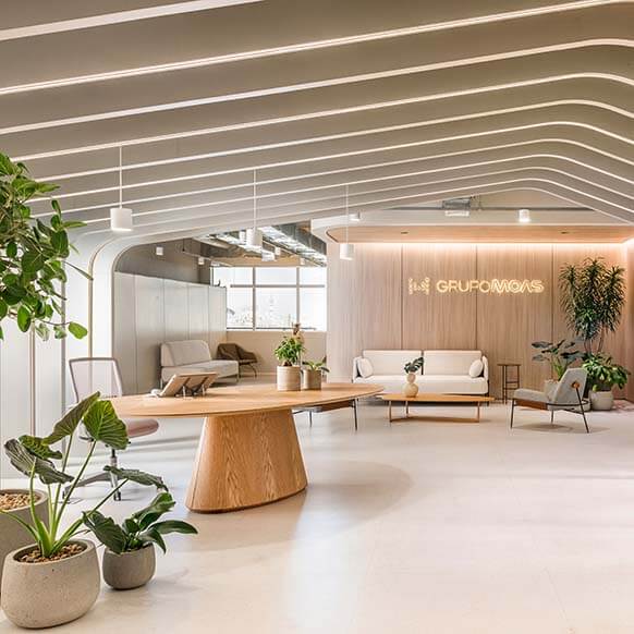
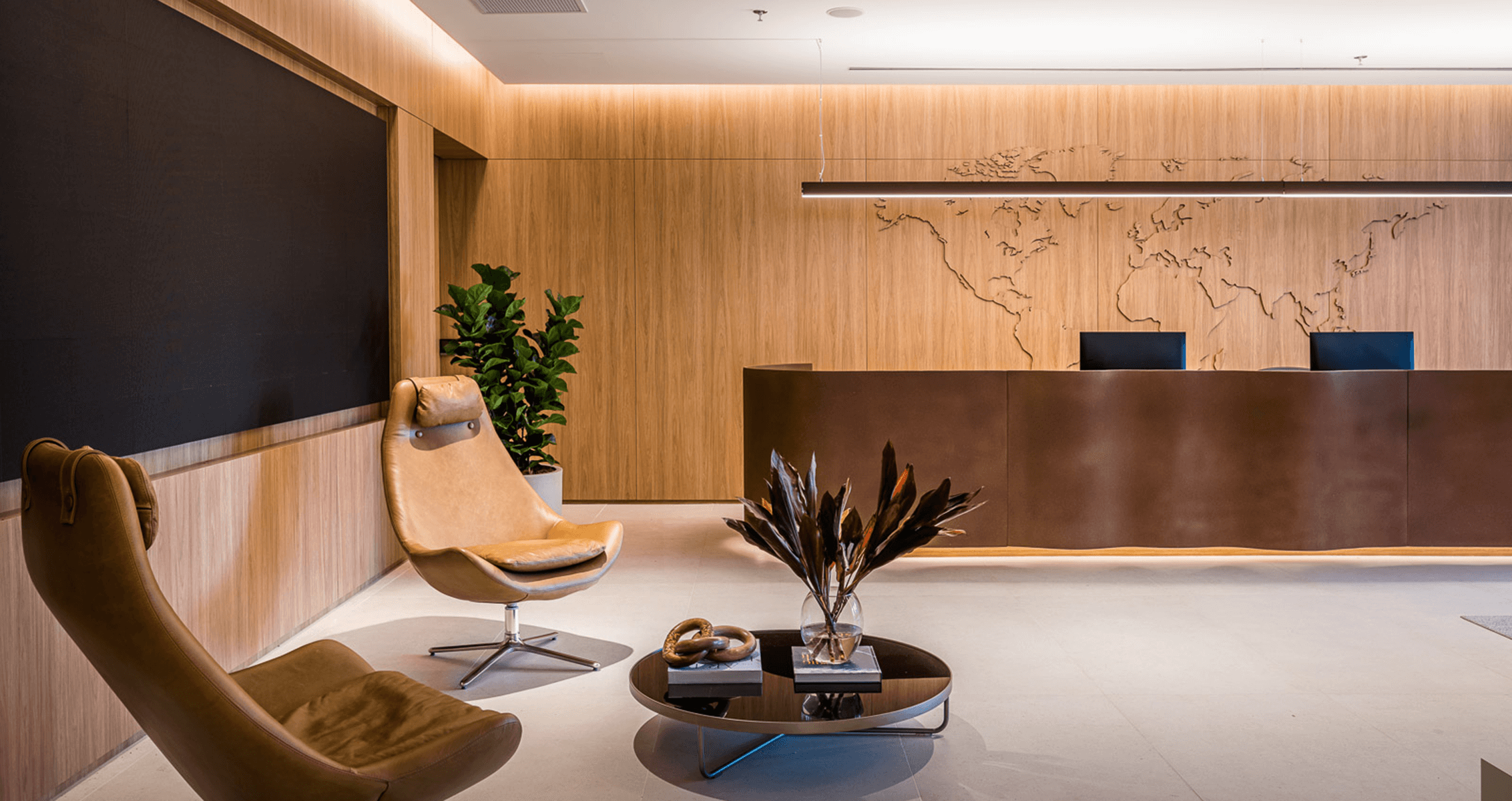
The Perkins&Will São Paulo team then turned to semantic research on the word “timbre”, of French origin and meaning stamp or seal. That is, that which indicates that the correspondence or order is ready to be sent. As in the past the letters were closed with wax seals in an earthy tone, the designers decided to include this tone in the interlining – the intermediate layer between the lighting structures and the lining itself. The color also dialogues with the copper, which is materially present not only on the building’s oxidized façade, but also on the polished sheet that covers the reception desk.
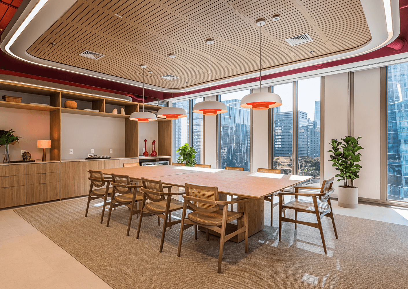
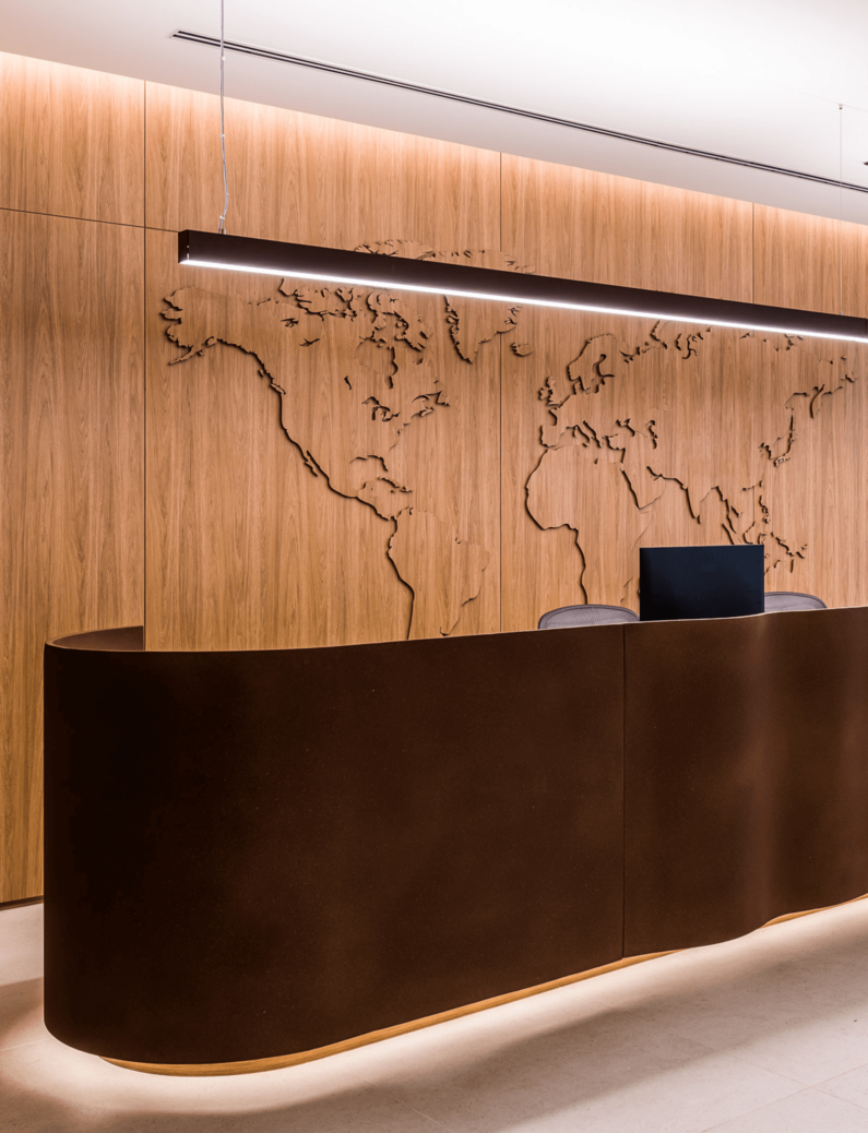
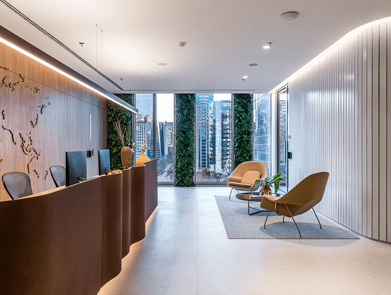
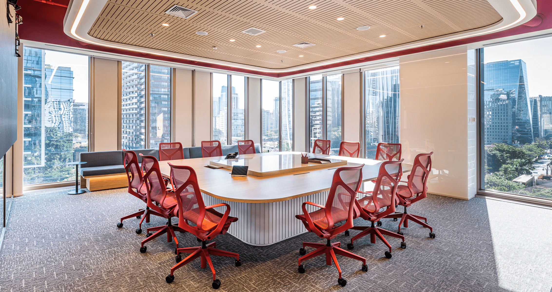
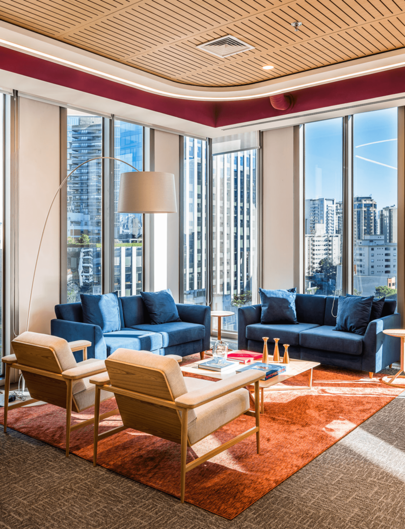
According to architect Cyntia Ayres, sweeping the ceiling void may seem simple at first sight, but requires complex engineering behind it – exactly as occurs with Timbro’s work – which was carried out together with Saeng Engenharia. “We deliver an office that cannot appear sophisticated in ostentation, but has to be functional and aesthetic, always answering the question of what each item does or does not add as value to the business”, she says.
