Carter’s Headquarters
Oatmeal. That’s what a key stakeholder brought to a design engagement session when asked what object best represented the Carter’s brand. Like the ubiquitous white Carter’s onesie worn by nearly every baby born in in the U.S., oatmeal is an American household staple.
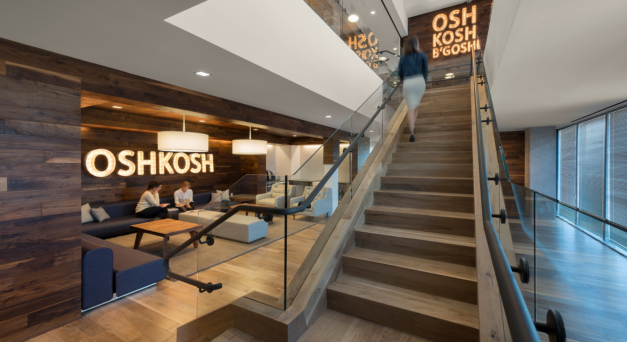
With oatmeal in mind, our design team went to work to create a neutral palette that played well with the disparate brand colors of Carter’s and Osh Kosh. The headquarters had to be a living space where patterns and fabric could easily be stored, cut, and considered as designers looked for the next outfit to inspire a whole new generation of kids’ clothing. It also had to serve as a recruiting tool for top talent looking to make their mark in the children’s fashion industry.
With spaces that mimic a home and family lifestyle, at Carter’s headquarters, the “birth to the bus stop” brand comes alive at every turn.
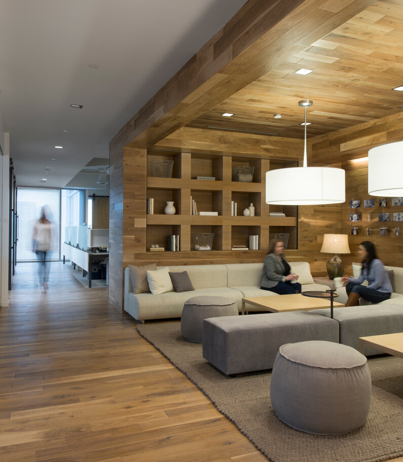
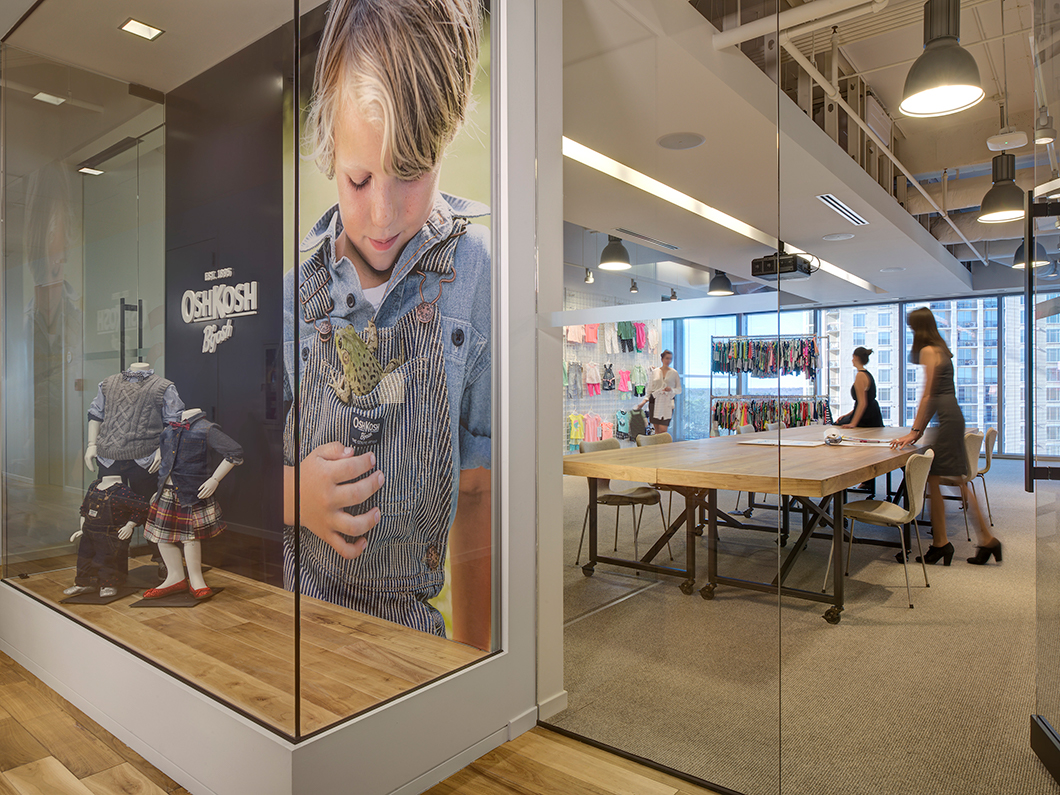
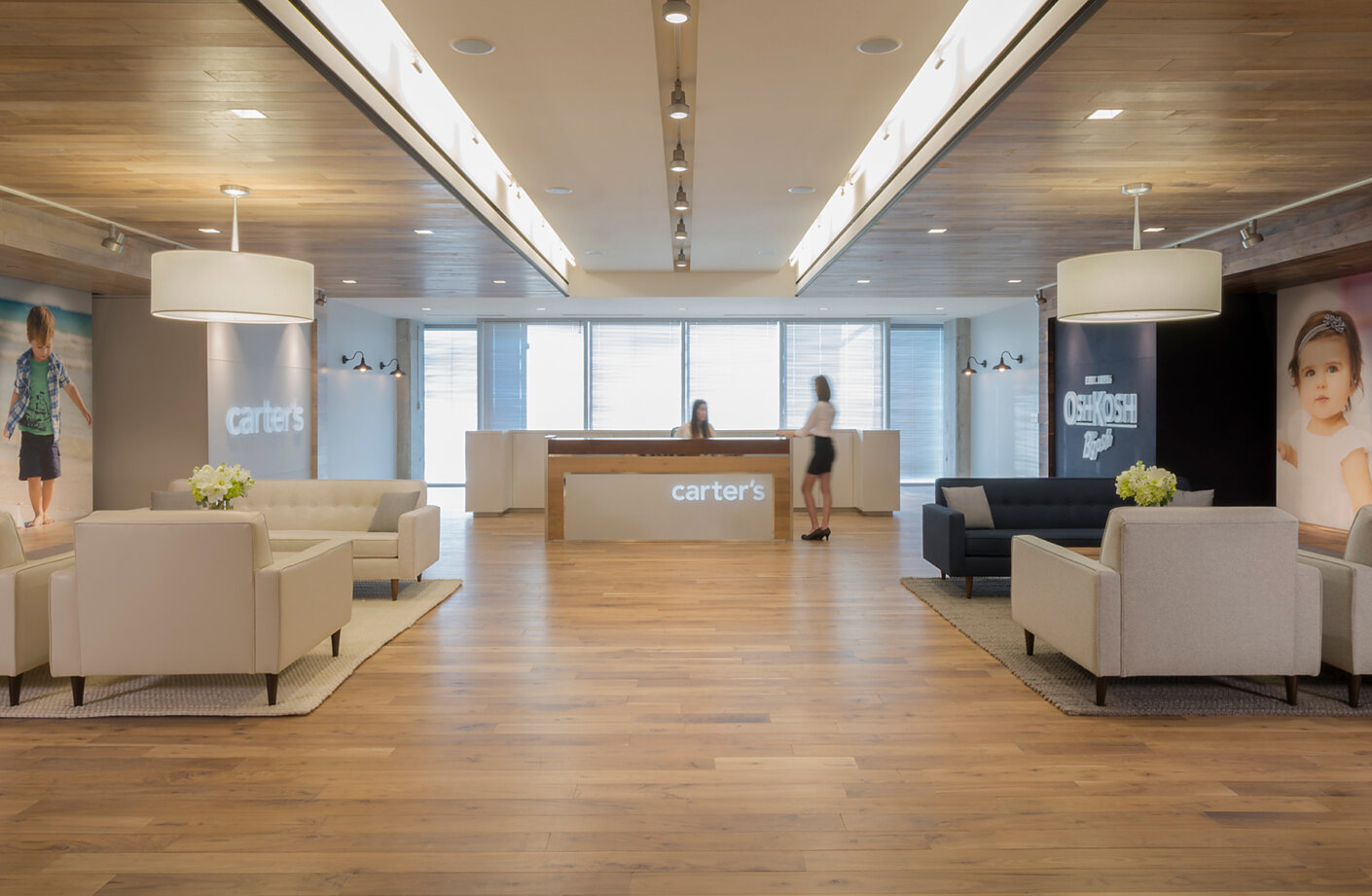
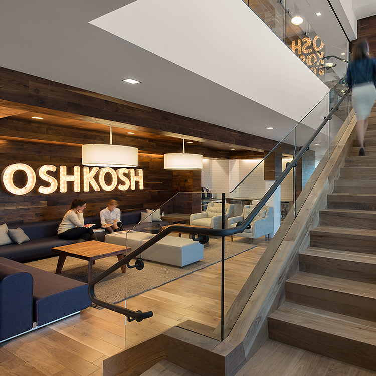
Rallying 1,200 employees together is much easier with spaces that connect the brand to its brand ambassadors. To build that special sense of place, the C suite and reception area live between the two brands—right in the middle of a high rise stack.
Further, executives’ offices may be enclosed, but they project a sense of total openness. Completely transparent, they are an extension of the overall concept that bring in warm and welcoming elements with a “touch of industrial” just underneath the surface.
