At Perkins&Will, we’ve always believed that the right tools can improve our design outcomes. We eschew “technology for technology’s sake.” Whether investing in a state-of-the-art tool, or simply leveraging an existing program in a new way, we’re focused on design excellence—and by extension, satisfied clients.
The pandemic hasn’t changed that ethos. In fact, it has strengthened it. When real-time interaction with clients can’t happen in person, tools that were once just nice to have become indispensable.
“We went from 25 studios to 2,500 studios in about a week,” says Nick Cameron, Director of Digital Practice, about our transition to working from home in March. Project work and client interviews didn’t stop while we settled into new settings and routines.
The focus of our Digital Practice and broader IT team became ingenuity, agility, and speed. Think: deploying a series of iVCams—an application that transforms a mobile phone into a webcam for your computer—versus sourcing webcams during a well-documented shortage.
It was also critical to reinstate the “power of the pen” in a virtual world. After evaluating the best tools for virtual sketching, the team recommended XP-pen tablets and styluses because they worked with applications we use and—almost as important—were easy to get to studios quickly. Another revelation? We don’t need to reinvent the wheel. “We discovered things that are already built into the tools that were being used,” says Nick about realizing that we could sketch right in a PowerPoint being presented to a client.
When we can’t hop on a plane to see a client, the challenge becomes returning the human connection to interviews and meetings. And to do this, marketers and IT have morphed into producers and directors, equipping project teams with the right tools and training to establish a seamless experience.
We’re drawing some lessons from broadcast news by dipping our toes into a cross-platform software that lets us merge the virtually presented material and the people presenting it on the client’s screen—the alternative being separate floating boxes, which are often distracting. This platform gets multiple teammates (who may be thousands of miles apart) in front of the same backdrop, which offers cohesion.
“The whole idea is to get people back in front of the work,” says Matt Petermann, Digital Practice Manager. When the client is looking in one place, we can better read facial expressions and body language. It strengthens connection and allows for a more natural conversation. Picture, for example, a fly-through video of a project playing behind two people, one in Los Angeles the other in New York. “It’s almost like a docent taking you through a gallery,” says Nick.
“We always tout that we’re technologically advanced, and this is a perfect way to show it while we’re presenting a design concept,” says Matt. “When there are questions like ‘how are you going to work with us,’ it’s easy to show that we’ve got a great platform.”
While we’re faced with new challenges—learning curves and prepping teams with enough lead time, to name a few—the pandemic has forced us to reevaluate our engagement with clients. In many ways, it lowers the barrier to entry. “Space has collapsed,” says Nick. “Our physical location doesn’t matter—and now there’s a greater pool of resources.”
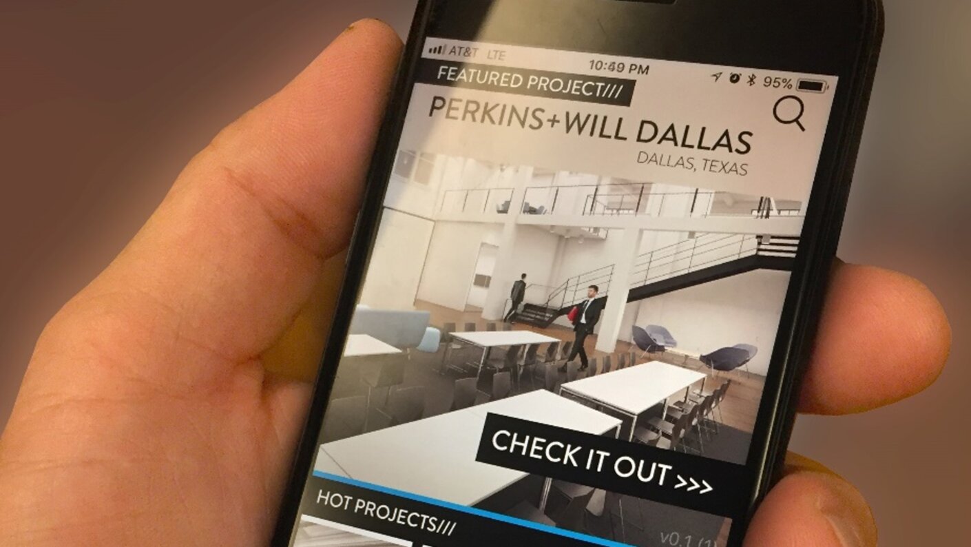
Three years ago, we launched VX (“Virtual Experience”), an iOS application that creates an immersive experience, letting clients explore some of our latest projects in 360 degrees. At the time, it was ground-breaking in its ability to help clients perceive buildings in a more tactile way and visualize changes in real time. Now, it’s integral to connecting when we can’t tour a client around a project or point out the features of a physical model.
“If you came into our studios, you’d see nothing is static. This is a way of putting dynamic virtual and augmented reality content, animated diagrams, and videos into someone’s pocket,” says Nick.
Our latest update creates a web as well as Android version of the content, with built-in internal processes to upload projects seamlessly and with an additional measure of quality control. For example, we created an including an InDesign template for plugging in content.
“A few years ago, it was cool. But it’s it’s starting to become almost necessary for how we need to work today,” says Matt.
Even in the midst of a pandemic (and perhaps especially in the midst of a pandemic), we leverage several empirical and visualization tools to bring concepts to life.
On a recent pursuit for Indiana University’s Health Center Medical Education and Research Facility, the project team used a robust Excel programming dashboard paired with parametric modeling, allowing for custom animations derived from the spreadsheets. They also tapped into Enscape, a gaming platform that allows users to fly through, pivot and pause within a Revit model, or even adjust the time of day to immediately respond to clients’ questions about the design.
“The tools allow the client to engage in a multi-dimensional way,” says Adana Johns, Science and Technology Practice Leader in our Chicago studio. “You were in the building. You can feel the space. And in the current time, this model also took the place of a physical model.”
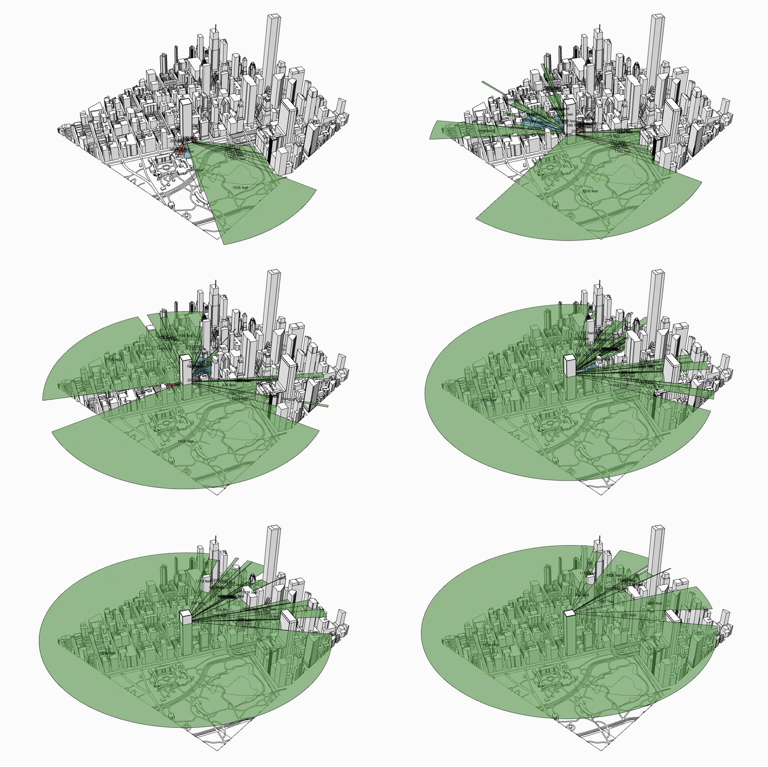
Throughout 2019, our Digital Practice team was laying the groundwork for moving building model data to the cloud. At the same time, they were giving designers more powerful laptops with GPUs (graphic processing units). The result of these strategic efforts is the ability to do more computational design—and do it in real time.
Advanced analyses like wind simulation or pedestrian comfort, which may have required a consultant in the past, can now be done on our laptops. “Data is in the cloud, but the processing is at the designers’ fingertips,” Nick explains.
These analyses, and the ability to do them quickly and without specialists, means we can help guide clients through the decision-making process more efficiently and effectively.
Like machine learning and generative design, “digital twin” has quickly gained currency as a trendy term in the last few years. Nick Cameron remembers learning about it in the context of GE, which created a digital twin of an engine. “[Unlike an engine], architecture is not a repeated widget,” he says. “Our clients live in these spaces, and they change them all the time. How do we create a way to have a model that can change and adapt as our clients adapt space?”
No longer reliant on powerful computers to create virtual experiences, we can look to what is being done in the real estate market, like Google Street View and Matterport. Currently, the Digital Practice team has dispatched a few scanners to select project teams to try out creating project scans. These allow designers and clients to not only experience the space, but also have vital information—the distance between two columns, for example—at their fingertips.
Lauren Obermiller, an architect in our Seattle studio, leveraged the Matterport Pro2 3D camera to capture one of her projects, a renovation of the Eileson Visitor Center in Denali, Alaska. The result was a walkable space from which she could take measurements and create floor plans.
“We knew that this one-time remote site visit was going to be crucial to documenting as much as we could,” she says. “Since the scope of work for this project is still developing, the hope was that the scan would become the main tool for us to revisit the site from afar, and gather info from areas that were not focused on during the initial site visit.”
This digital twin of the space means her team can virtually visit; it just takes one person and one trip to bring the whole team on the same page. Similarly, clients can walk through these scans with just their phone and an active link.
As Matt explains, digital twins are nothing new. But in the past, creating one was an extremely costly and time-intensive endeavor involving expensive scanning equipment, professional surveyors, and months of processing time. “It wouldn’t have been an option except for the biggest and most important projects.” Now, he says, it’s realistic for projects of all sizes.
The overarching philosophy is to make it easy—to get the right tools in the hands of designers while eliminating the pain points. “We’re focused right now on lowering the threshold so that price, time, and schedule are never barriers,” says Matt. And that’s how we’ll keep delivering superior design and fostering real-time engagement with clients, whether we’re in 25 (or 2,500) studios.
